The skincare industry still creates impossible standards of beauty built on claims that time can be slowed or even reversed. Sekkeizu’s credo is to accept the inevitable effects of time and work with your skin’s natural defences. Don’t follow trends which are more likely to cause long-term damage. Its cutting-edge skincare uses the power of ingredients sourced from nature underpinned by proven science. Envelope captures Sekkeizu’s brand story in a carefully crafted and trademarked catchphrase… “Time creates beauty”.

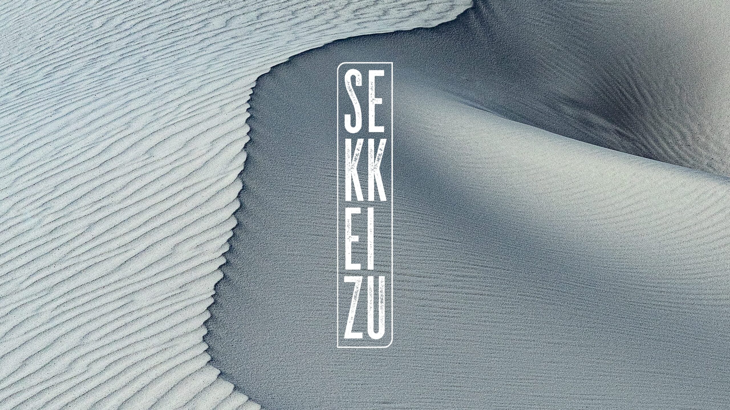
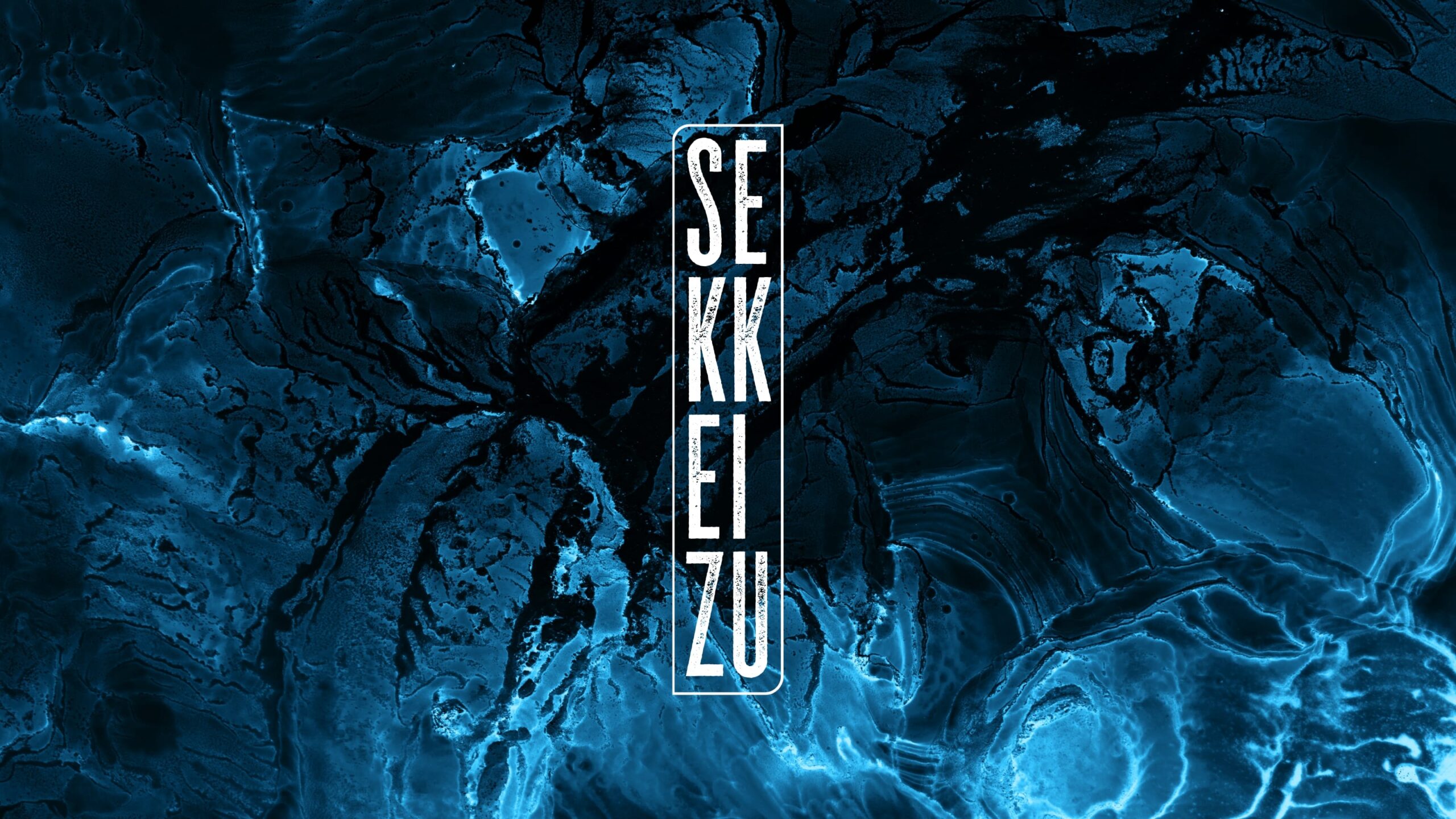
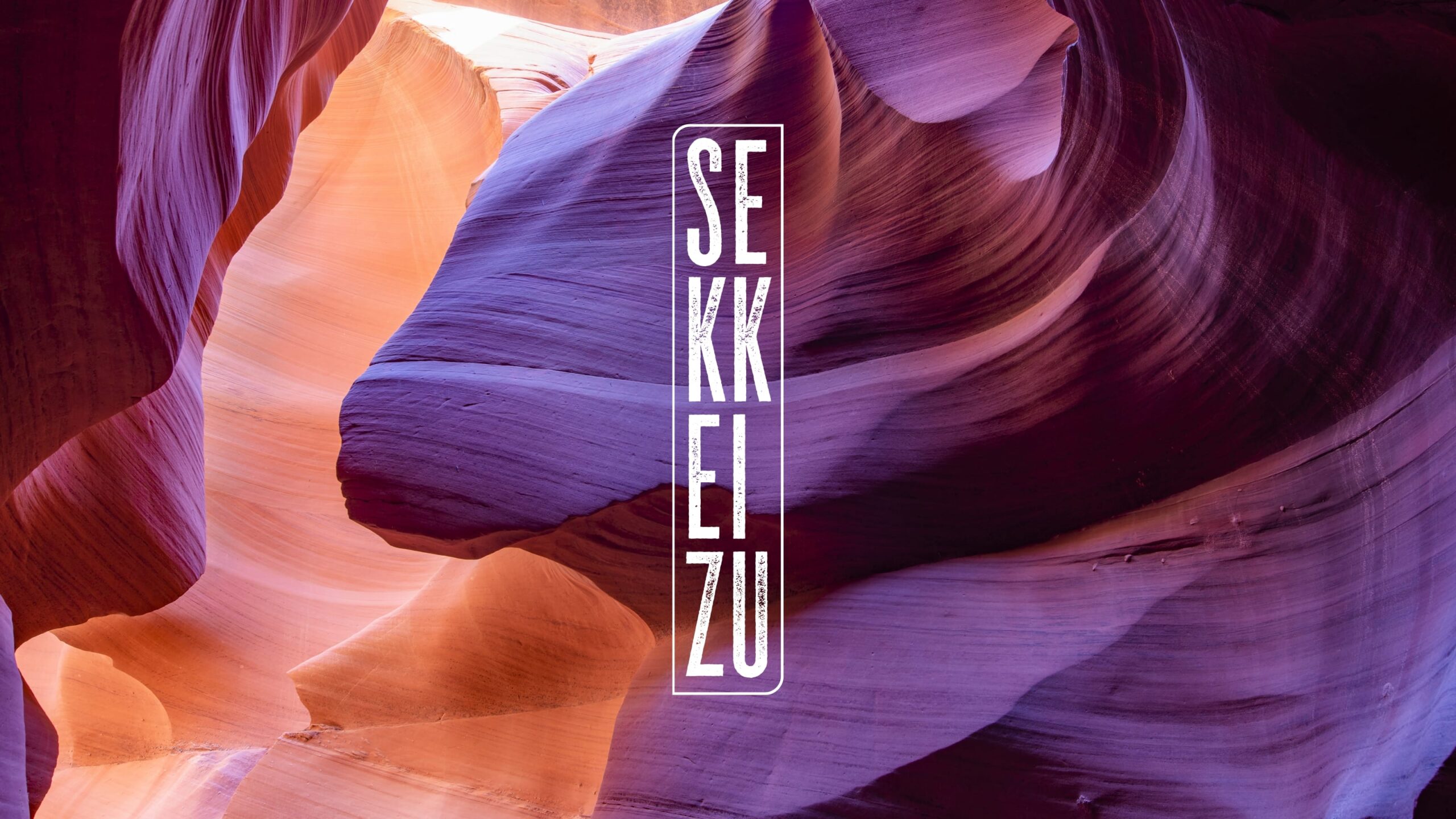
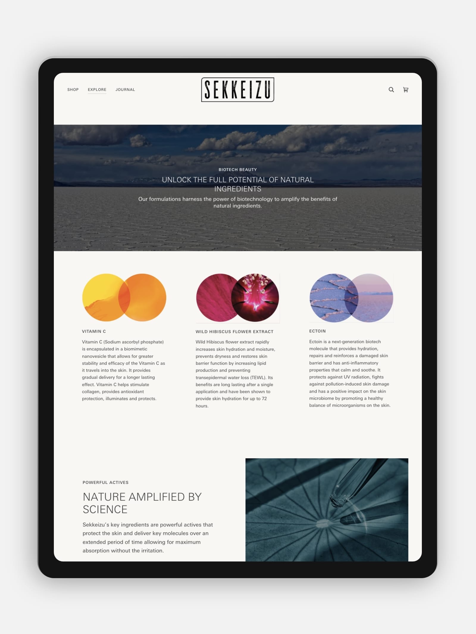
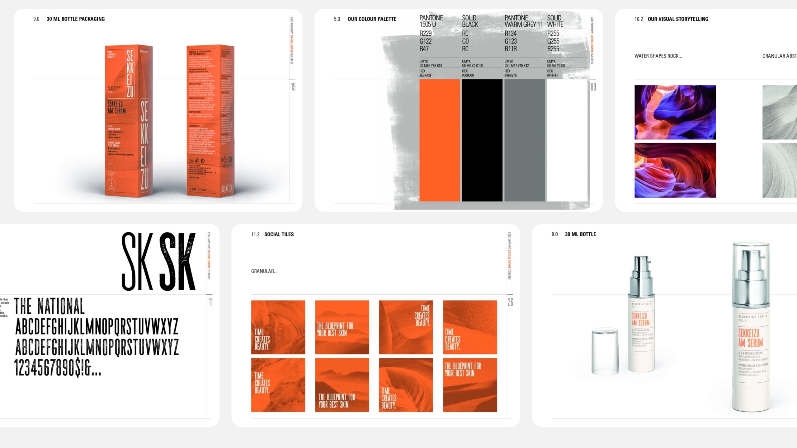
Sekkeizu means “blueprint” in Japanese and the brand’s founder loves the philosophy of Wabi-sabi — a cultural aesthetic that appreciates beauty that is “imperfect, impermanent, and incomplete” in nature. A typeface that embodies woodblock printing is the perfect choice for a logotype which when configured vertically has a subtle nod to “kanji” scripts. Nature’s awesome beauty is celebrated with images from all over the world illustrating the stunning effect time has on stone, wood, sand and ice. Presented in full colour on the website or as grainy background textures on packaging they tell the story of beauty created by the passage of time. A custom designed hourglass icon underlines it.
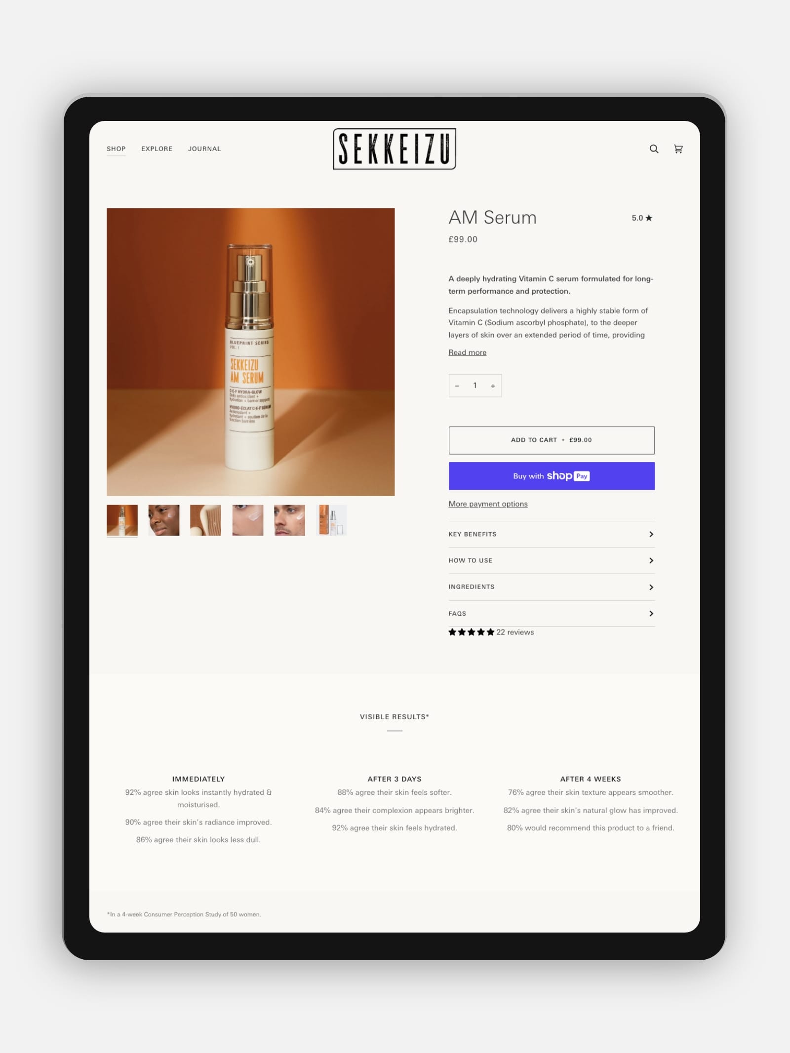
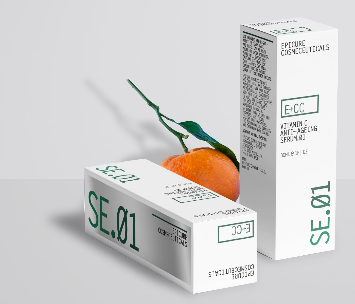
With sustainability foremost in Sekkeizu’s MO, Envelope works closely with a local printer in the UK to produce a single packaging form. The unique solution cleverly accommodates multiple SKU sizes, reducing waste and ensuring its commitment also extends to the well-being of our planet. This one size fits all approach also ensures visual cohesion on retail shelves with all boxes the same height. Detailed product information is distilled onto boxes in a clear hierarchy presented to customers in a typeface with a deliberately “technical” aesthetic. Sekkeizu’s first product, the AM Serum is rich in Vitamin C. Orange is the perfect colour to boldly contrast with the sterile white packaging that has become the default choice for skincare brands that want to be seen as “clinical”.
The process of creating a brand identity with Envelope was akin to therapy. They really dug deep into the core of why we exist and pulled out so much more than I thought possible. The enthusiasm for what we were creating never wavered. As a new brand I’m excited for the collaborative journey with Envelope ahead.”
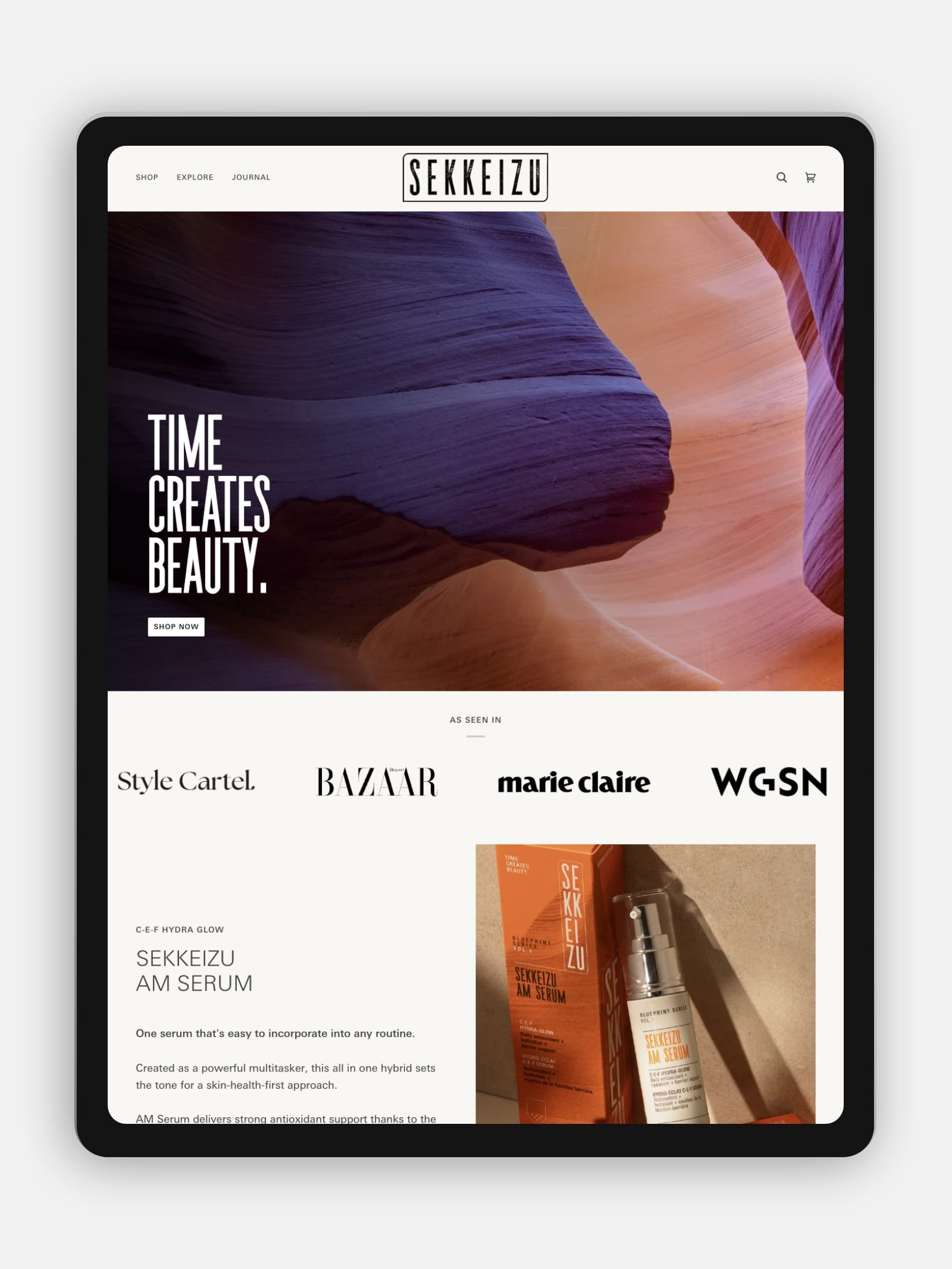
Sekkeizu is sold through its own Shopify store, a platform chosen for its security, popularity and familiar customer fulfilment process. Envelope carefully crafts the chosen template into a refined brand experience. Sekkeizu continues to populate content with complete autonomy building its brand, confident in the knowledge that Envelope is always there when needed.
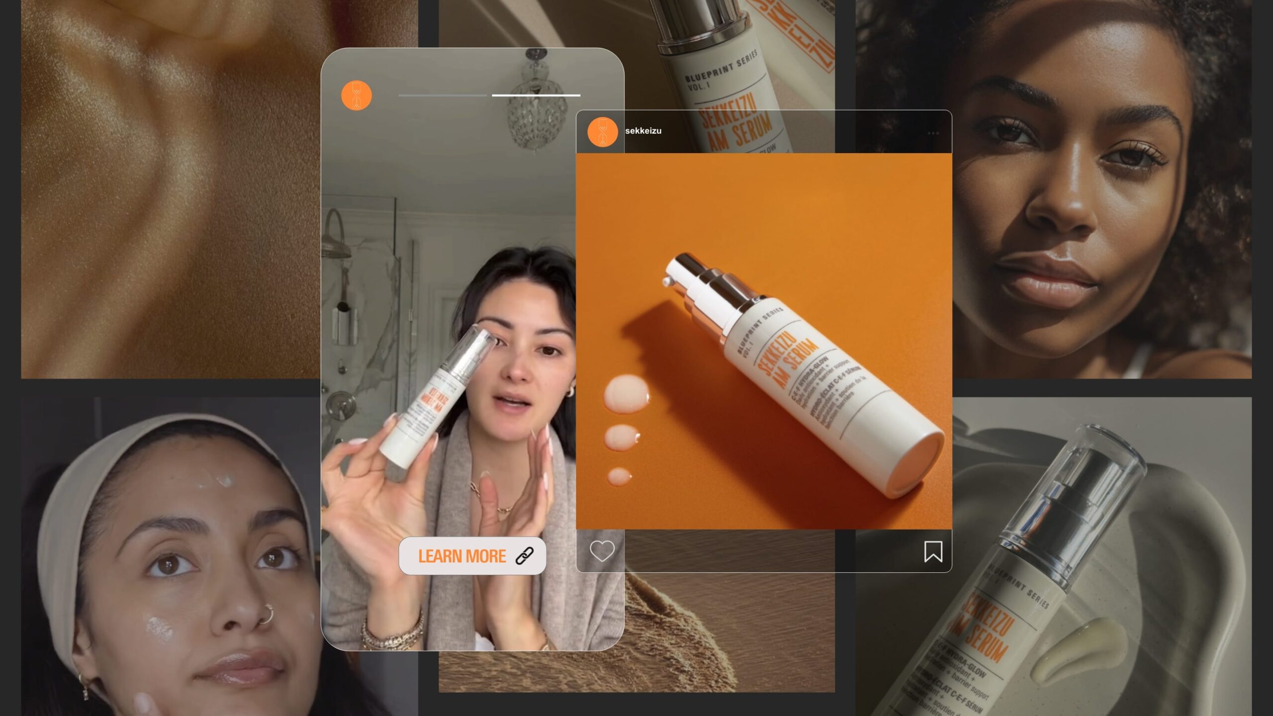
Sekkeizu has its roots in the natural world but these days, connecting with customers is all about digital engagement. Product photography, nature abstractions and influencer videos intertwine to form a rich social media presence, bursting with life.
An Envelope brand toolkit provides Sekkeizu with everything needed to maintain and nurture its brand. Using everyday language it explains typeface choices, colour palettes and even handy hints on image preparation for digital and physical applications. No room for marketing jargon there thank you very much!
l
[email protected]
T +61 (0)412 249 745
Instagram