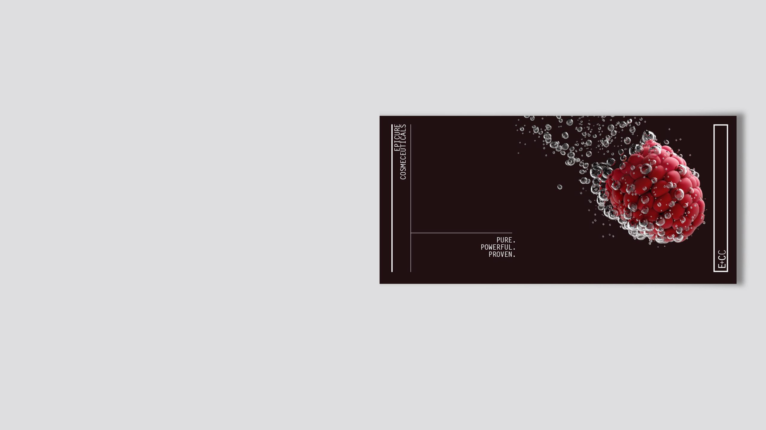
It’s a bold claim but one that Envelope reinforces with a virtual raspberry as a metaphor for the union of nature and science. This live 3D model can be viewed from any angle and lighting condition to generate captivating digital content. Together with the three-tiered tagline the scene is set for a story about ingredients that are good enough to eat.
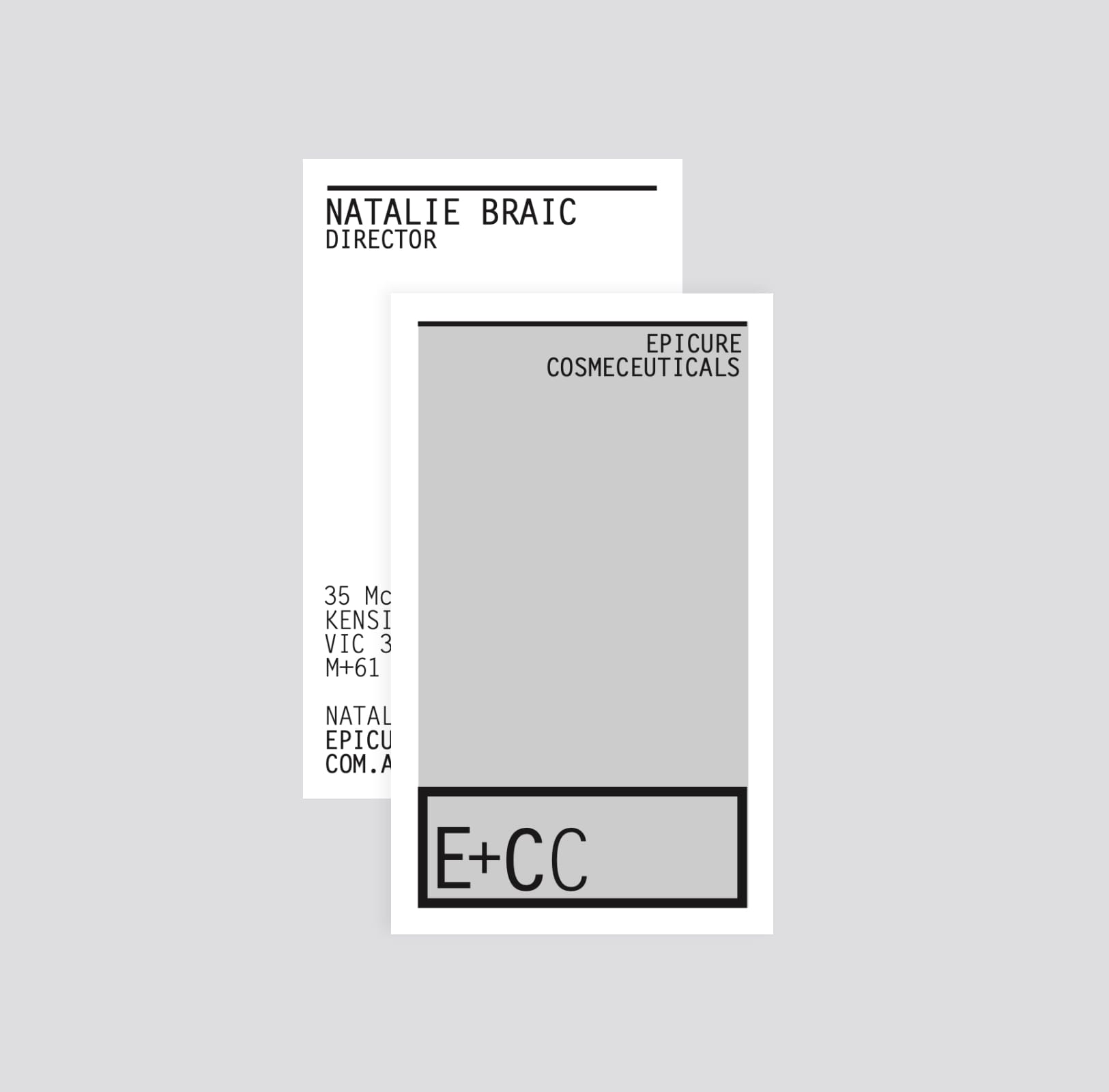
Epicure’s brand language reflects the science behind its efficacy using minimalist typography within a finely structured design grid. Who says art can’t be mathematical?
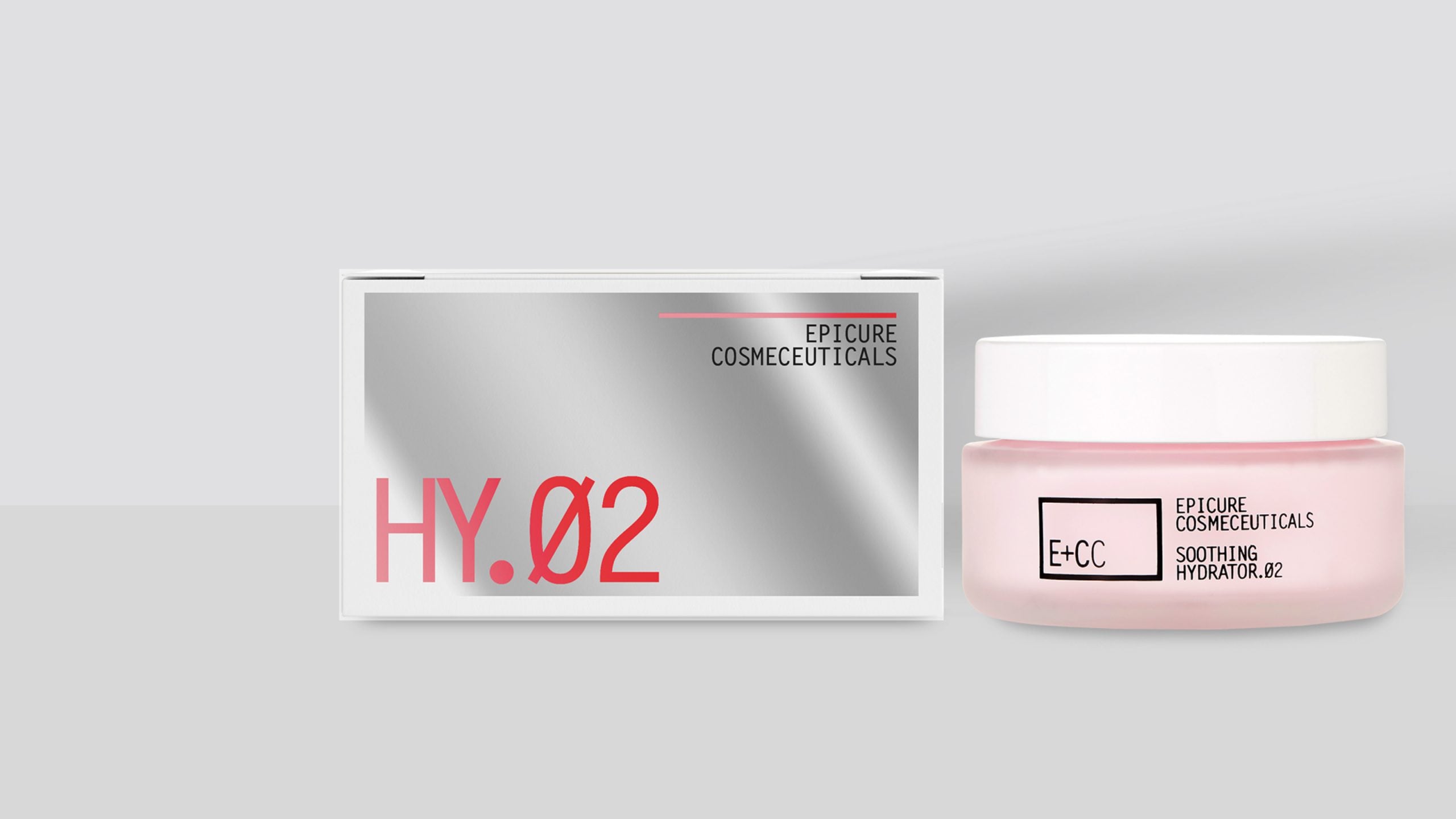
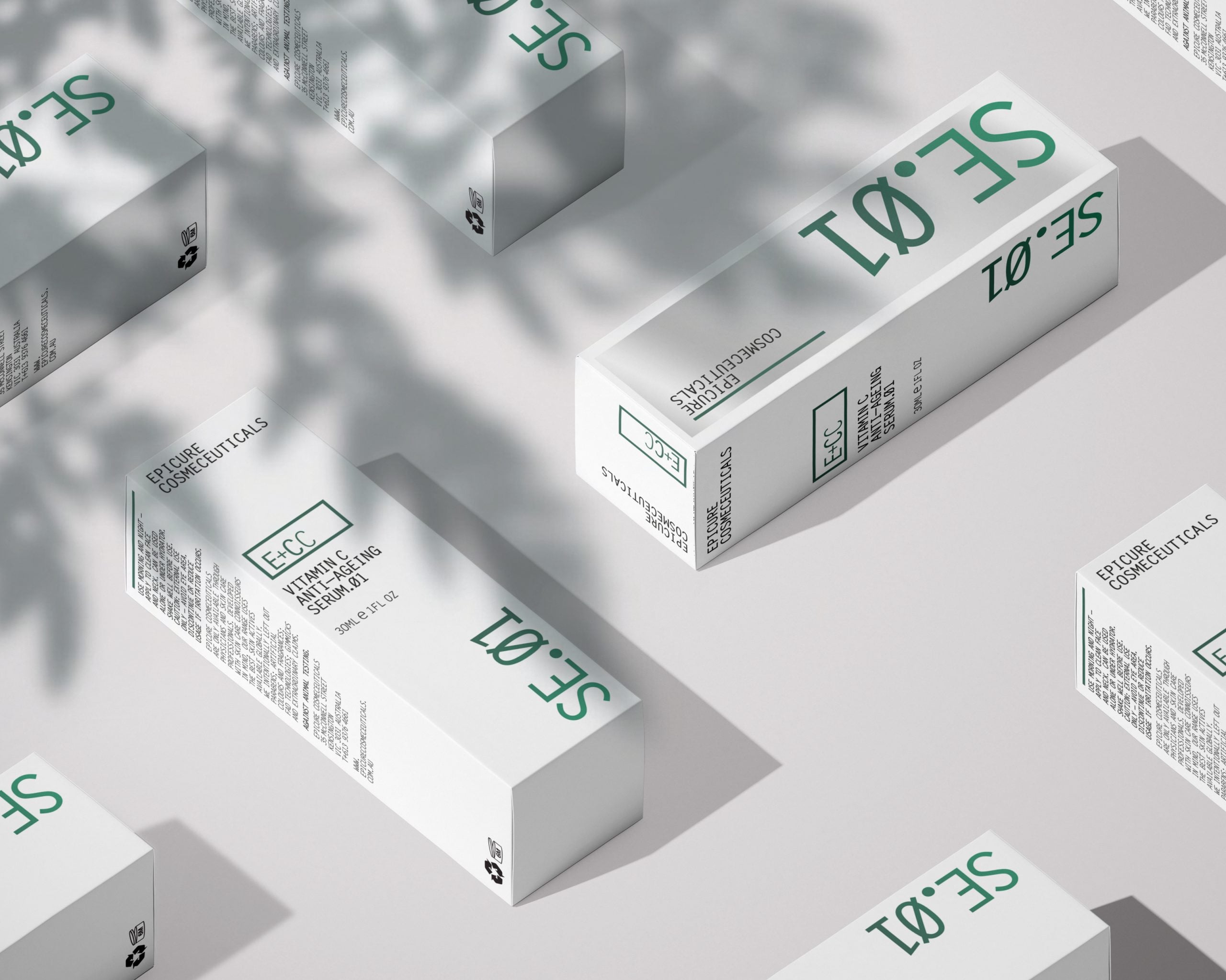
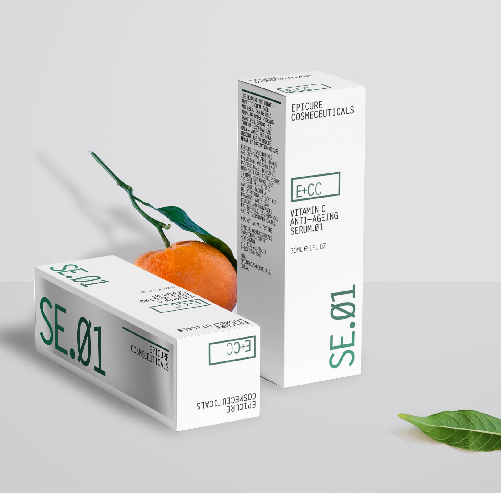
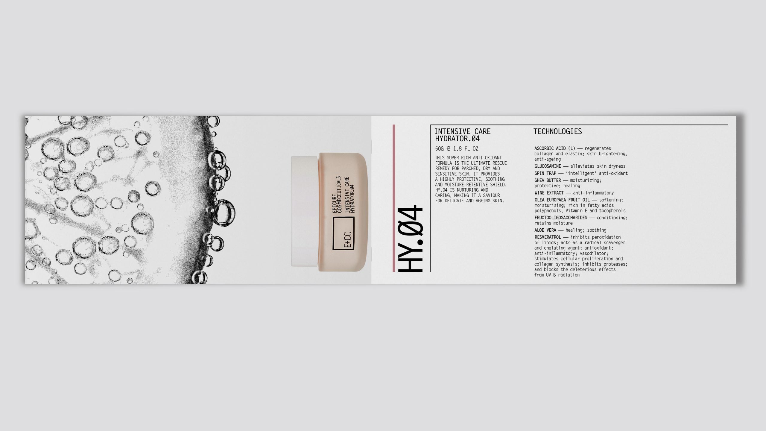
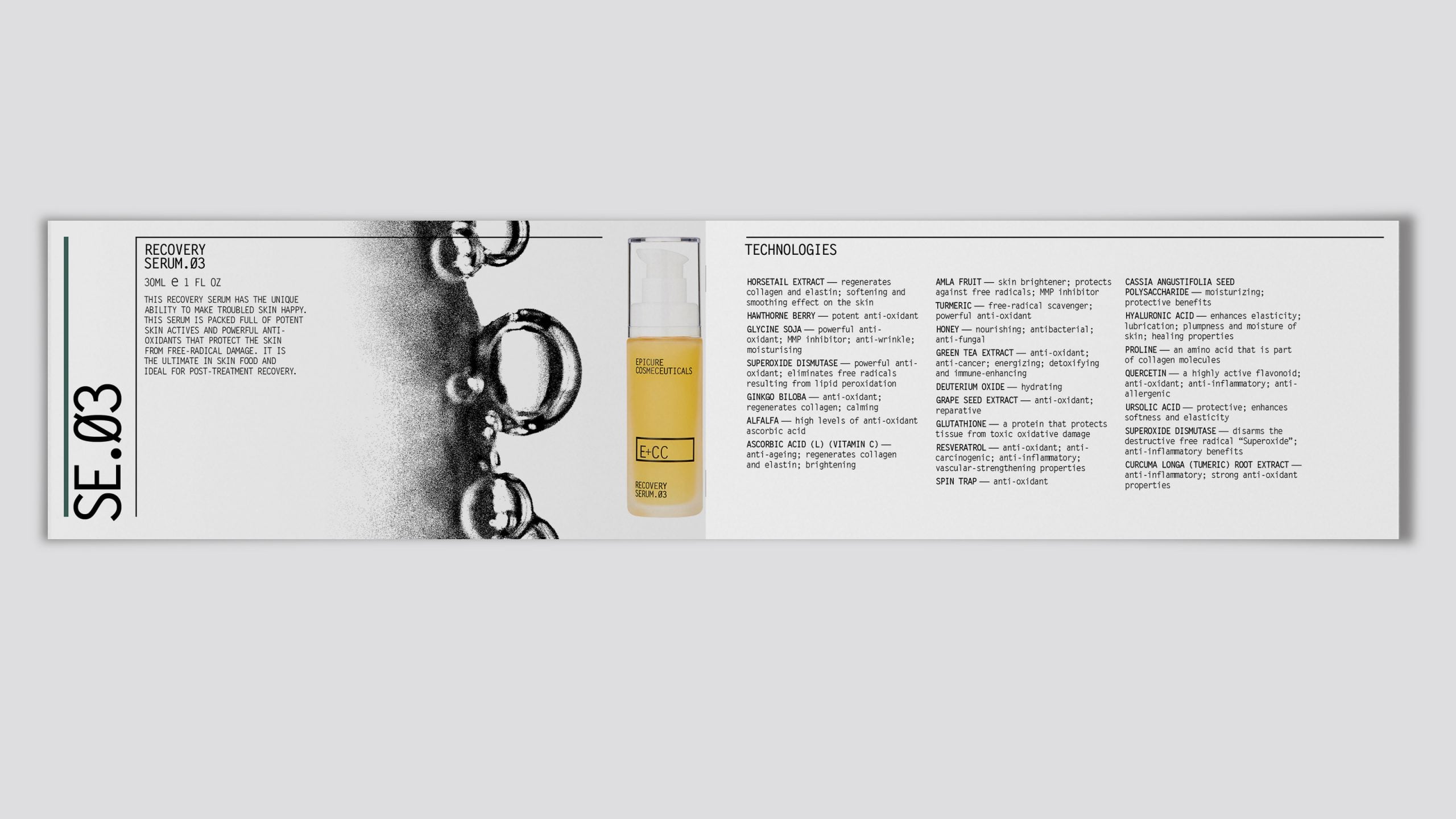
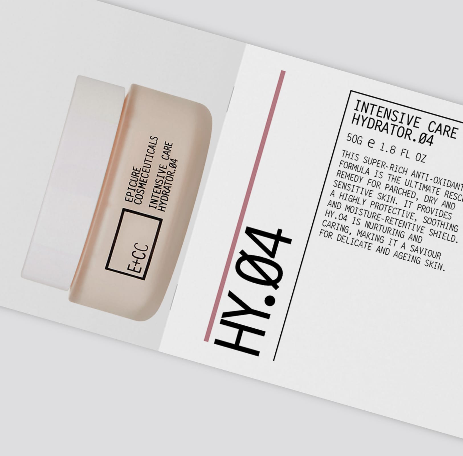
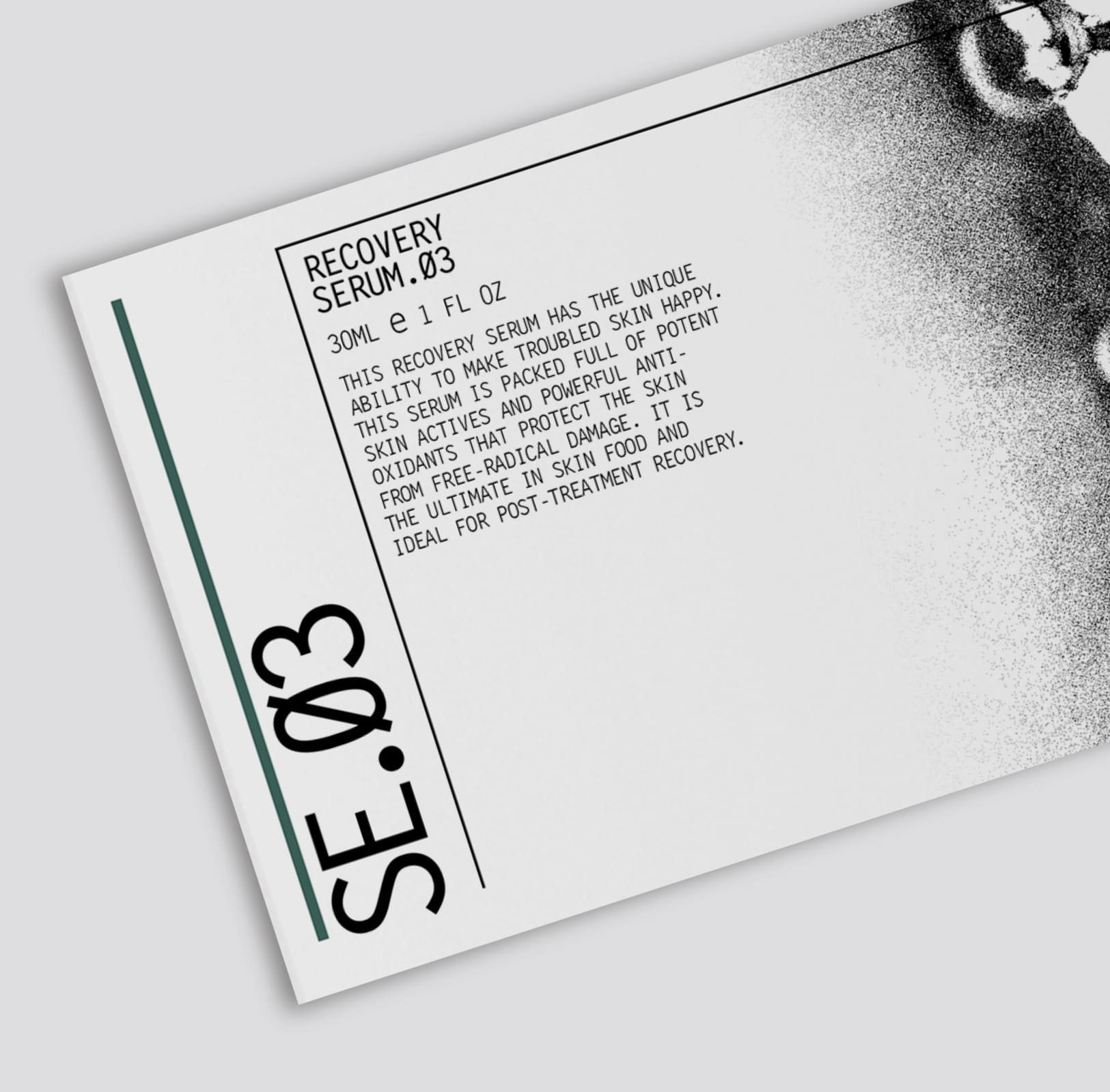
Epicure’s packaging has an intentionally technical aesthetic. Large numerical codes differentiate product SKUs, further individualised by a contrasting but complementary colour scheme. Embellishments such as a reflective mirrored box face are meaningful rather than just decorative. Science-made elegance.
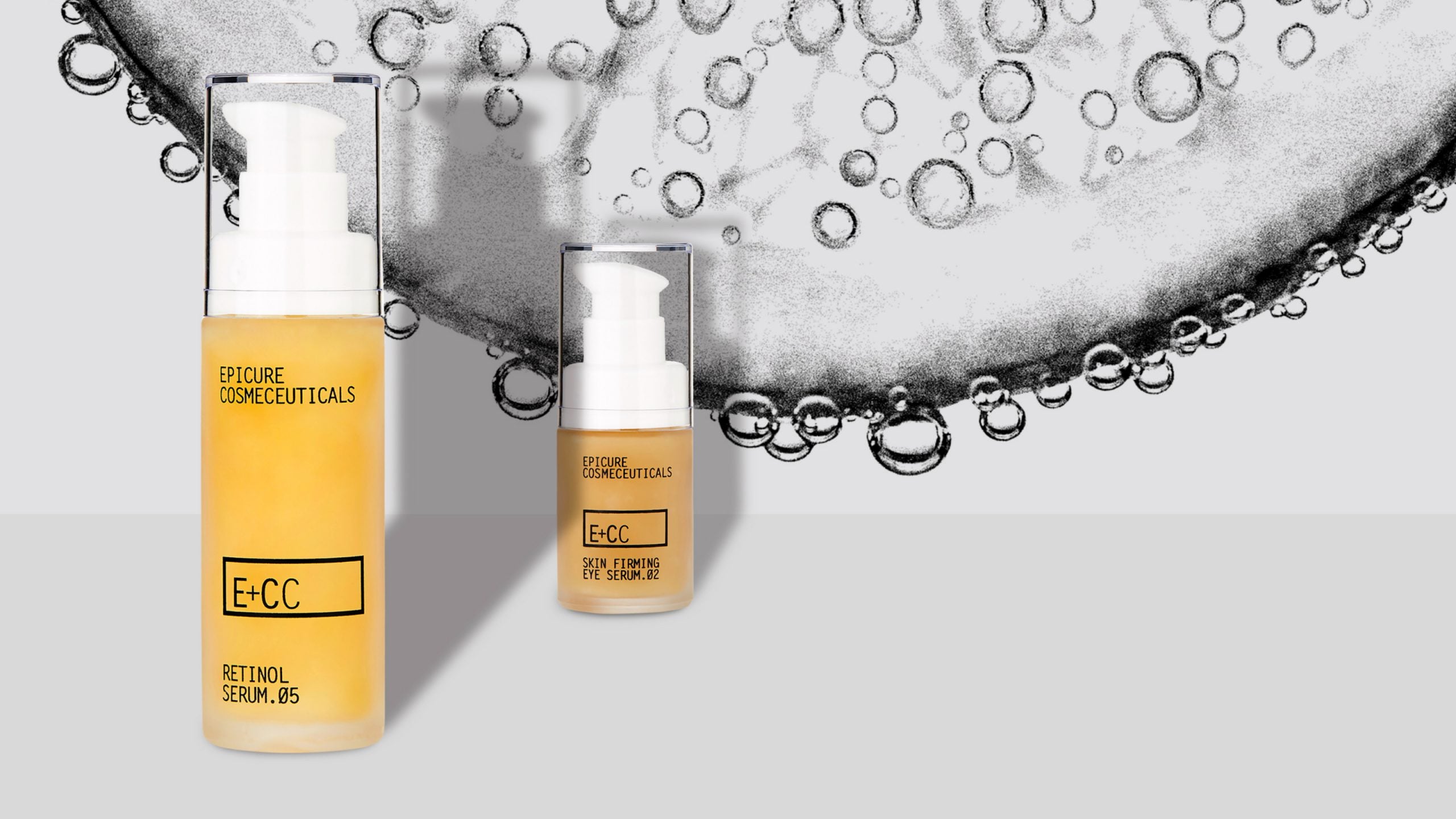
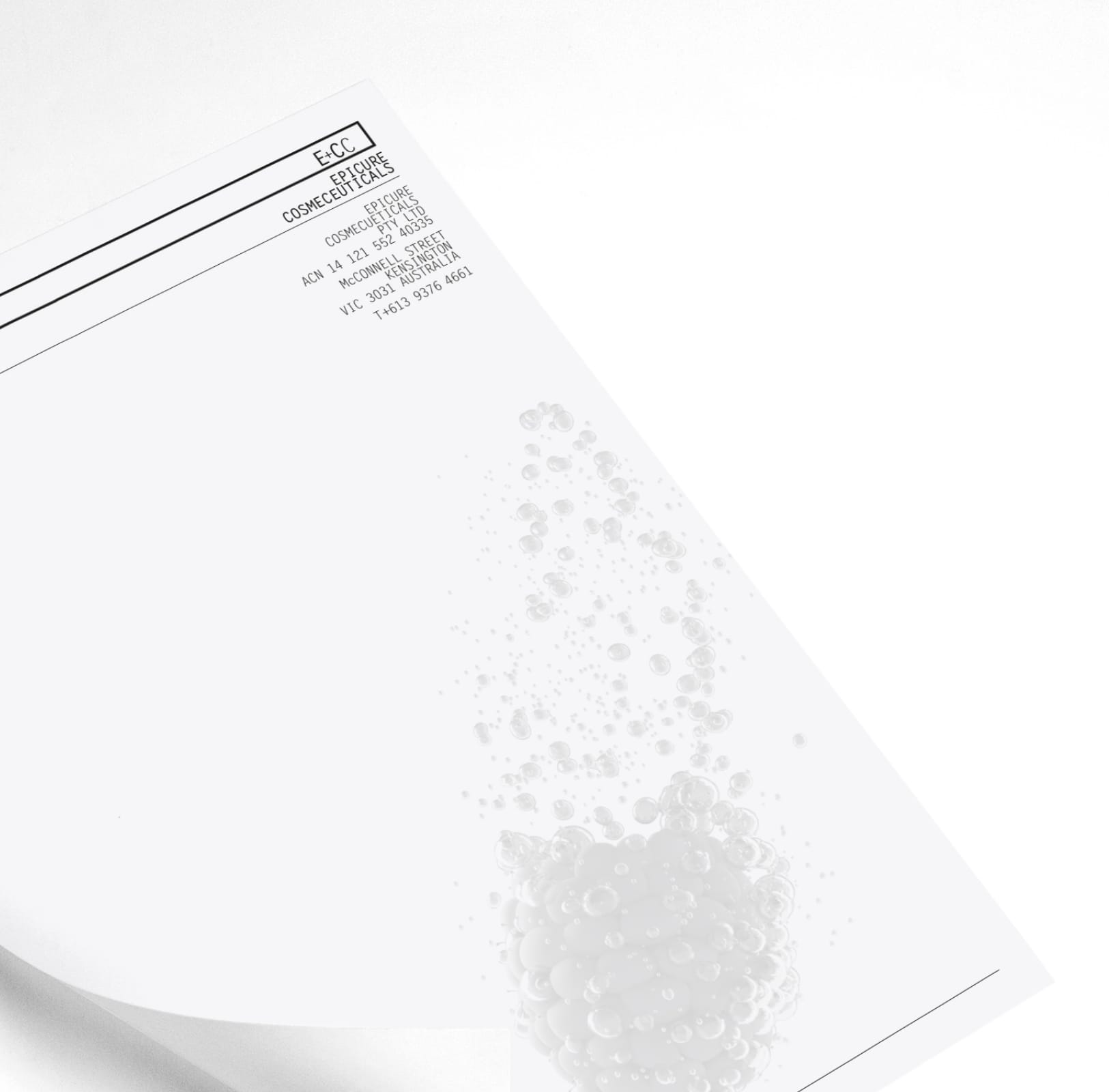
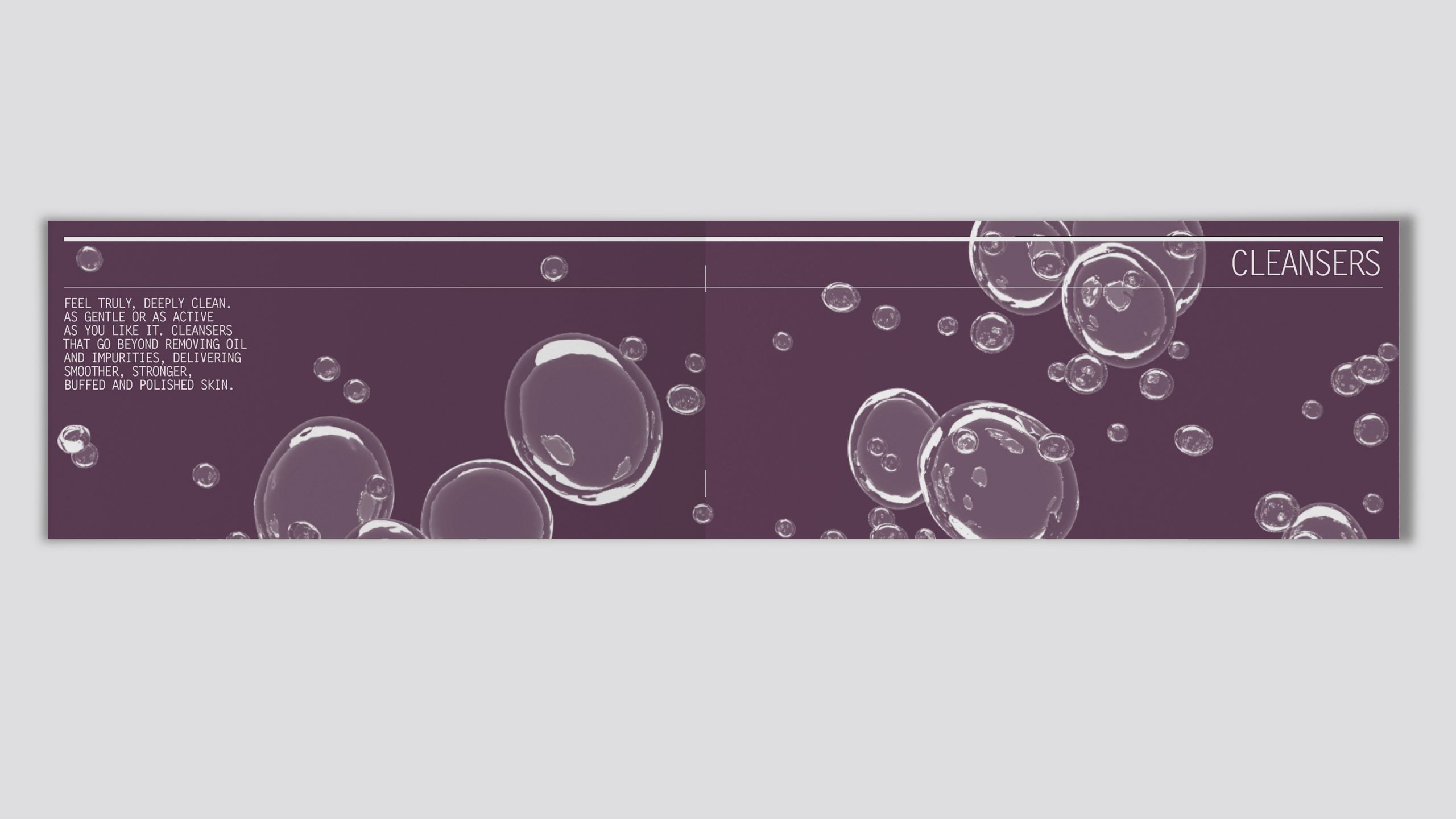
Visual abstractions of Epicure’s natural ingredients bursting with water droplets provide the perfect backdrop for product photography.
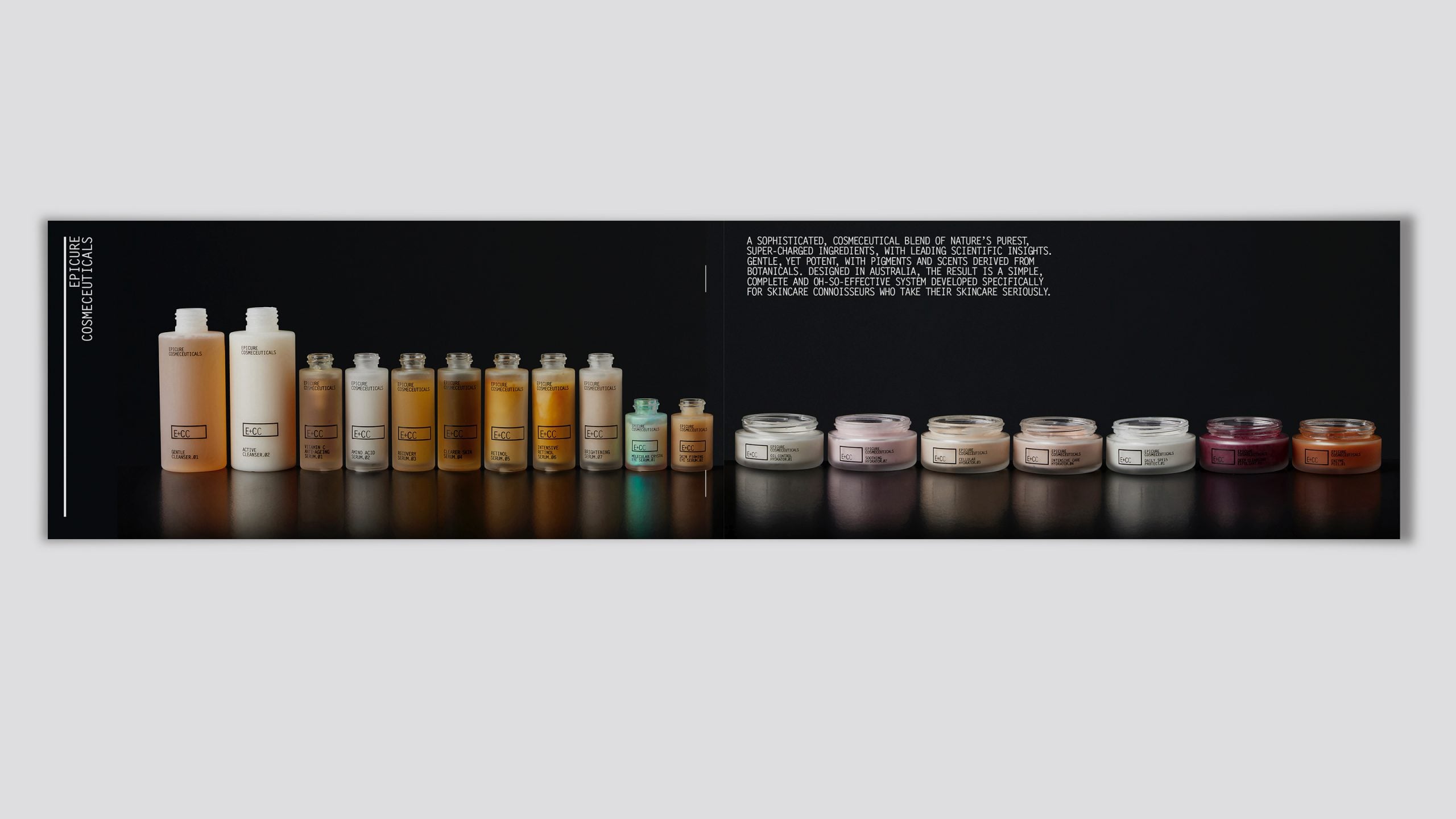
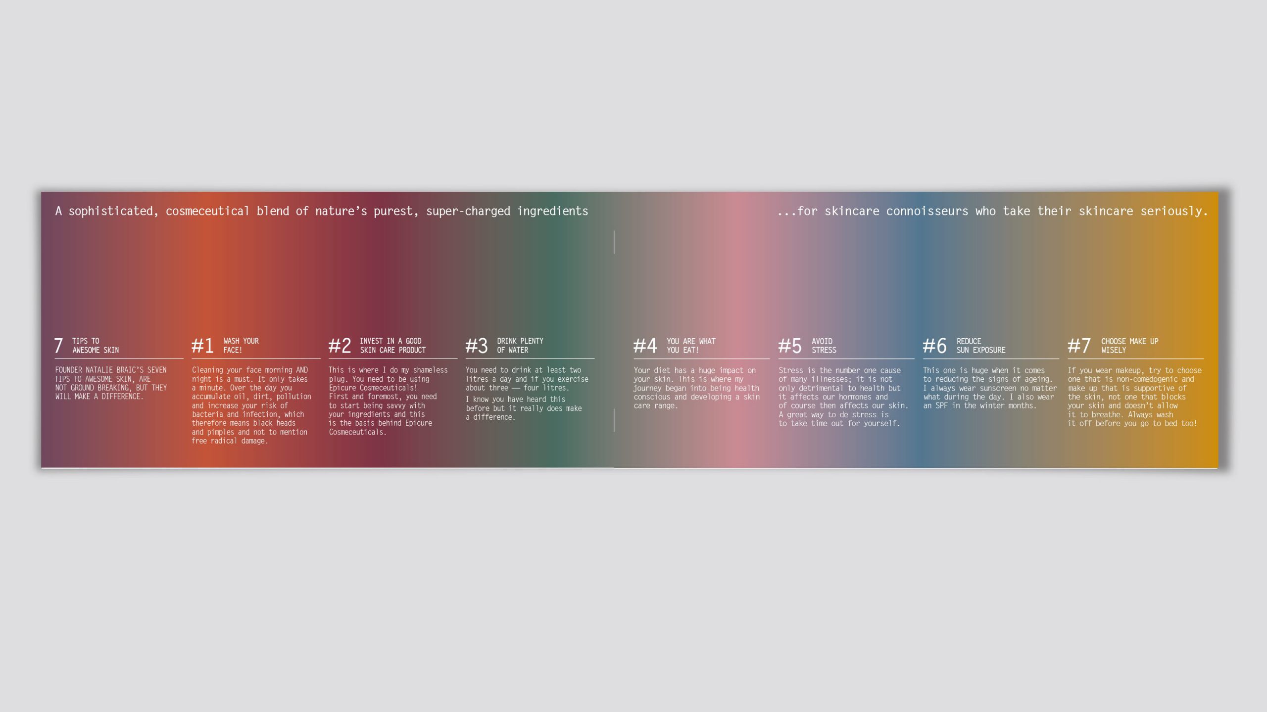
The flagship catalogue details the complete range in a format that feels good in the hand. Cate Rayson’s engaging storytelling positions Epicure as the choice for skincare connoisseurs who reject fad technologies, gimmicks and unproven claims.
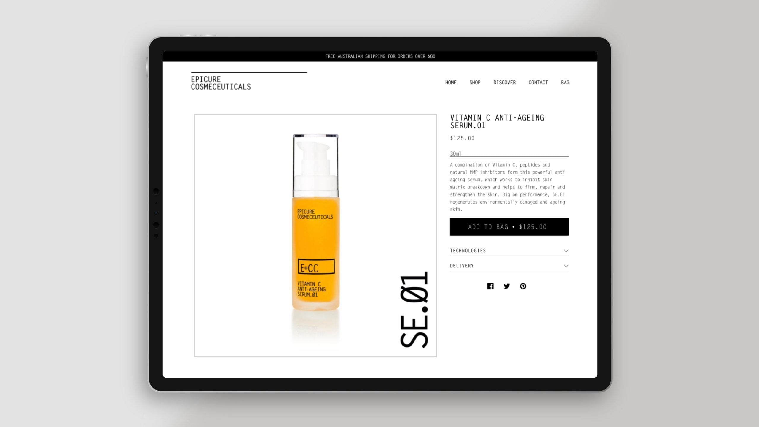
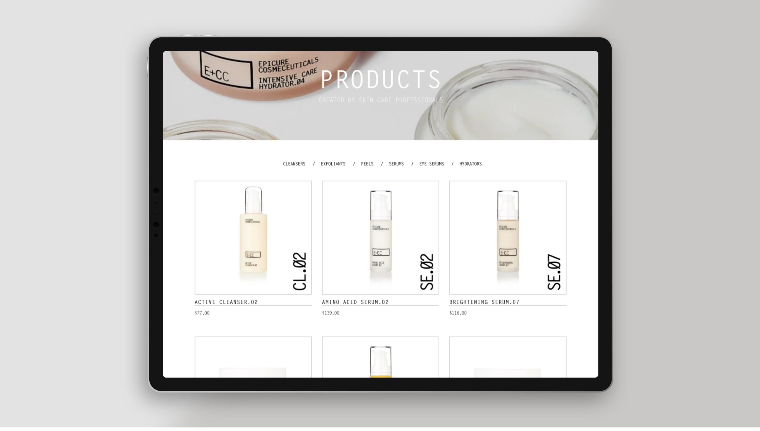
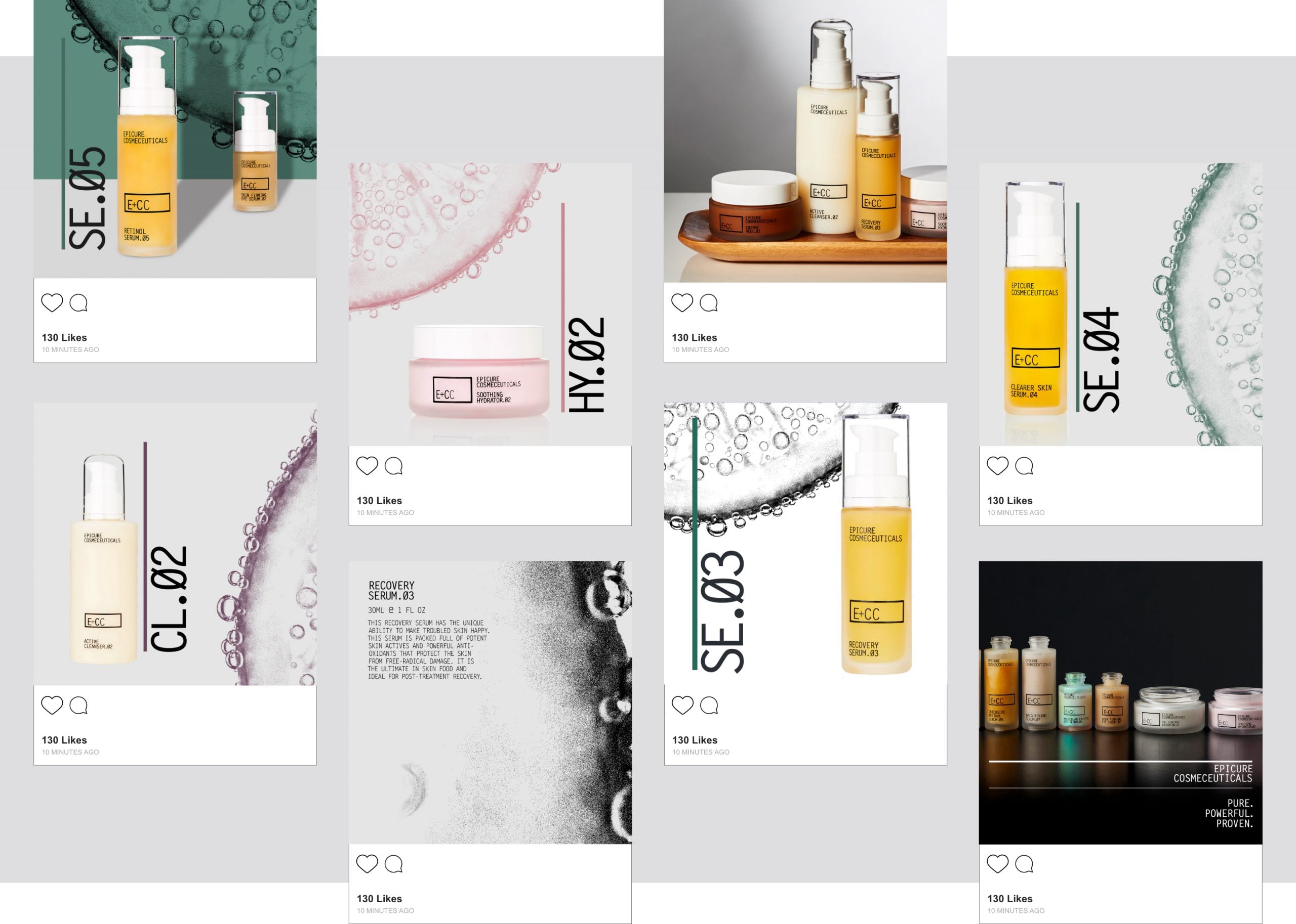
The elegantly conceived website is concise, rational and features logical navigation for visitors new and old. Built on the popular Shopify platform, the business is supported by convenient inventory and e-commerce features which simplify day-to-day operations. Staying on brand on social media is made easy with a range of flexible templates.
From Epicure’s inception, Envelope has been integral to the success of our brand. I love working with Ty as his insights into the industry ensure Epicure always stands apart from our competitors. We originally asked for a logo and packaging and over the years this collaboration has created an integrated brand story across all our channels from the all-important packaging to our website and everything in between.”
[email protected]
T +61 (0)412 249 745
Instagram