
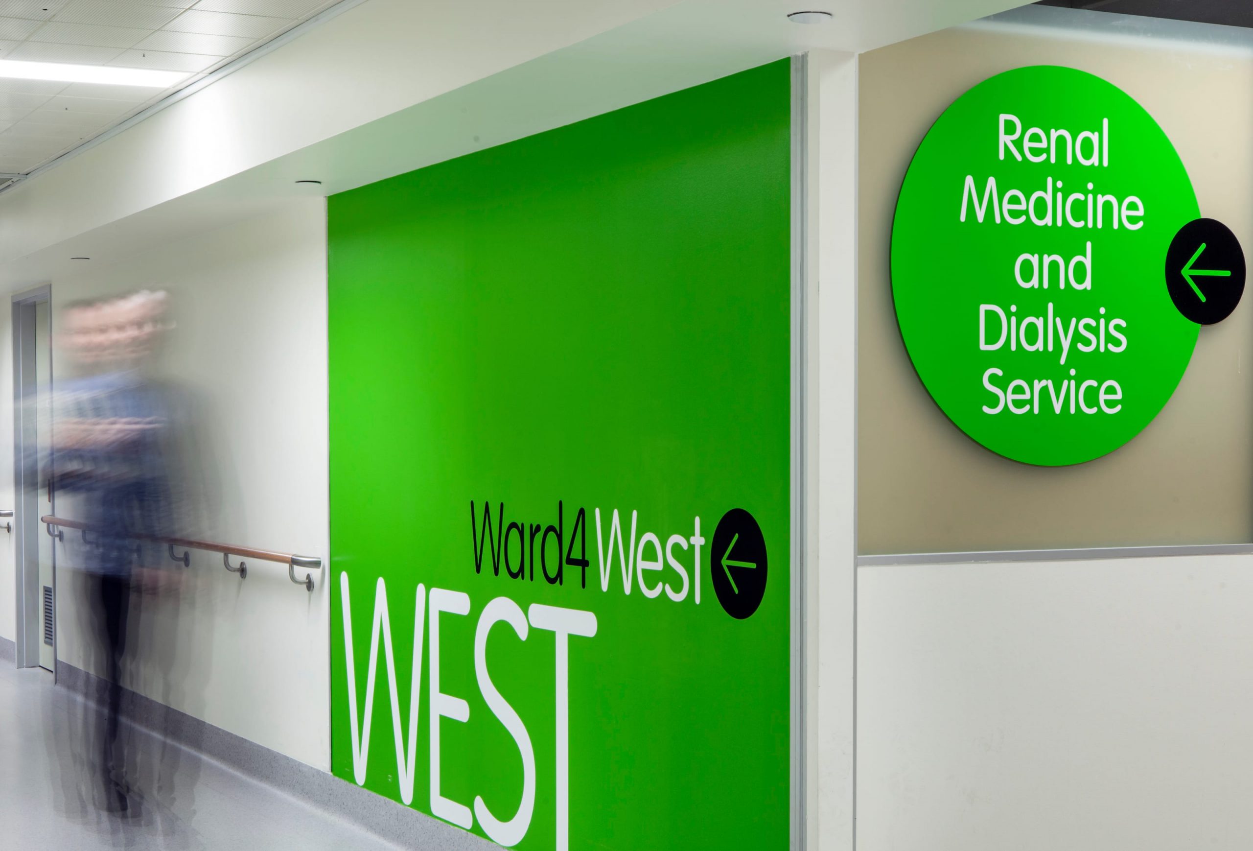
The Alfred’s long history of providing healthcare services to Victorians has been punctuated by a number of different signage systems. Envelope’s analysis of patient and visitor movements informs a brief to develop and test a new wayfinding and signage prototype.
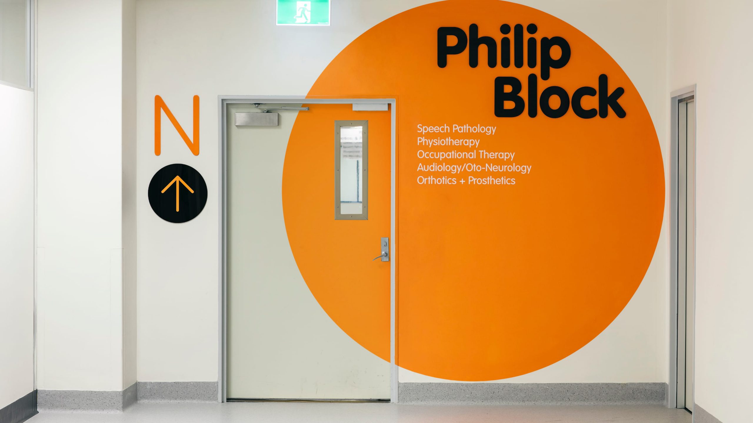
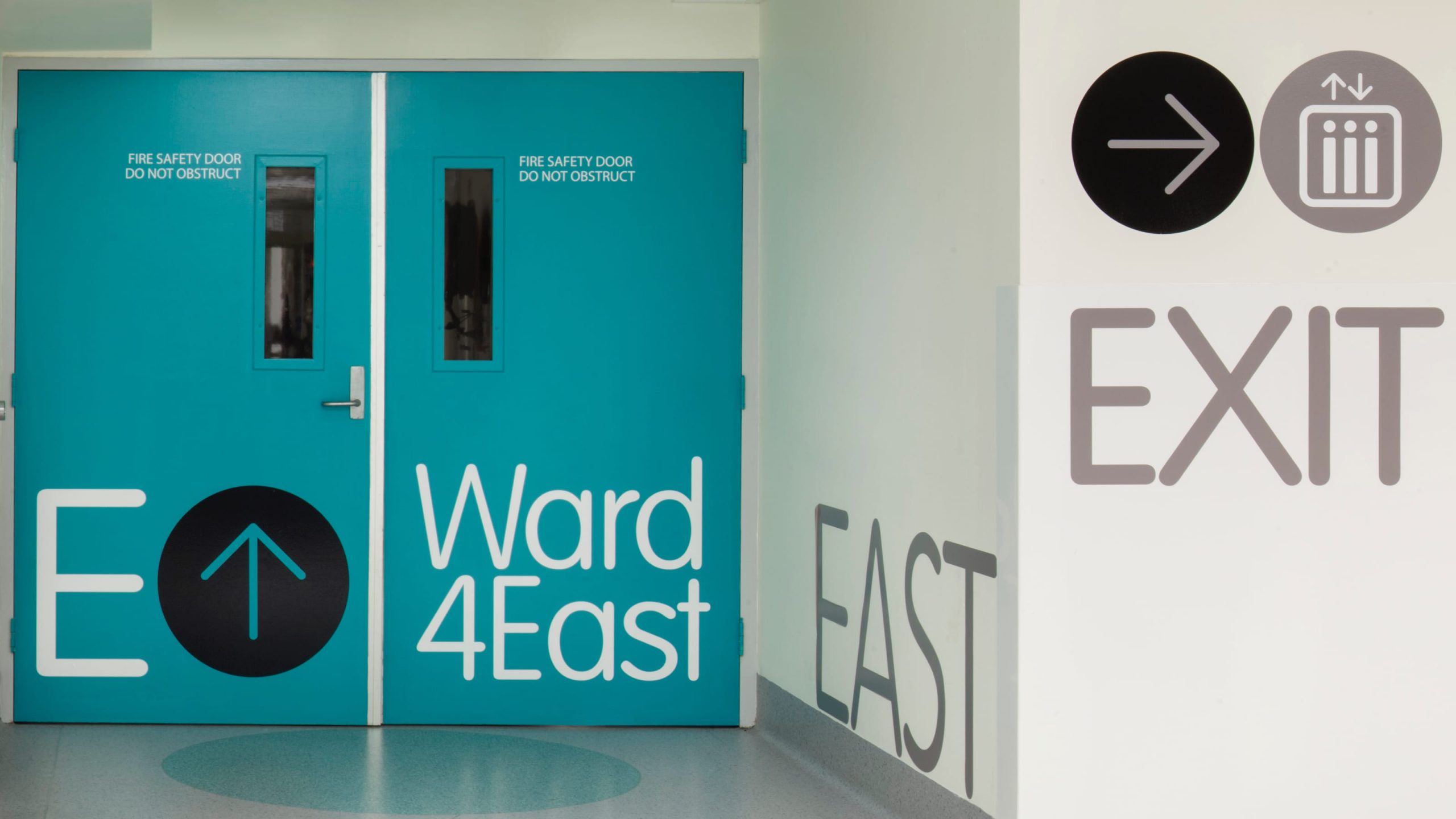
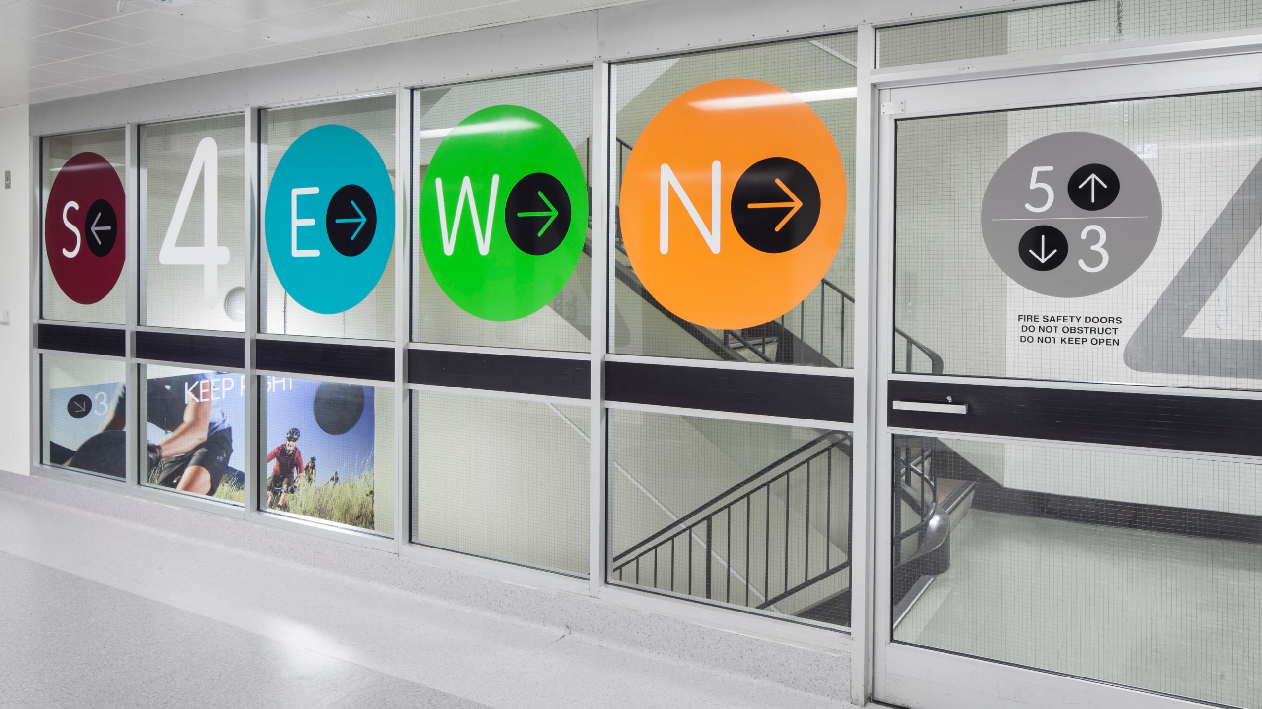
An additional aspect of the brief is improving the visual amenity of this enormous campus. Geometric supergraphics applied in bold colours from The Alfred’s brand identity immediately warm up the environment. Ward names are set in a friendly rounded typeface replacing acronyms familiar to staff but foreign to patients and visitors.
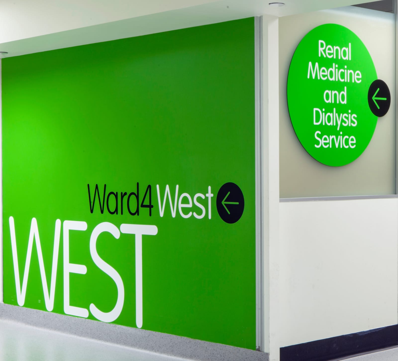
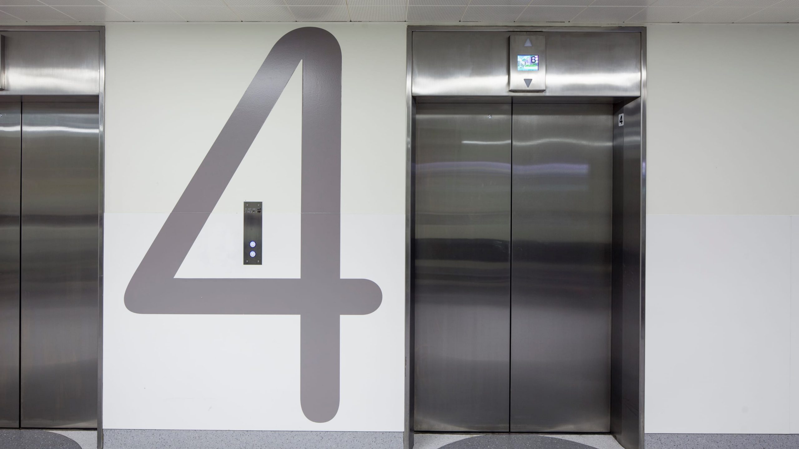
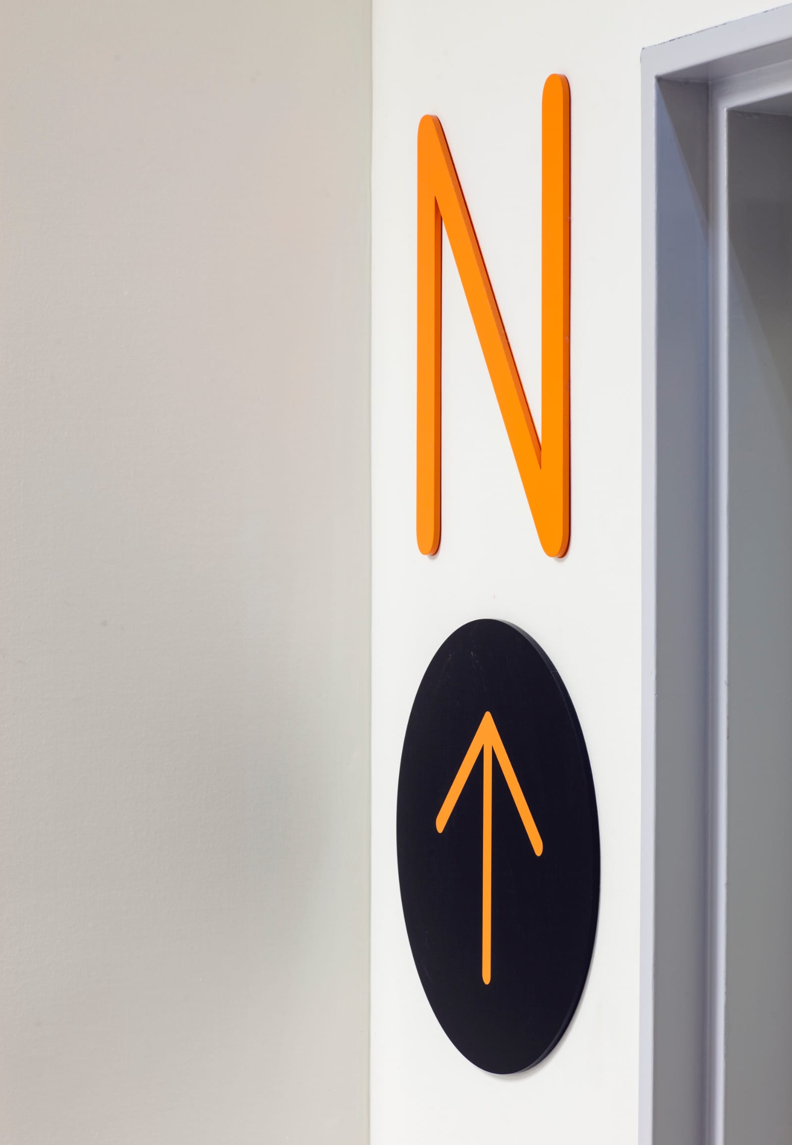
Overlooked for many years, a compass inlaid in the linoleum flooring at key intersections is given a new life. The new strategy reintroduces a north, south, east and west navigation system.
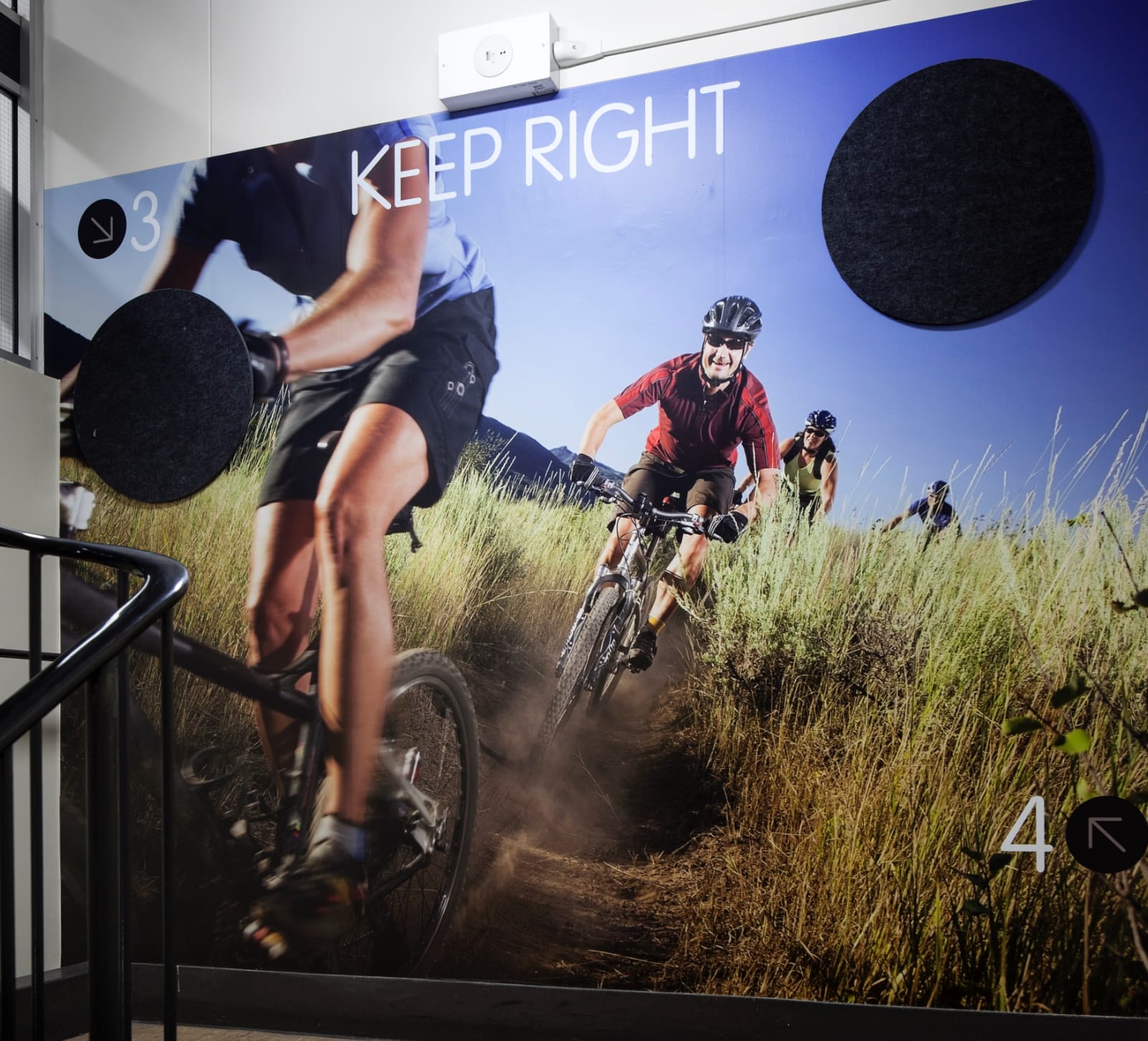
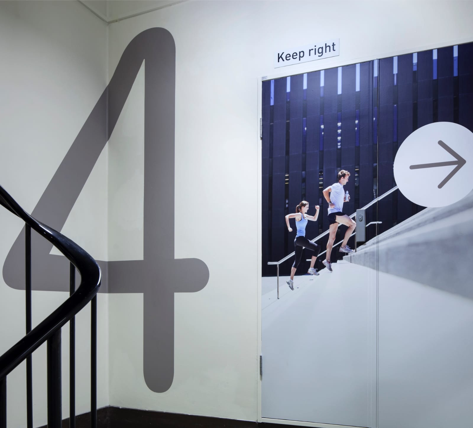
Stairs are often overlooked and can be gloomy thoroughfares. Originally designed as escape routes, Envelope’s stakeholder engagement reveals Alfred staff prefer stairs over elevators to move between one or two levels. These dark stairwells are improved with new lighting and wall-to-wall imagery of healthy exercise activities creating a visually energetic journey.
[email protected]
T +61 (0)412 249 745
Instagram