
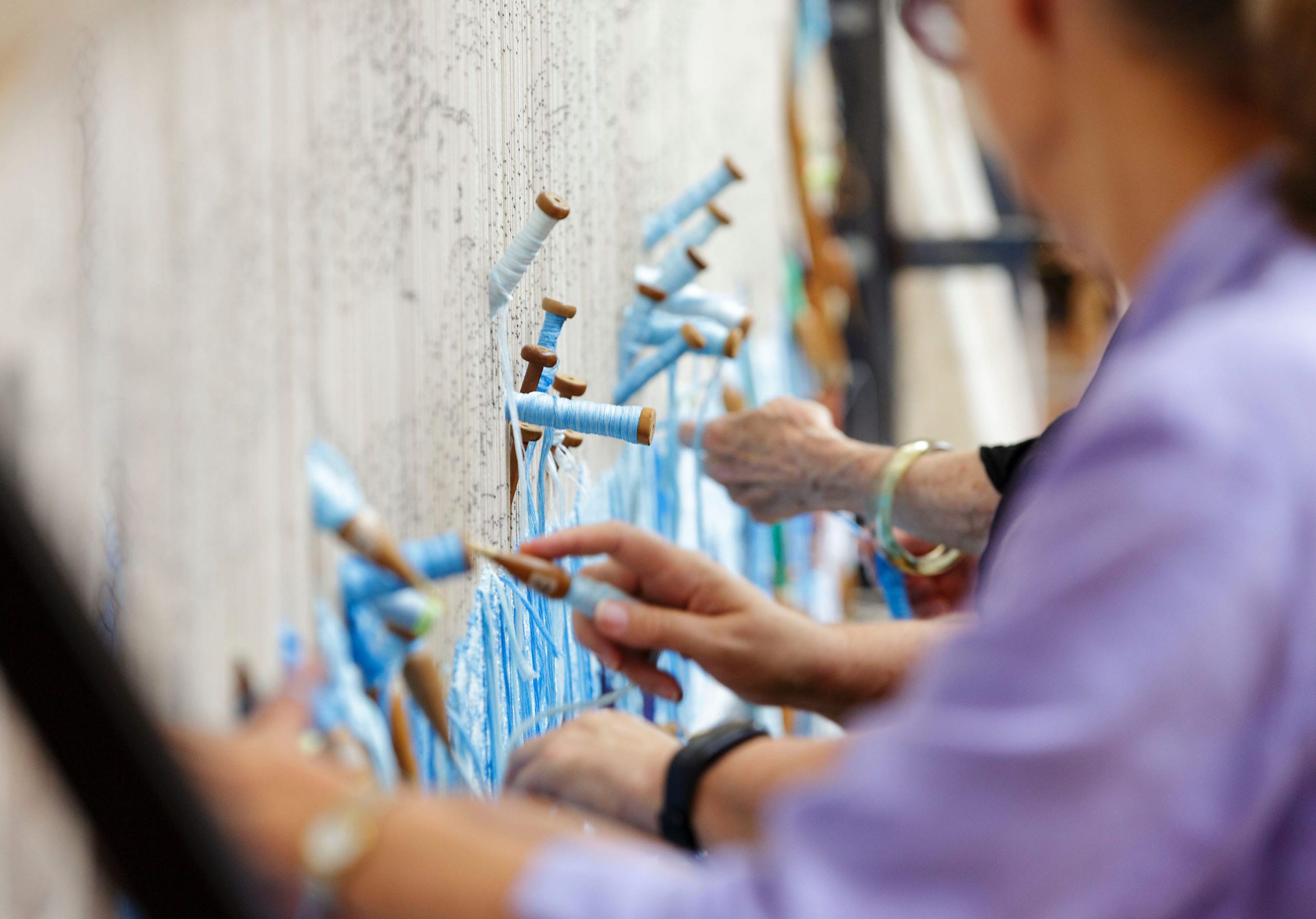
Building on a previous rebrand by Garry Emery to emphasise the national reach of the workshop, Envelope expanded the colour scheme and developed a sophisticated set of abstract woven graphics to fully express the breadth and complexity of hand-woven tapestries.
New variations of the wordmark give greater flexibility to the organisation in expressing the brand.
This visual language as well as detailed macro photography of actual tapestries is integrated into a unique typographic system for application in printed and digital communications.
Redesigned in a magazine style, the workshop’s annual report is expanded from twenty to forty pages. Renamed WOVEN, the expanded format invites readers with an editorial approach to the display of content. Envelope’s ongoing collaboration delivers a range of publications, including the bi-annual ‘Tapestry Design Prize for Architects’.
Facilitated by sponsorship partnerships secured by Envelope with both Ball and Doggett for paper and Southern Colour for printing, the workshop’s stringent budget is maintained.
Generous page spreads make the most of the Workshop’s photography and the editorial format makes each annual report a joy to read.
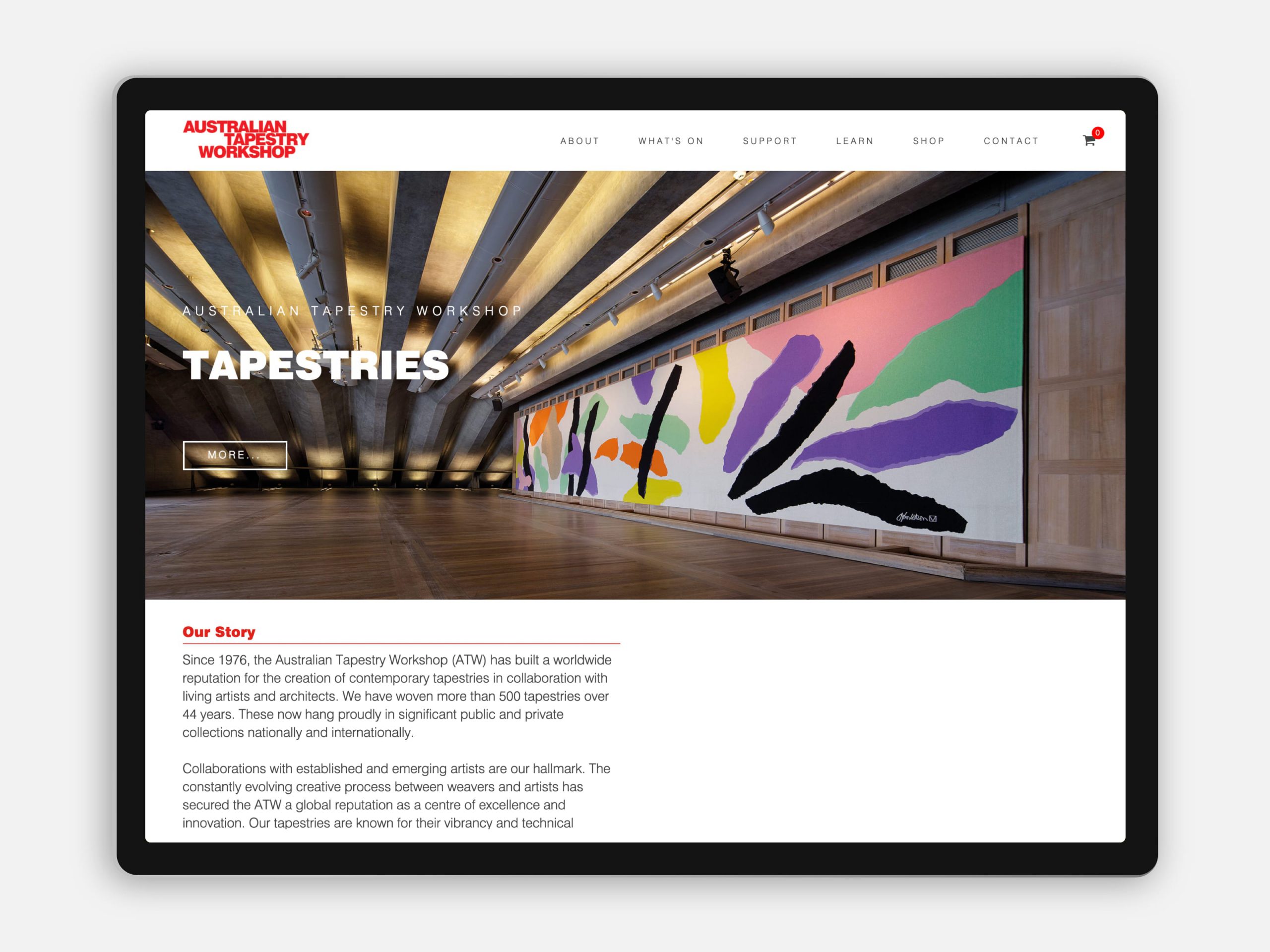
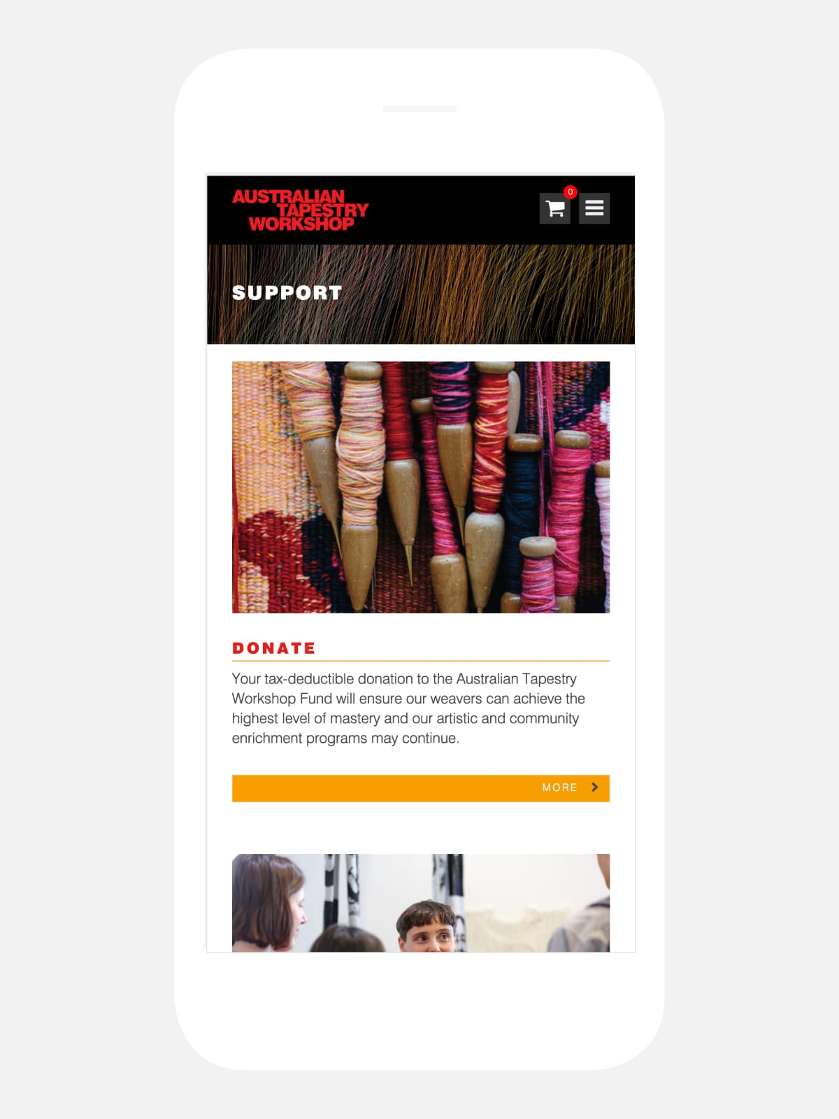
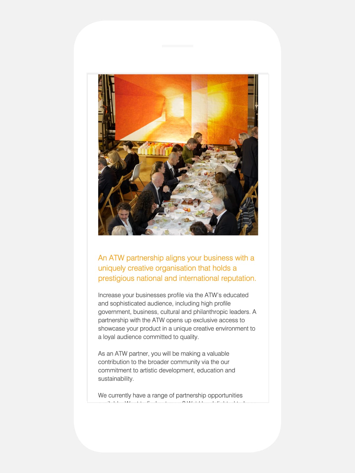
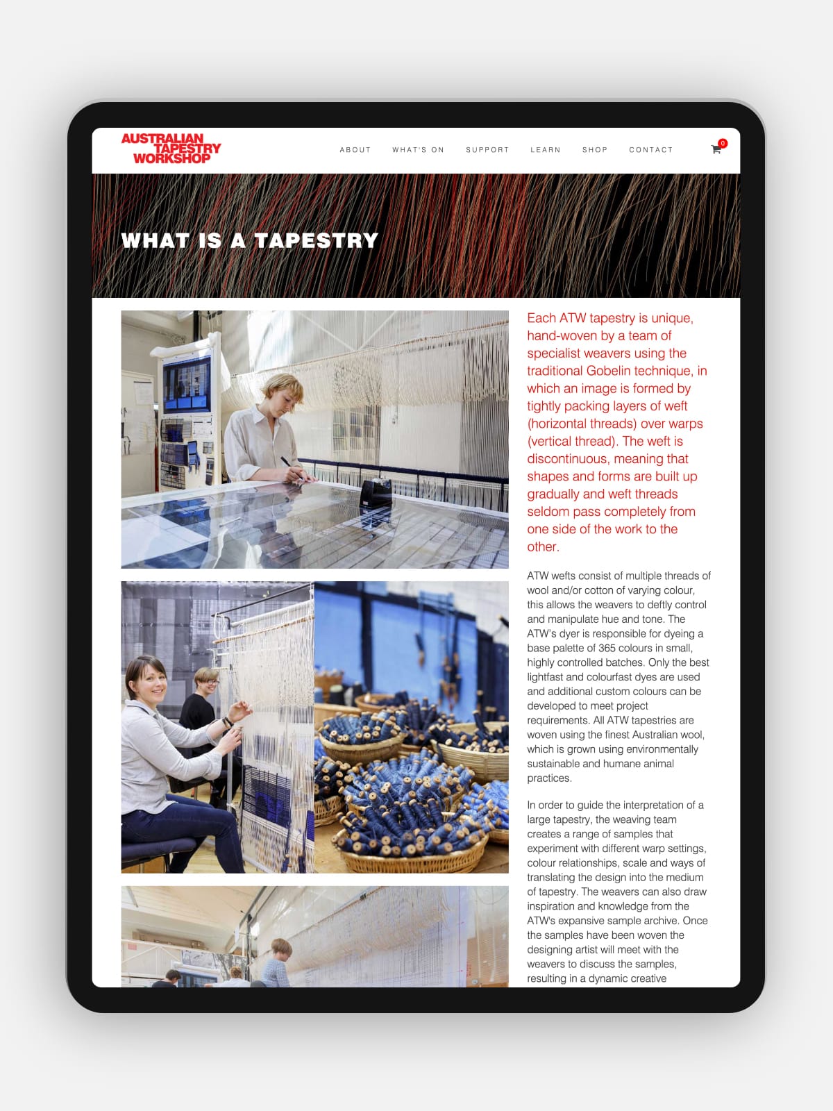
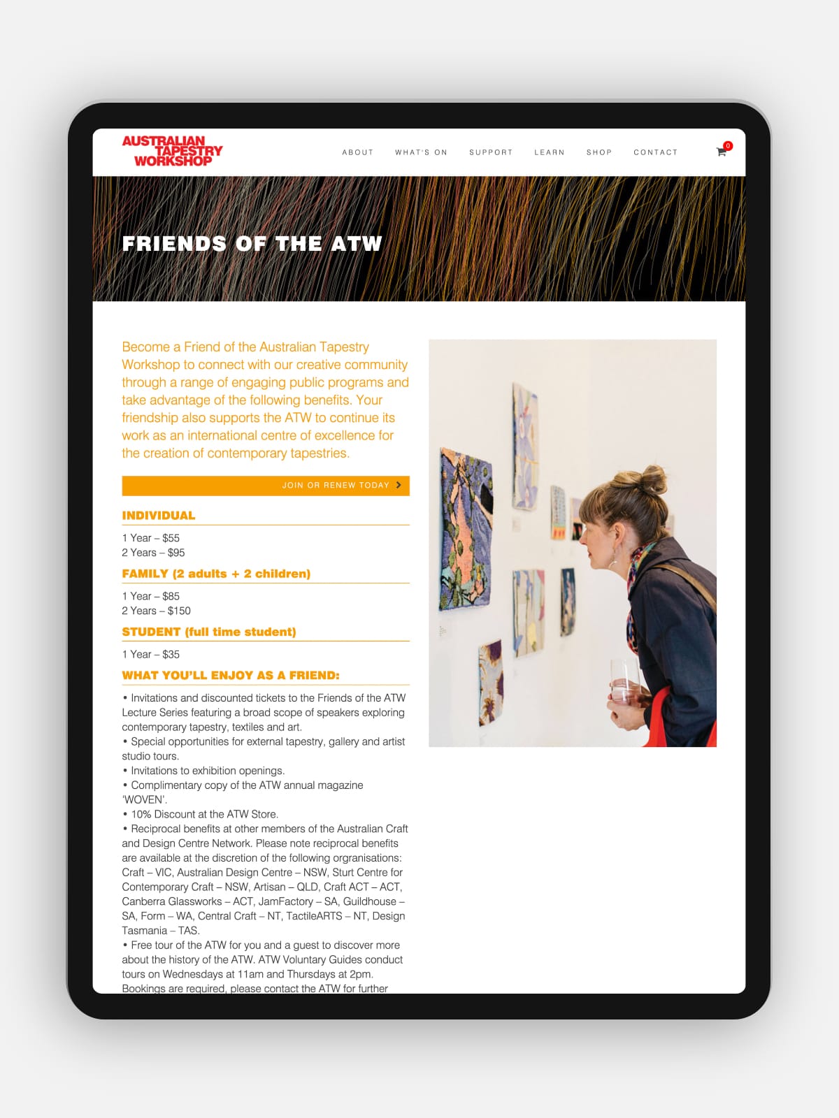
This redesign informs a full review of the workshop’s printed communications and forms the brief for a completely redesigned website which maximises the display of images of tapestries and the unique workshop environment in which they are created.
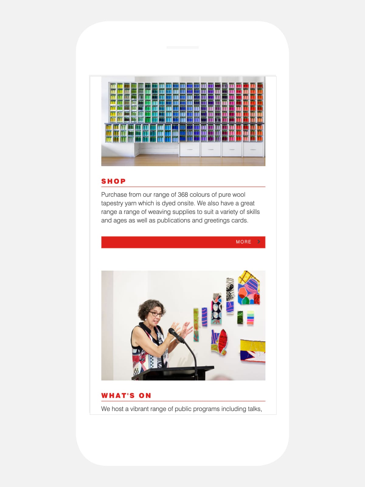
An important element of the new website is a completely redesigned shop experience, streamlining the navigation of a myriad of colour yarn choices.
[email protected]
T +61 (0)412 249 745
Instagram