
The highly recognisable daffodil symbol is refreshed with a simplified rendering on reenergised colour palette. “The Cancer Council” appears in a timeless sans serif with “Leading the fight” contrasted in a classical typeface to reference the Council’s long history of championing the cause.

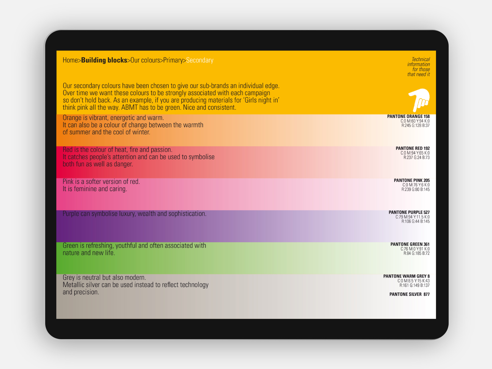
A multitude of state and national fundraising programs suffer from a lack of awareness about exactly which cancer charity benefits. Envelope’s simplified umbrella brand architecture unifies and harmonises individual sub-brands into an integrated system. The programs can happily continue on their individual paths while leveraging equity into the master brand.
Major strategic partnerships are integrated creating benefits for both parties. Consistent alignment with the master brand for the all important cause of one day finding a cure.
A simple measure of a uniform approach to displaying contact details helps the Council build recognition and familiarity.
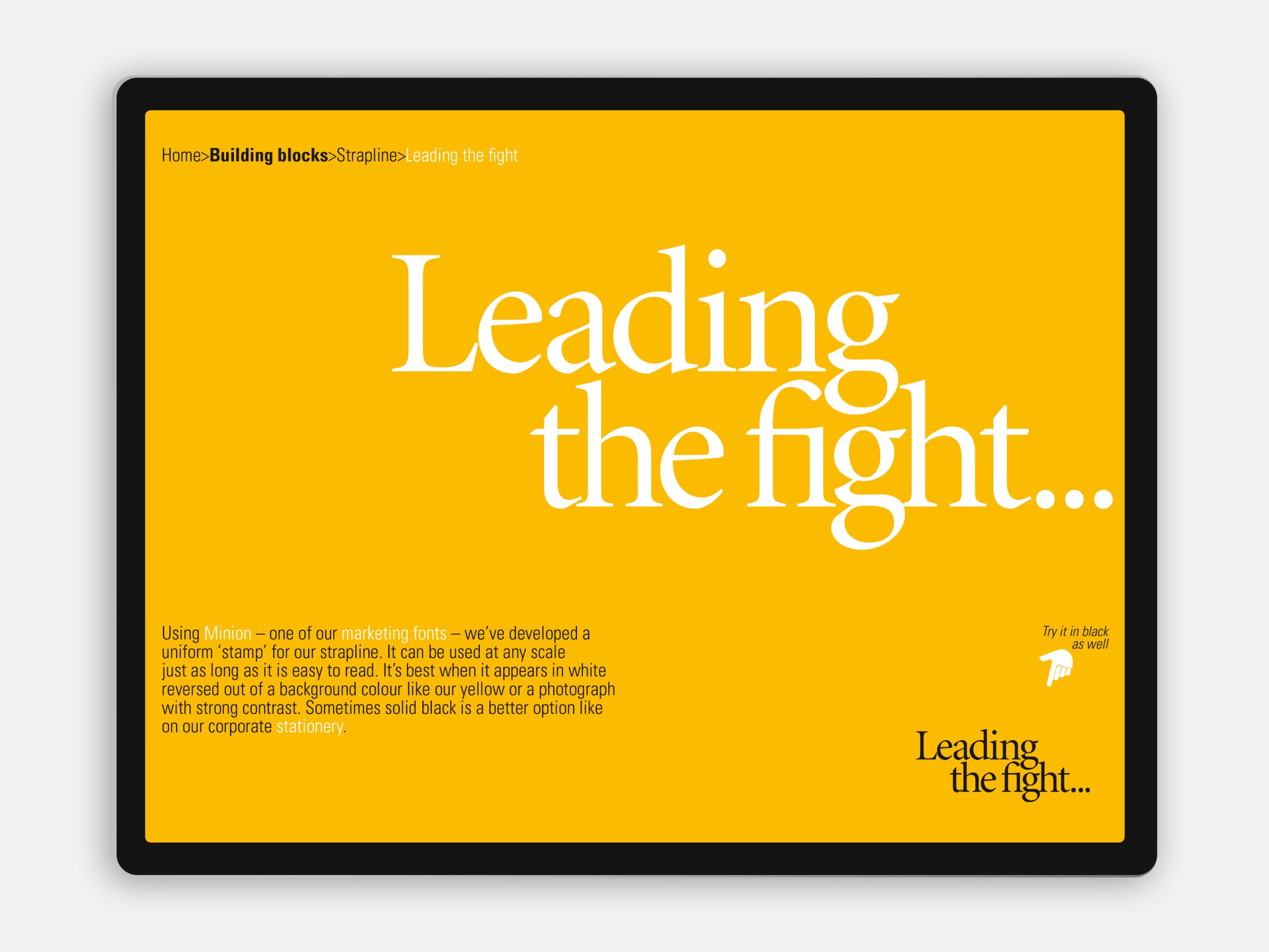
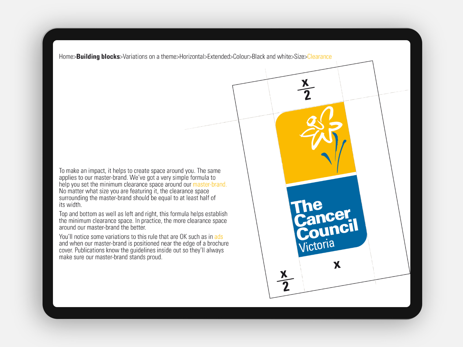
Employee engagement is critical to the success of any brand evolution. An Envelope toolkit uses everyday language to share the principles of the brand. These days it’s important to engage everyone, not just marketing types.
Production of the Council’s enormous array of publications by its in-house design unit is streamlined with Envelope’s flexible templates delivering valuable cost savings. More money for the cause.
[email protected]
T +61 (0)412 249 745
Instagram