
Since 2007, Envelope has combined site specific photography with custom copywriting to help Apollo Projects deliver placemaking on a residential scale.

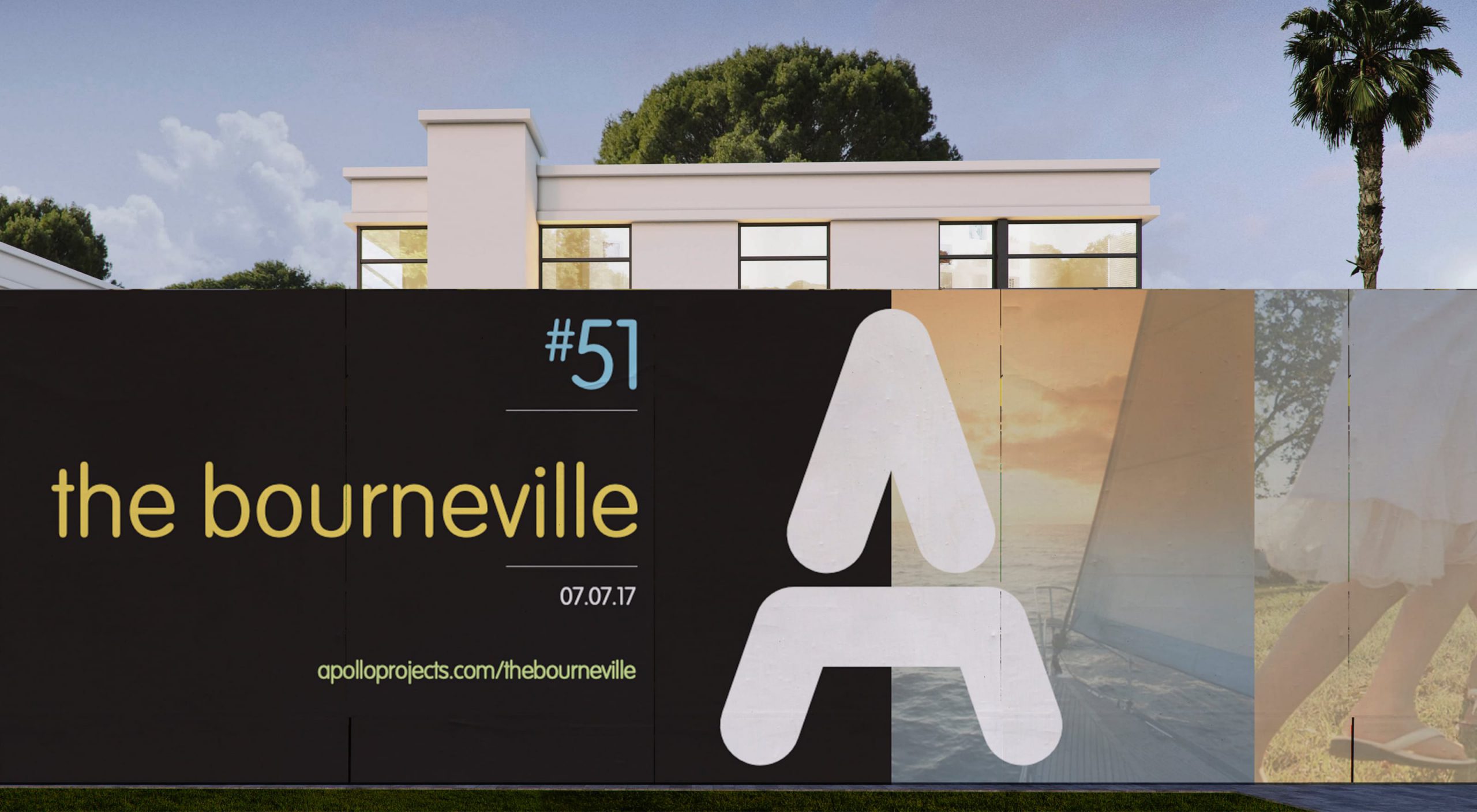
The logo is an iconic symbol of the quality and professionalism this small family business takes pride in. Whether it appears in block colours or masking arresting location photography this flexible symbol has become highly recognisable in the bayside suburbs of Melbourne as well as its namesake of Apollo Bay.


Drawing on nautical themes and inspired by a library of Andrew Curtis photography, Apollo Projects’ brand architecture provides for a range of expressions across physical and digital communications.
Secondary images help illustrate the breezy bayside lifestyle that might appeal to potential residents from far and wide.


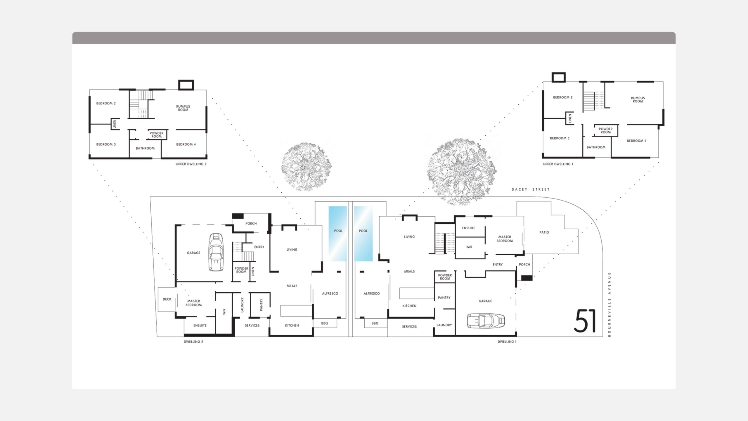
Large format marketing brochures are generous and expansive, reflecting the architectural intent of each residence.


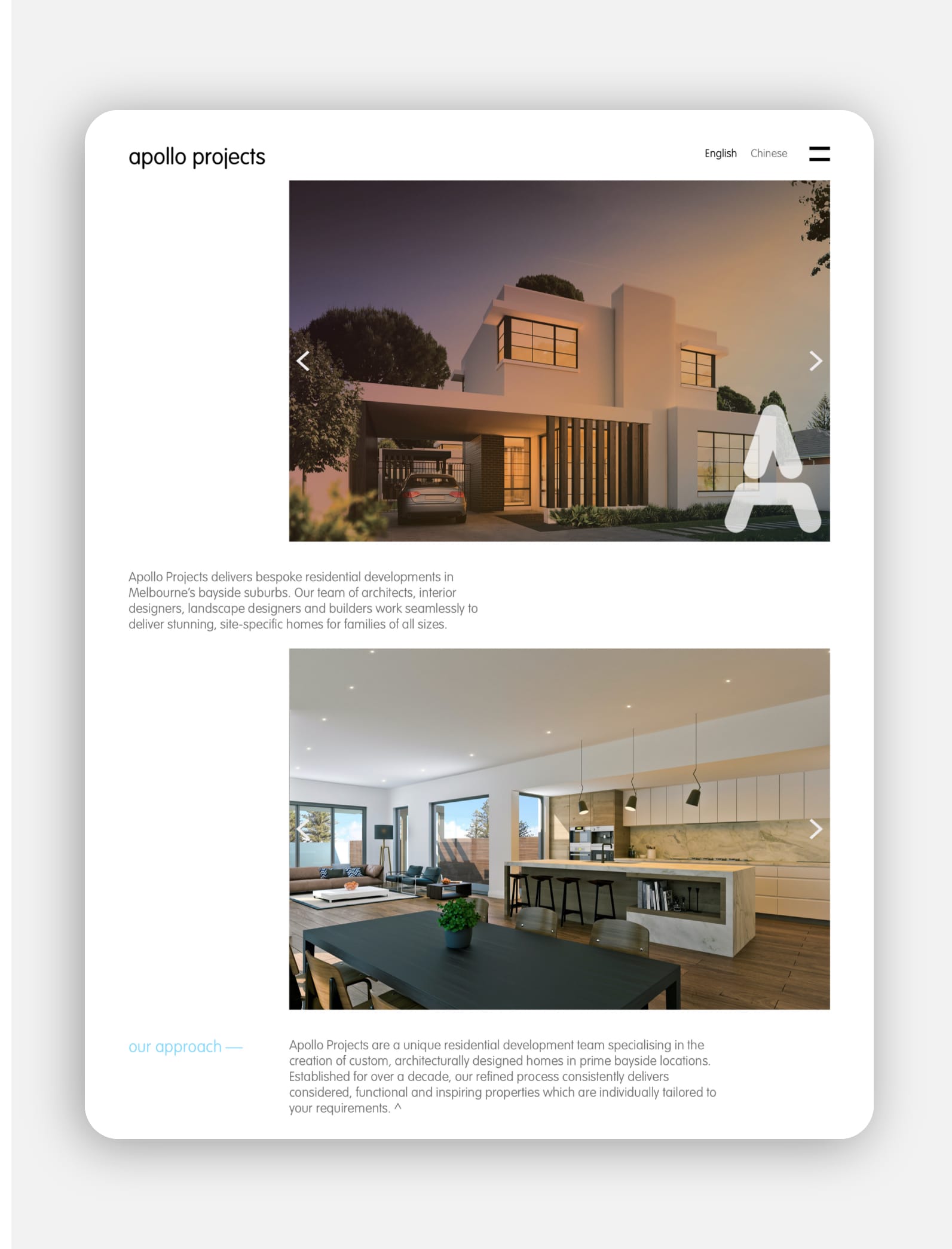
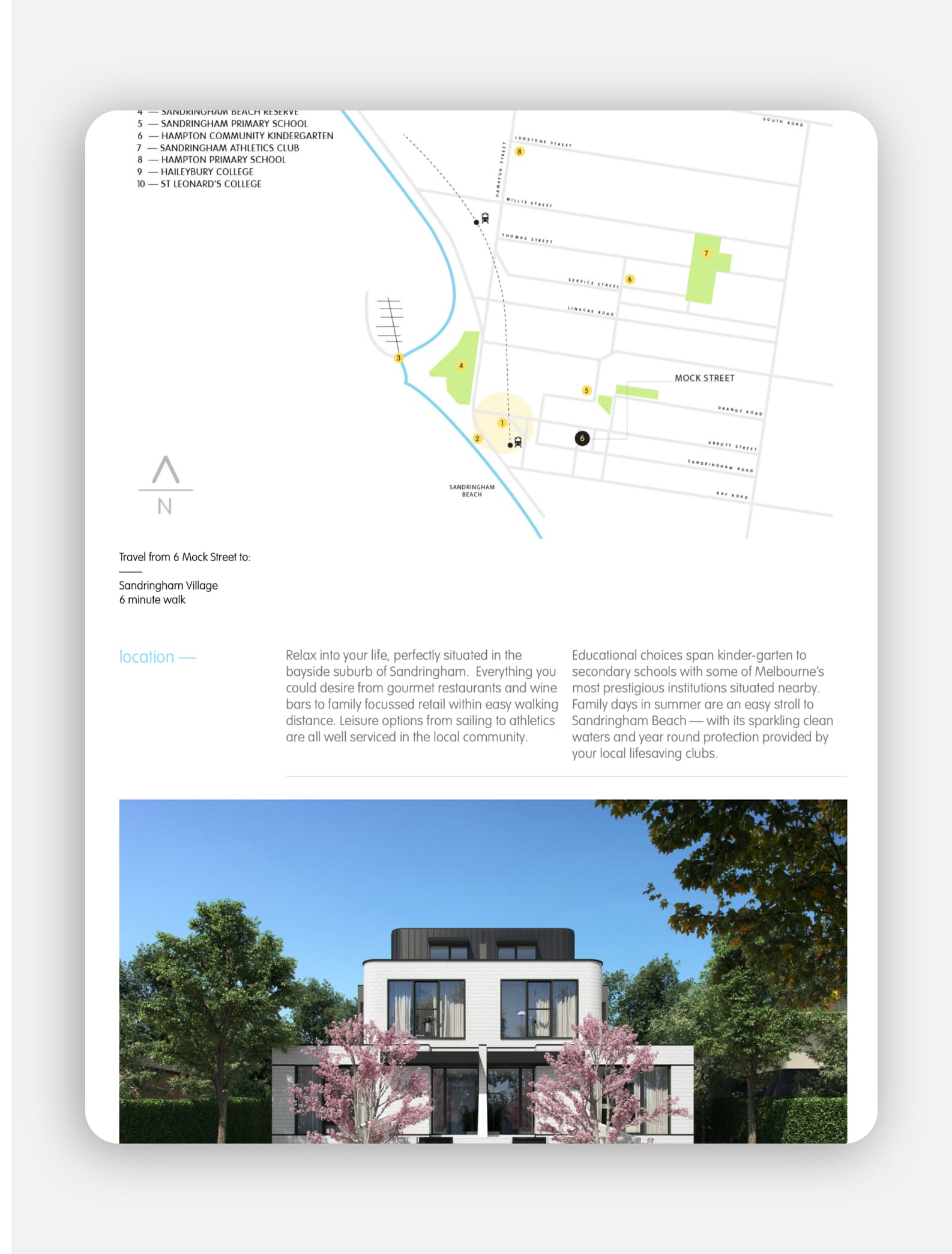
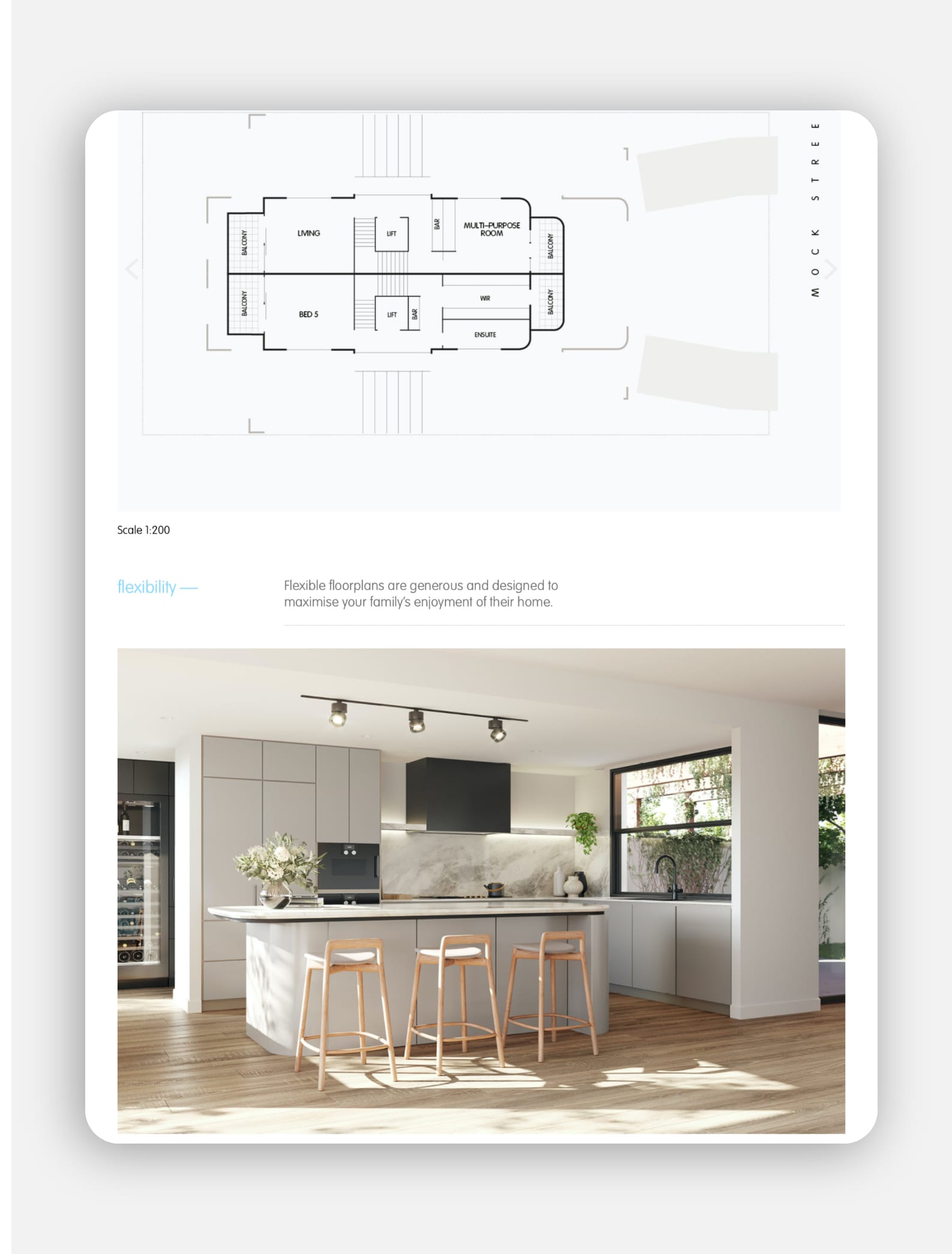
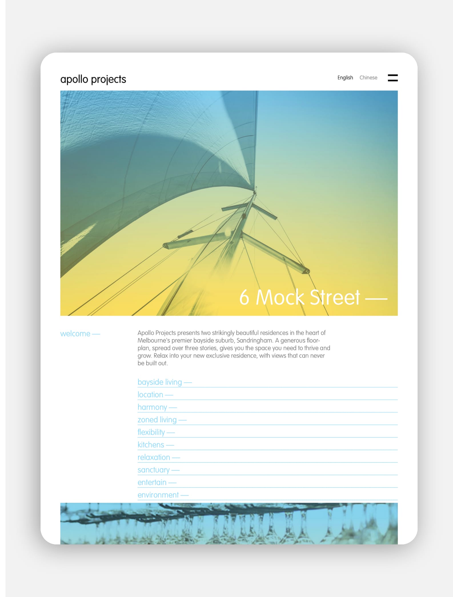
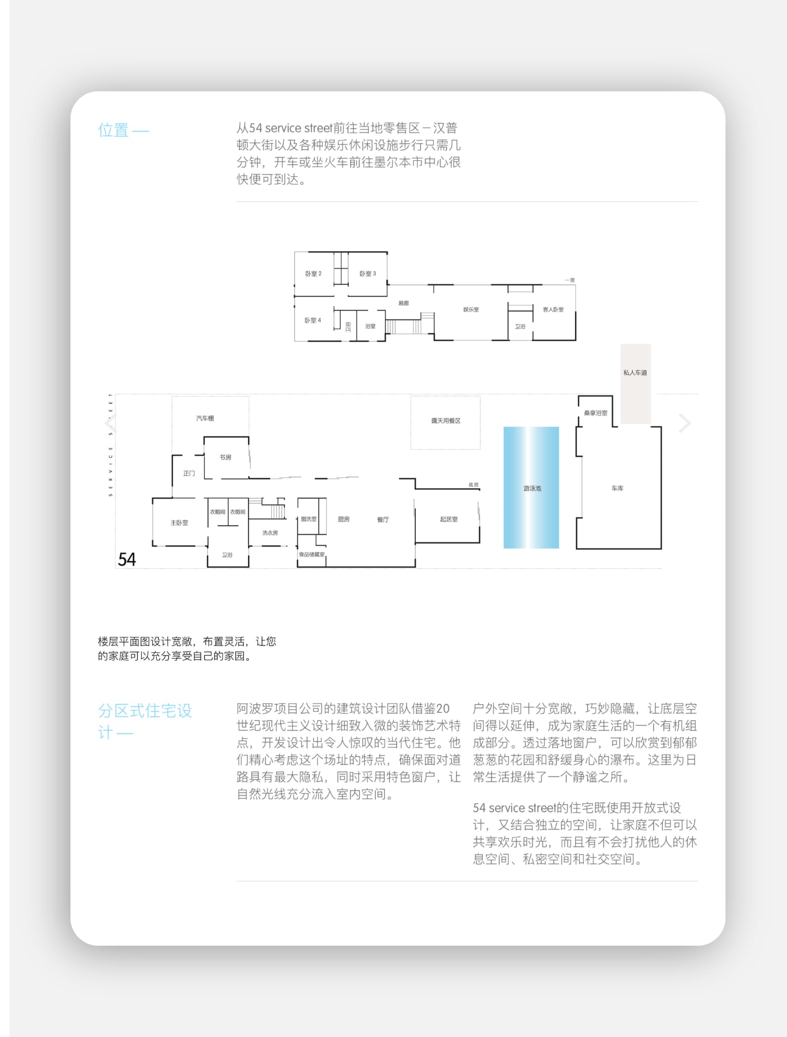
A streamlined website showcases the portfolio of projects to prospective buyers. Built with bi-lingual pages, the site enables Apollo to reach lucrative international markets.


[email protected]
T +61 (0)412 249 745
Instagram