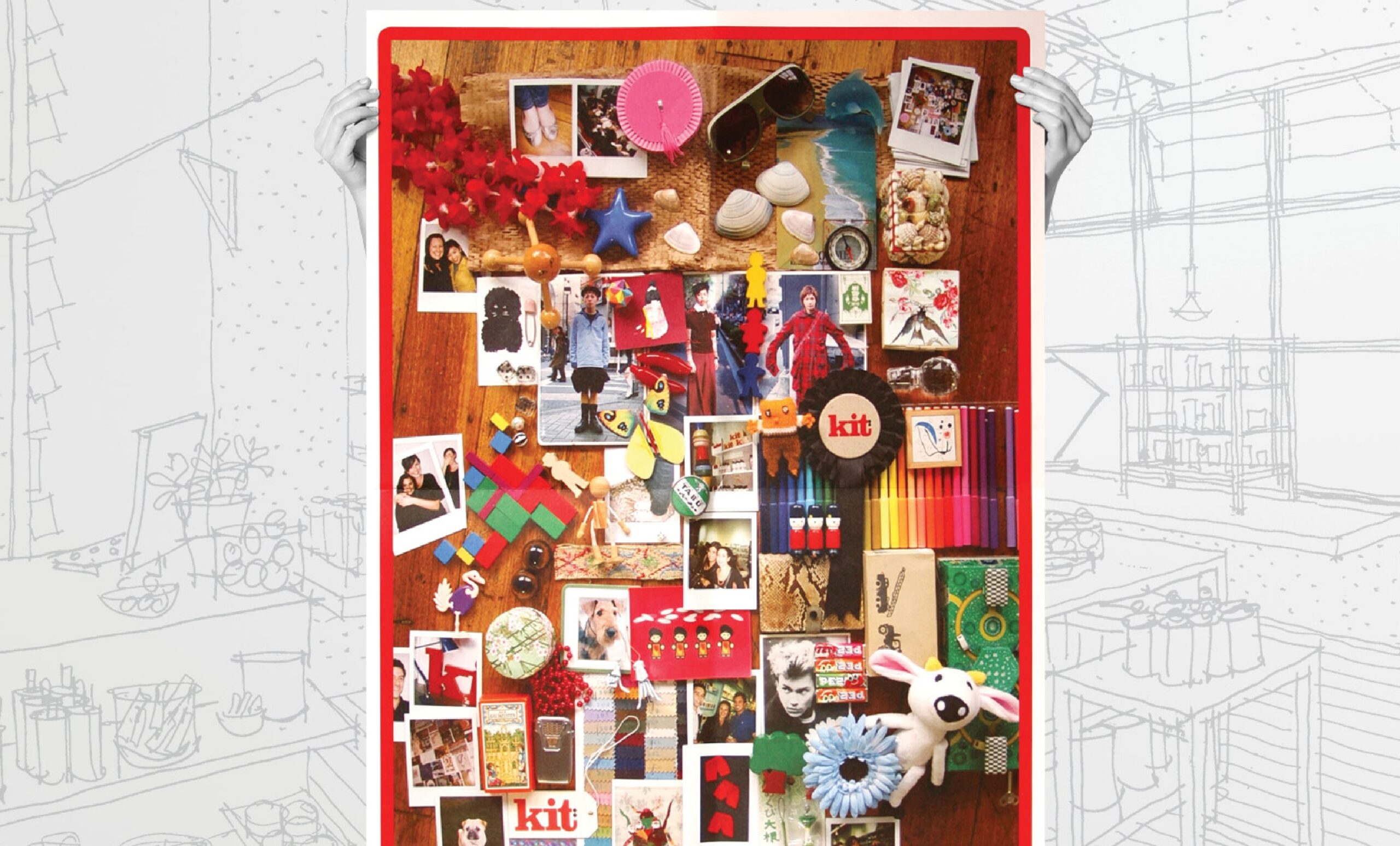
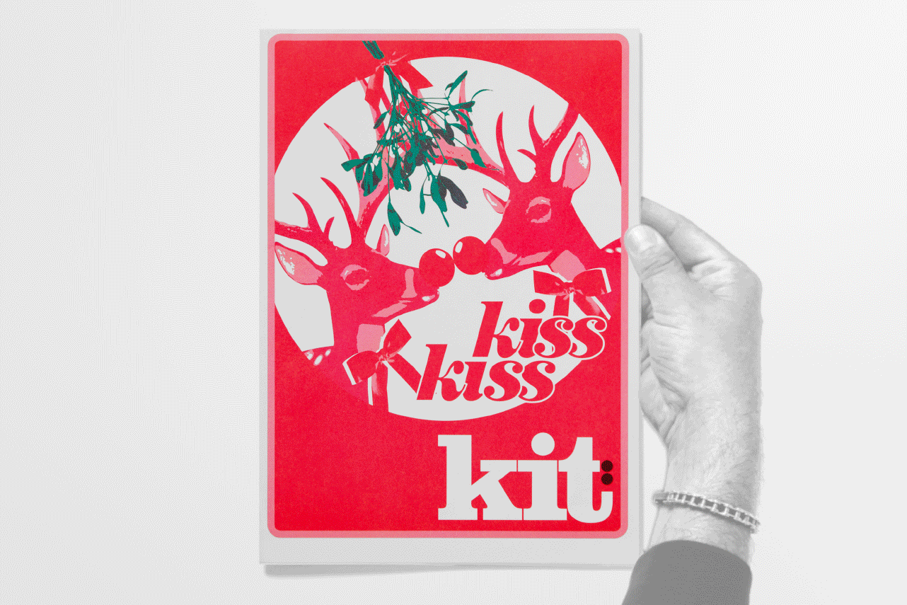
kit’s brand identity is inspired by wood typefaces and letterpress printing with a sprinkling of the visual dynamics of early 20th century propaganda posters. Red, black and white keeps things simple to manage but boldly noticeable. Oh by the way, red isn’t usually a colour associated with skincare… but kit was anything but usual. Polaroids, magazine clippings, and souvenirs collected from global travels are haphazardly collaged into an image telling the story of global travel and serendipitous discoveries. Keeping on brand, cliché images of beautiful models are NOT included!
kit’s hand-made, photocopied, PR kit is full of architectural sketches and found images, collaged together with scratchy scribbles and Dadaist typography. Nothing lines up exactly. Obviously!
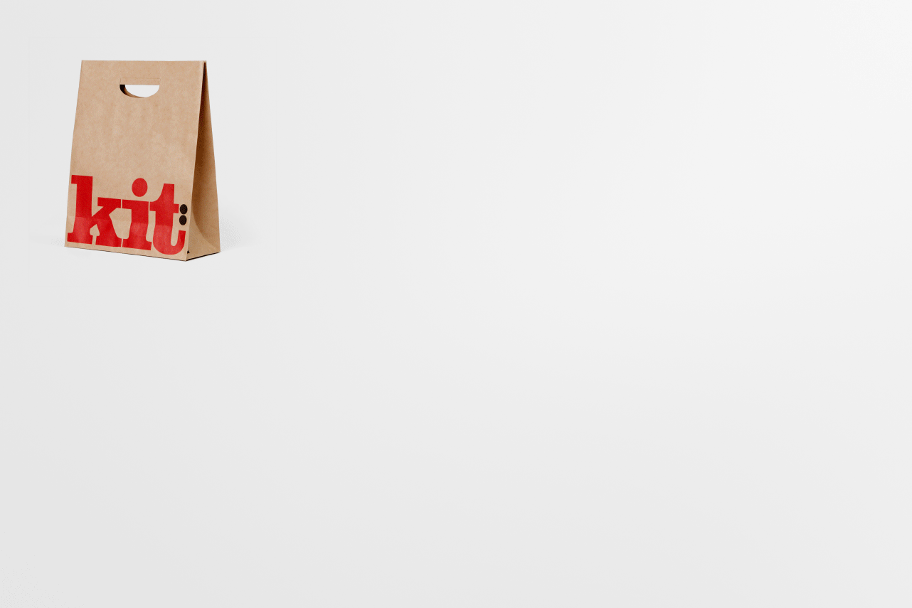
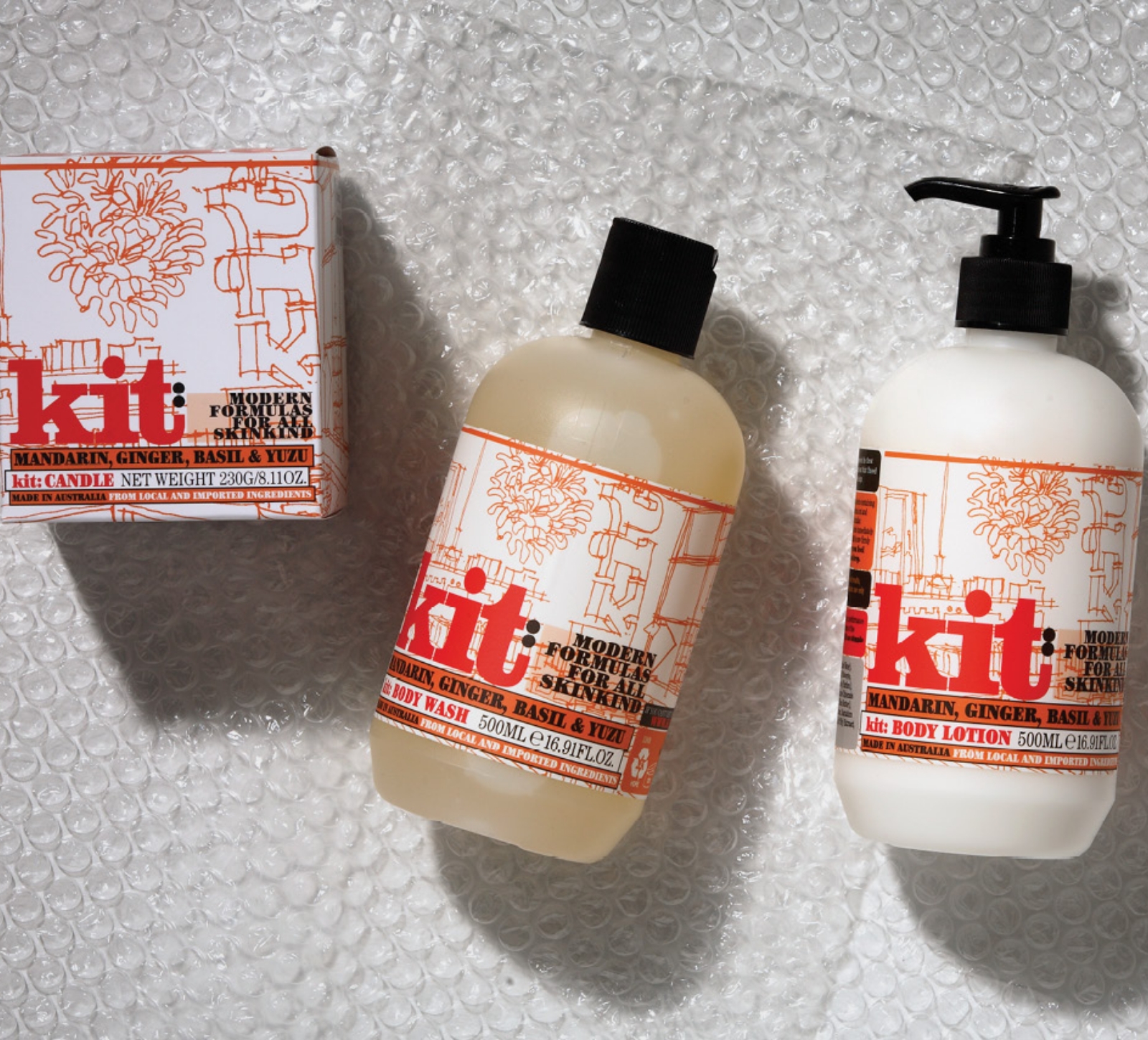
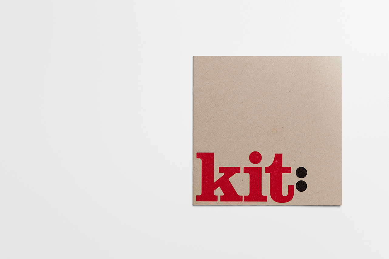
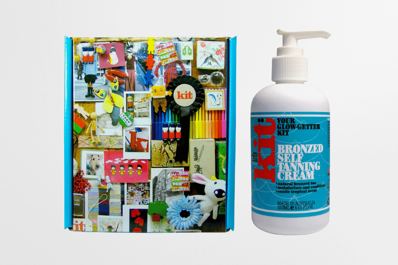
Catalogues, shopping bags, store signage and kit’s own signature line of products reinforce the “hand-made” plus a commitment to sustainability. No superfluous anything here thank you very much.
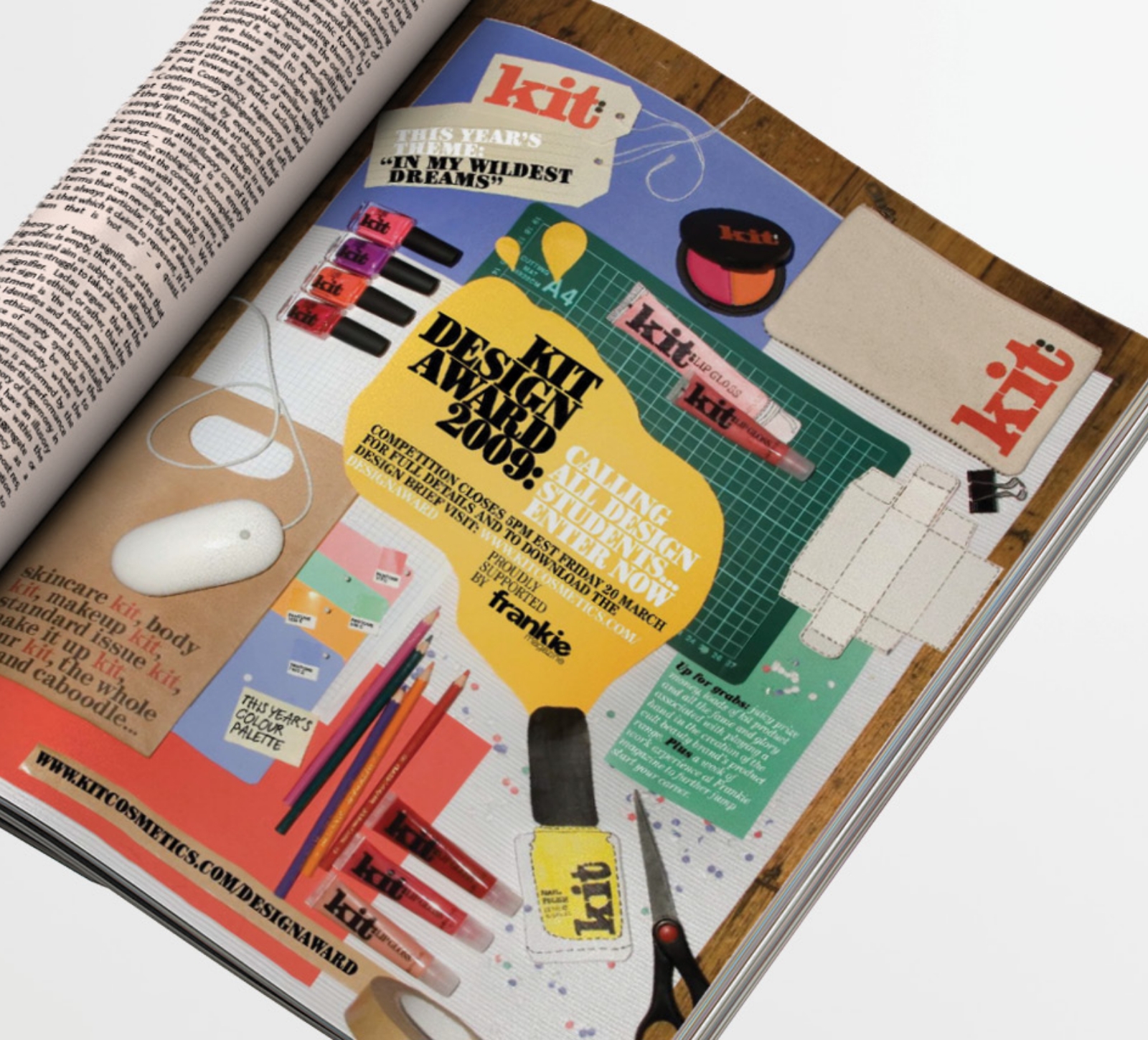
Advertising in “frankie” magazine teases graphic design students with the possibility of their packaging concept going into production. Envelope’s creative brief? No time for high-brow art direction. Nail polish, blush and lip gloss collide with the creative tools of the design trade on the wooden floor of kit’s office. Snap! Perfectly kit!

Ty was there for the very kernel of the kit idea forming, and he breathed life into every aspect of it. Its branding and spirit is as relevant now as when it launched over 15 years ago and we have Envelope to thank for that — and thank them we do!”

hello@envelopegroup.com.au
T +61 (0)412 249 745
Instagram