
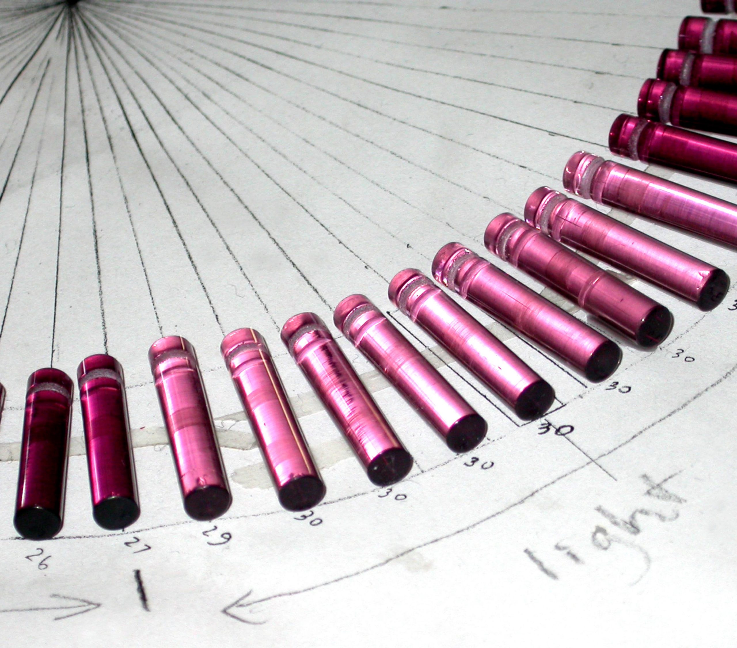
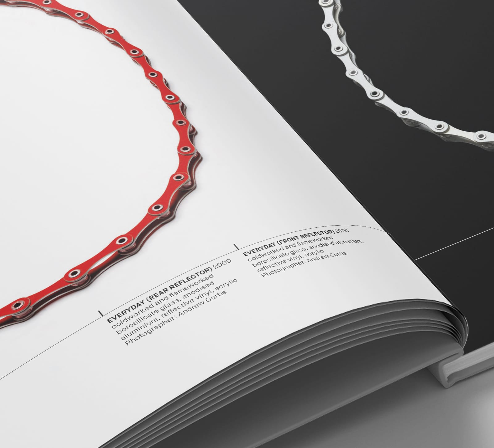
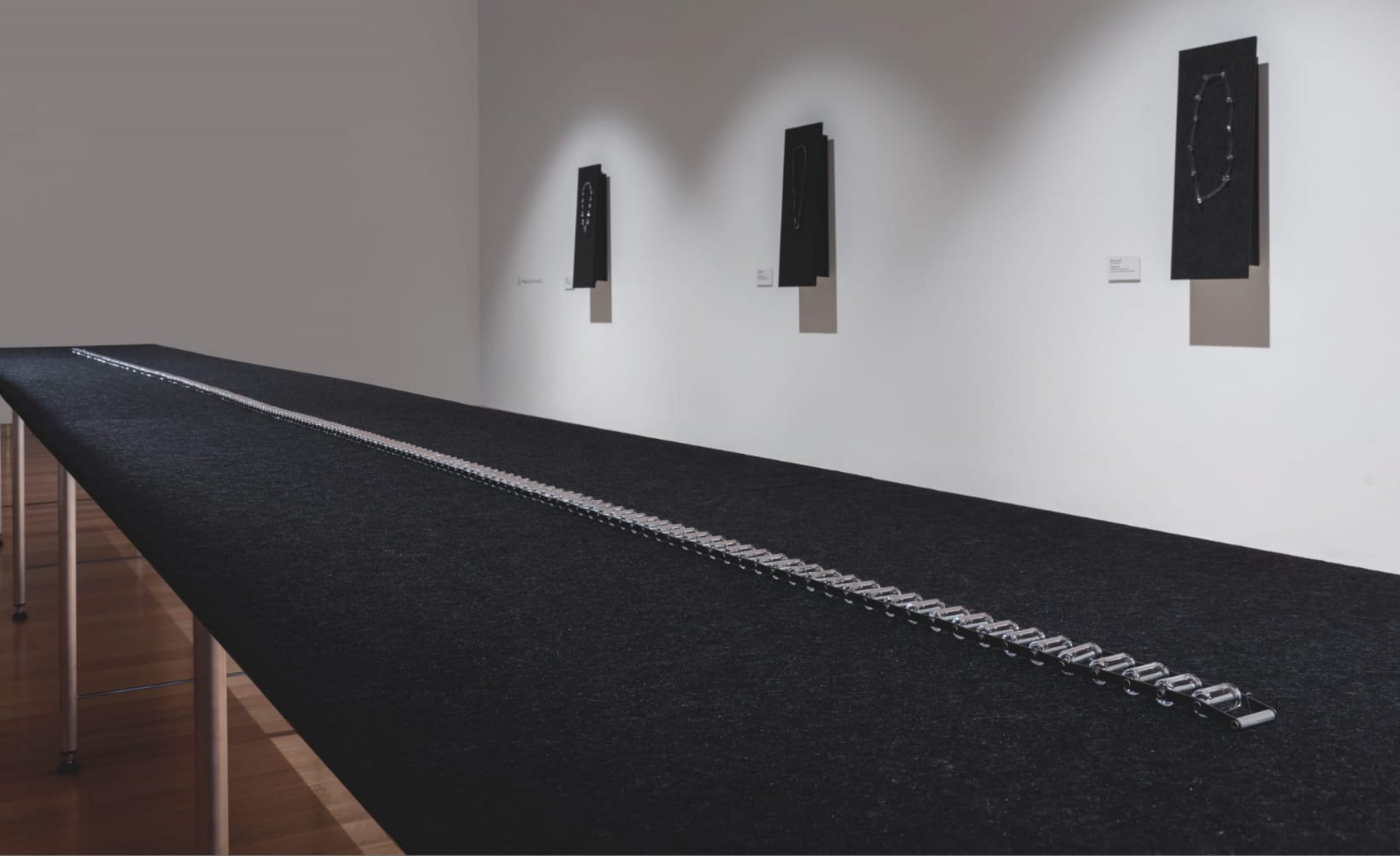
Consequently she makes jewellery that is loaded with contradictions. Things like glass bike chains. Her love of a distant horizon across a glassy ocean, reflecting the mood of the sky above it, informed the creation of Envelope’s enduring brand image.
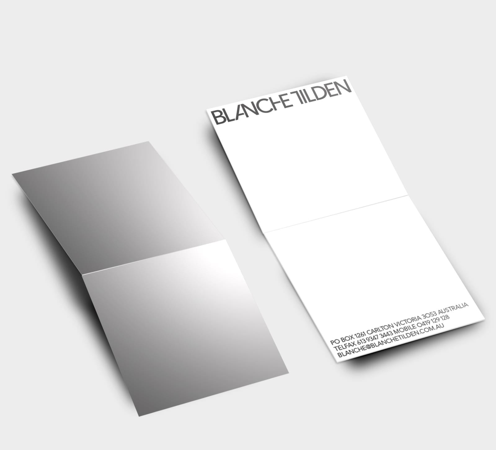
Custom typography is inspired by her love of mechanisms and their inherent geometry. A business card designed in 2002 still embodies all of these qualities almost two decades later.
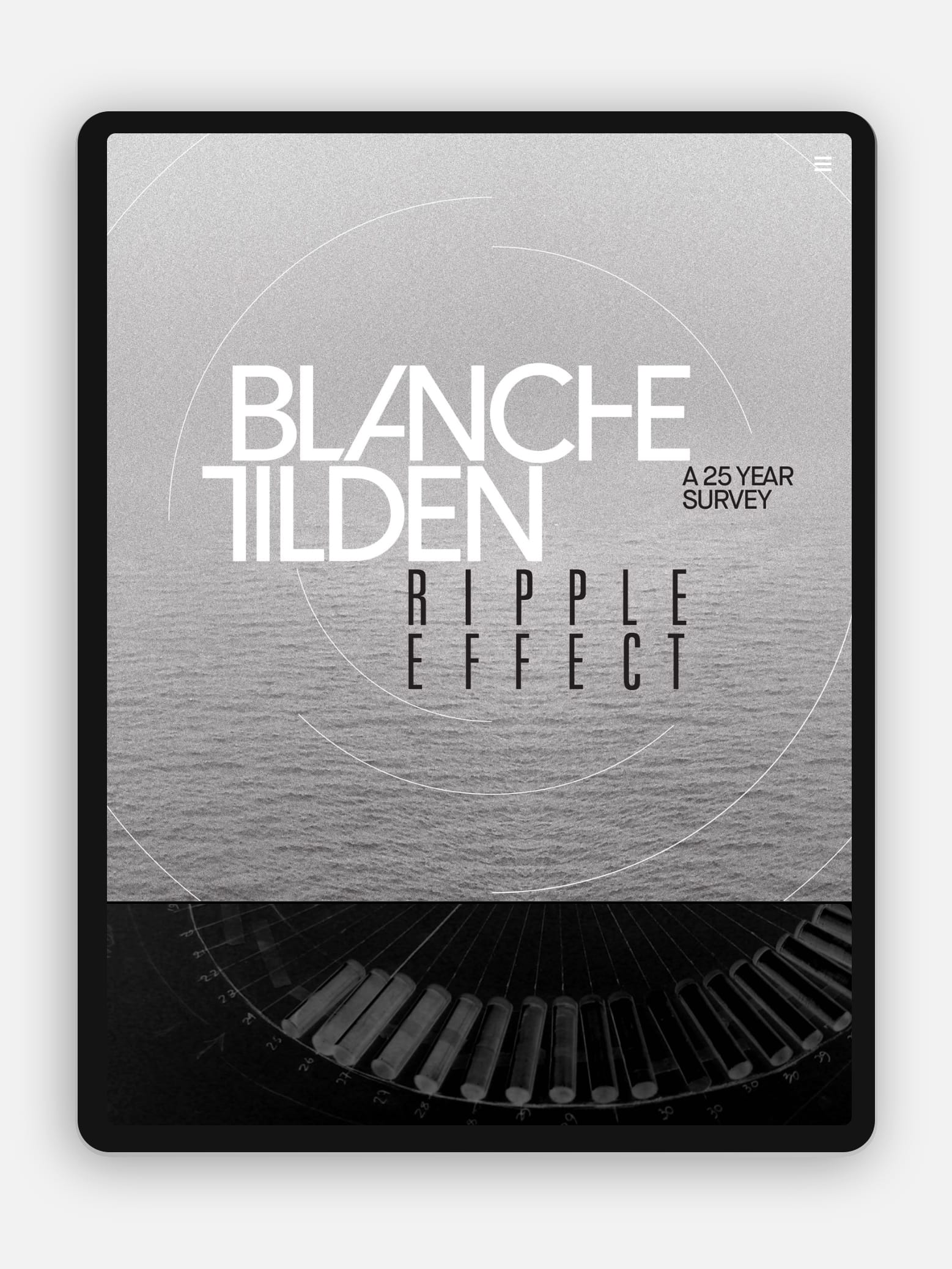
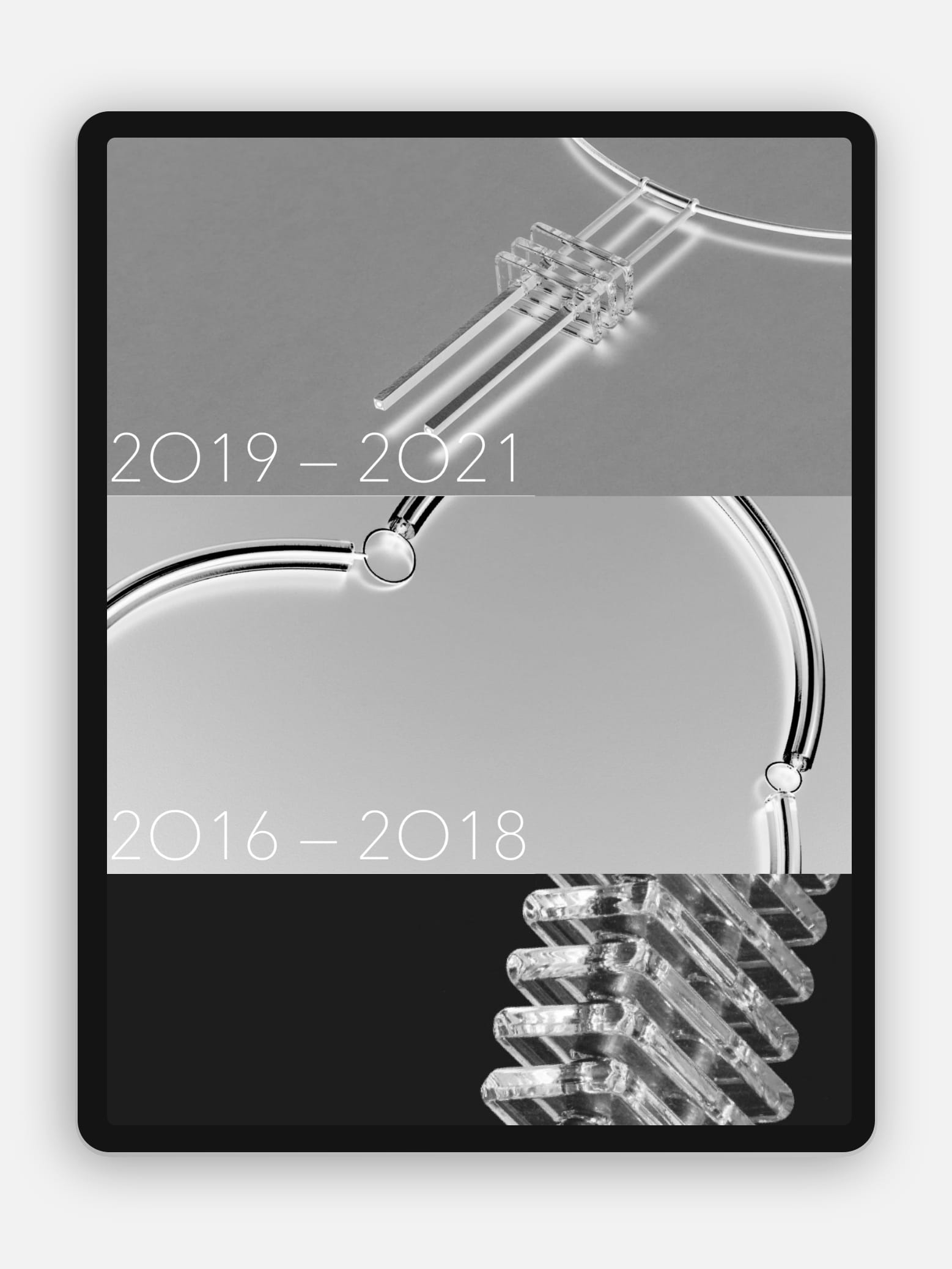
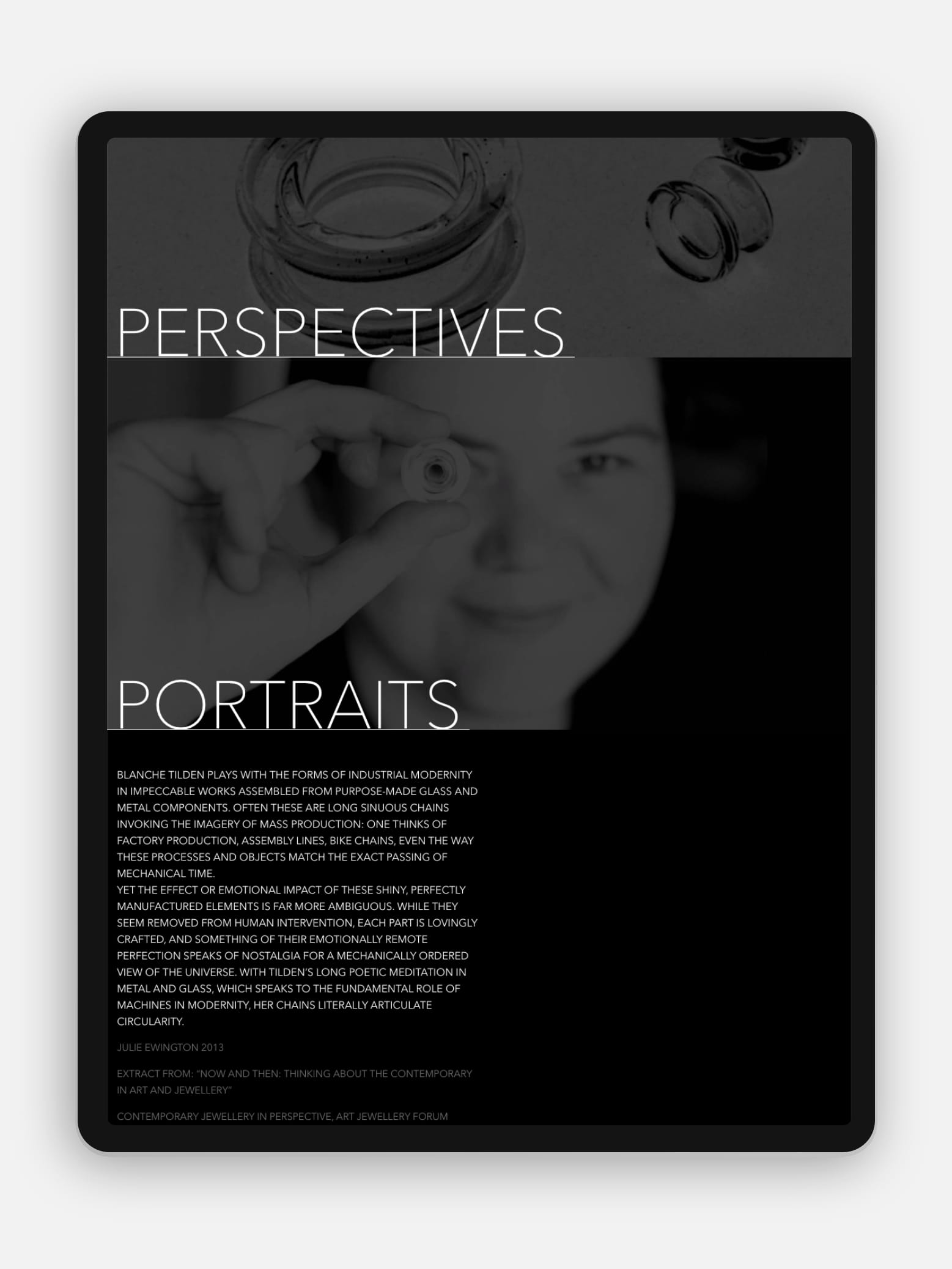
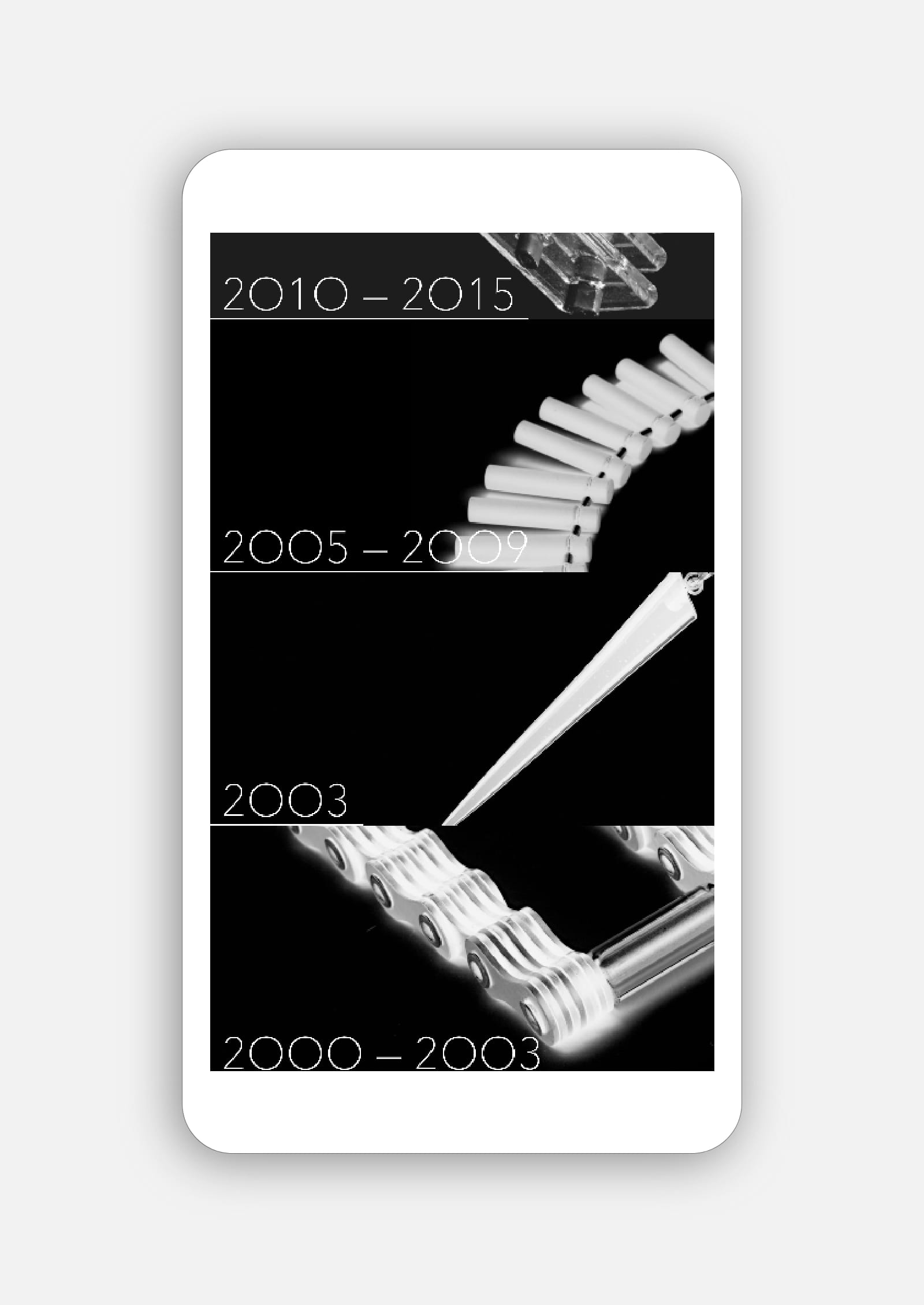
Blanche’s website is a chronological archive of her life’s work. Bold typography eases navigation complemented by the generous display of photography executed by Andrew Curtis, Rhiannon Slatter, Grant Hancock, Jeremy Dillon et al.
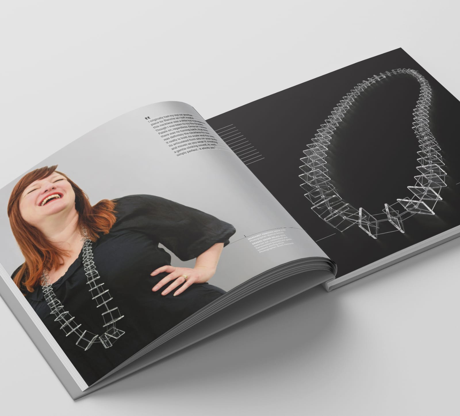
Blanche’s loyal collectors are captured in personal portraits photographed by her husband Marcus Scholz. To add a voice to these collectors, Envelope suggests the inclusion of individual quotes.
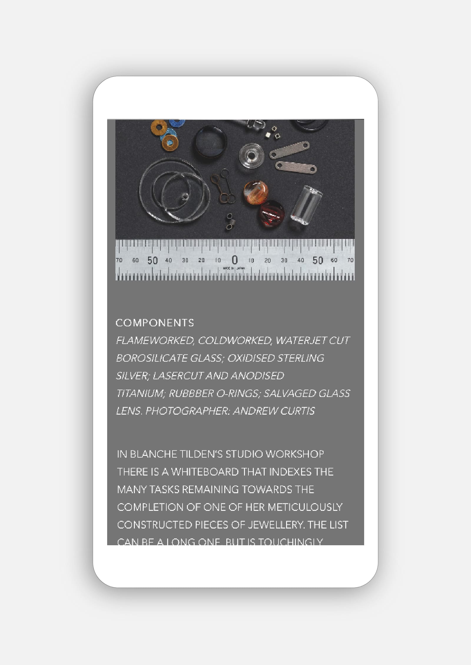
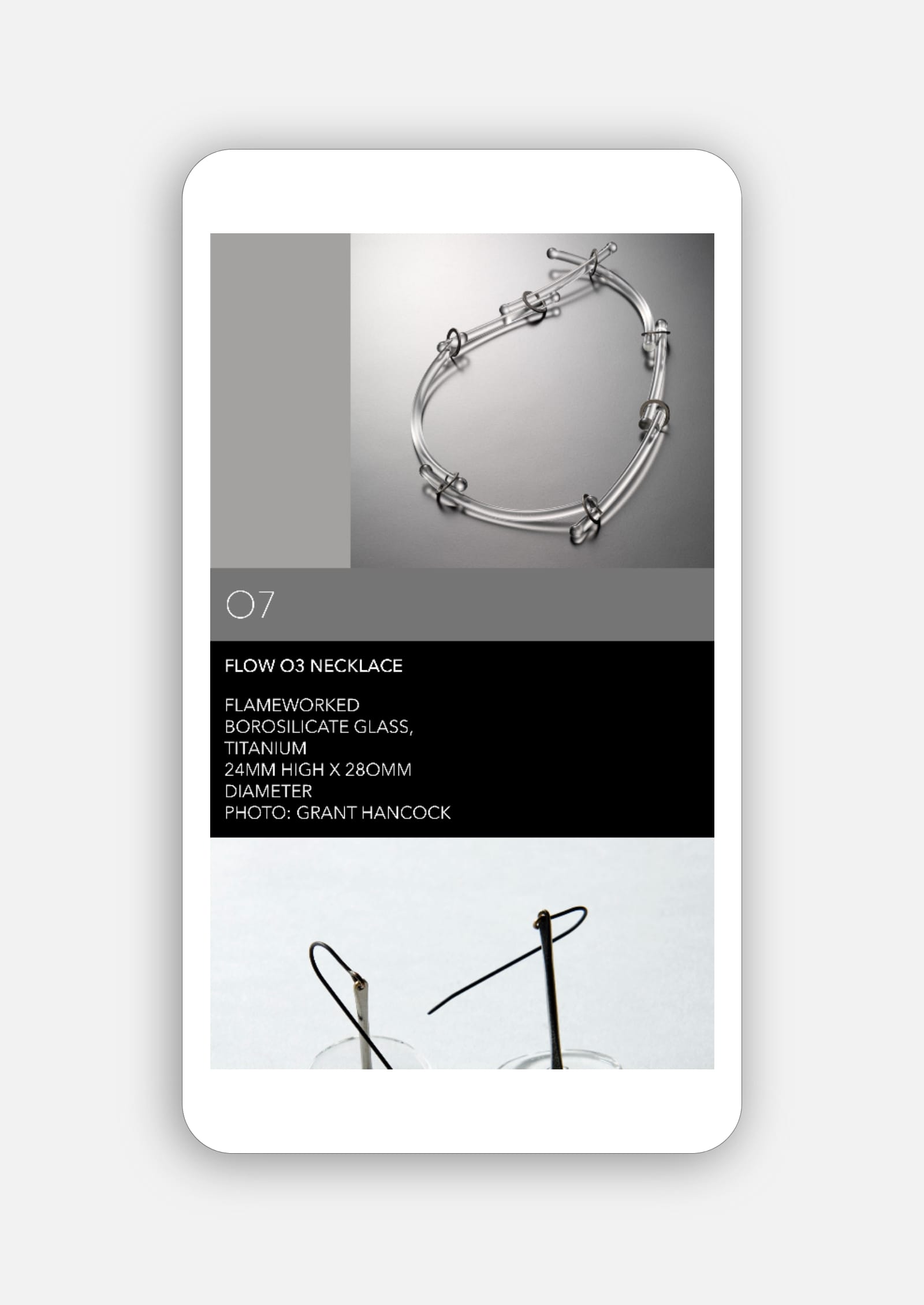
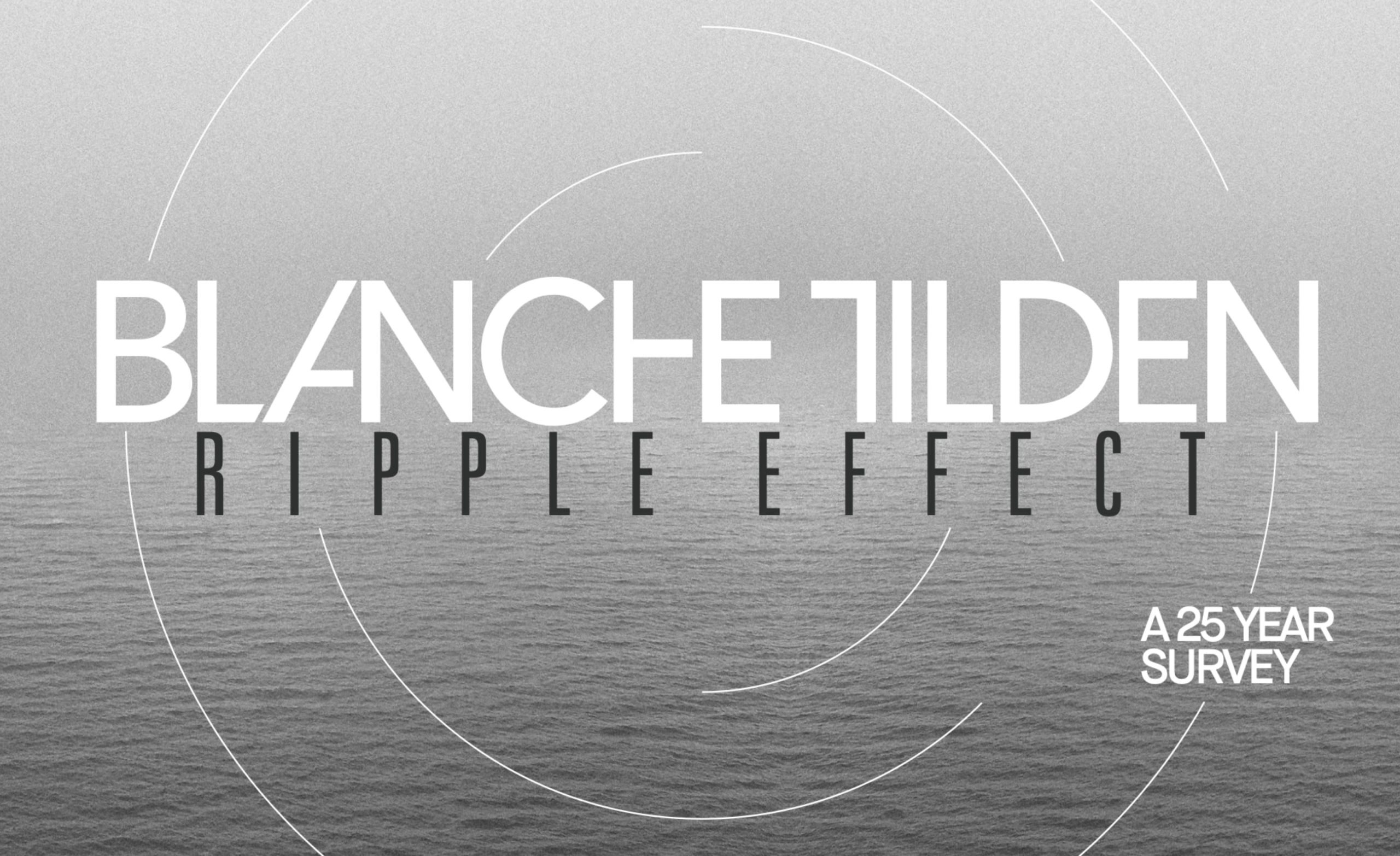
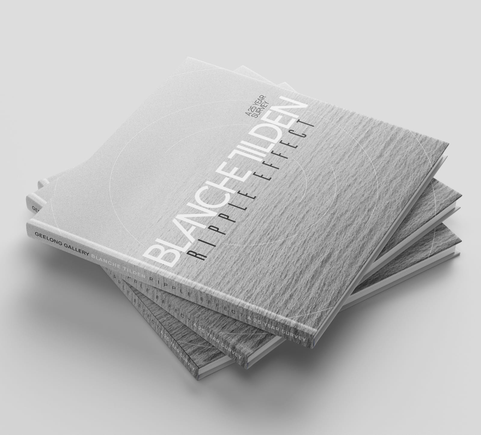
In recognition of Blanche’s achievements as one of Australia’s most successful contemporary jewellers, Geelong Gallery’s 25 year survey exhibition Ripple Effect synthesises Blanche’s jewellery and her brand architecture into a powerful design statement.
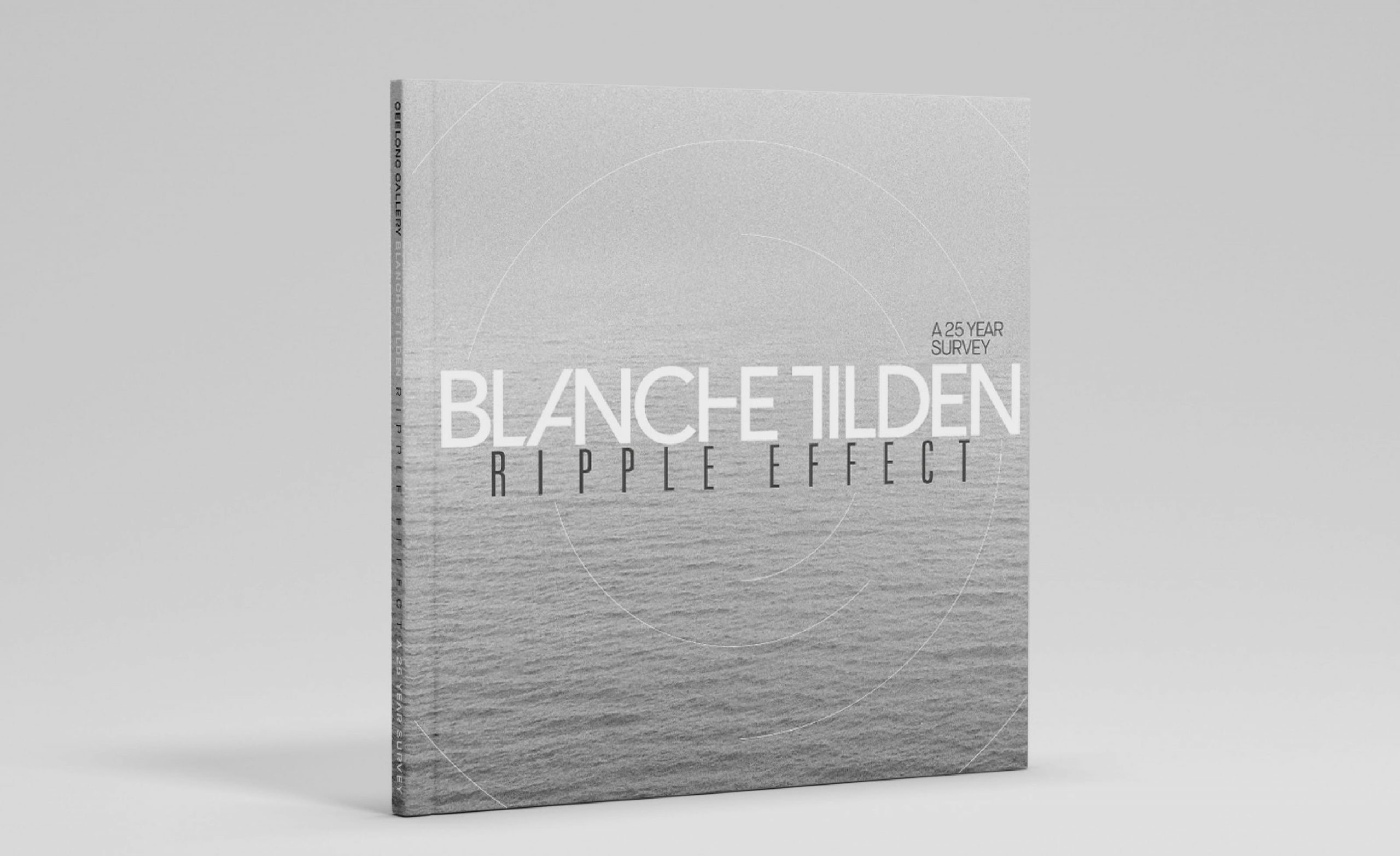
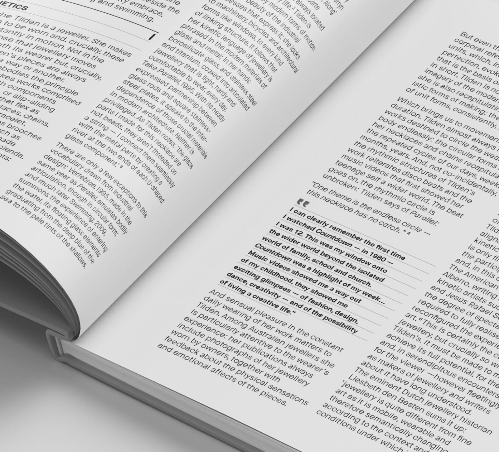
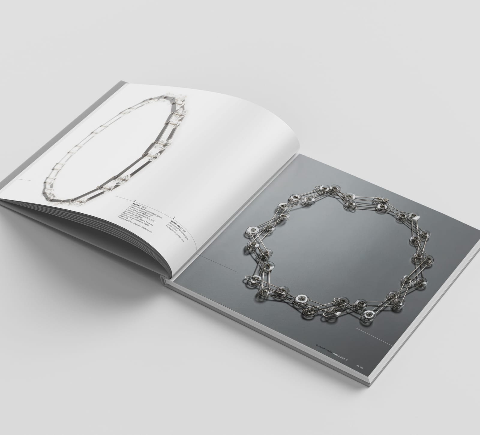
Envelope’s 108 page exhibition catalogue and additional campaign graphics perfectly encapsulate the exhibition through its generous photographic spreads, long-form essays and chronology of her work.
Shortlisted, 2022 Museums Australasia Multimedia and Publication Design Awards (MAPDA), Exhibition Catalogue (Major)
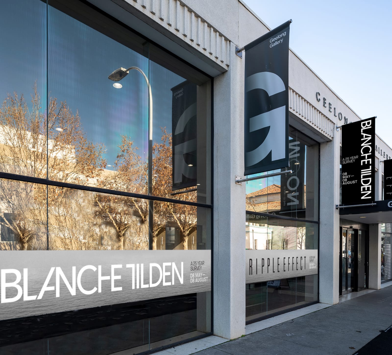
Blanche’s brand architecture is highly flexible and readily adapted to suit internal and external signage requirements.
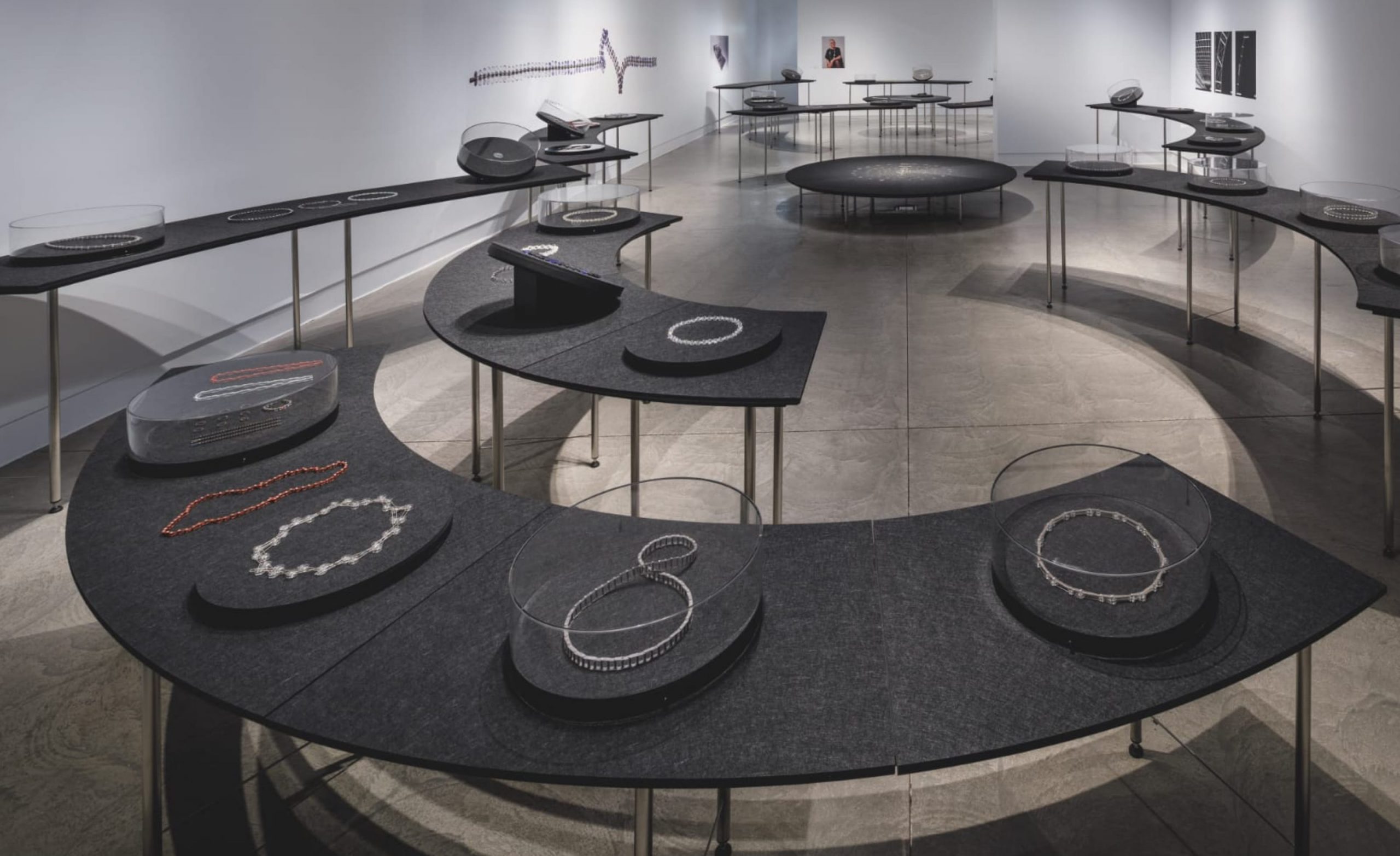
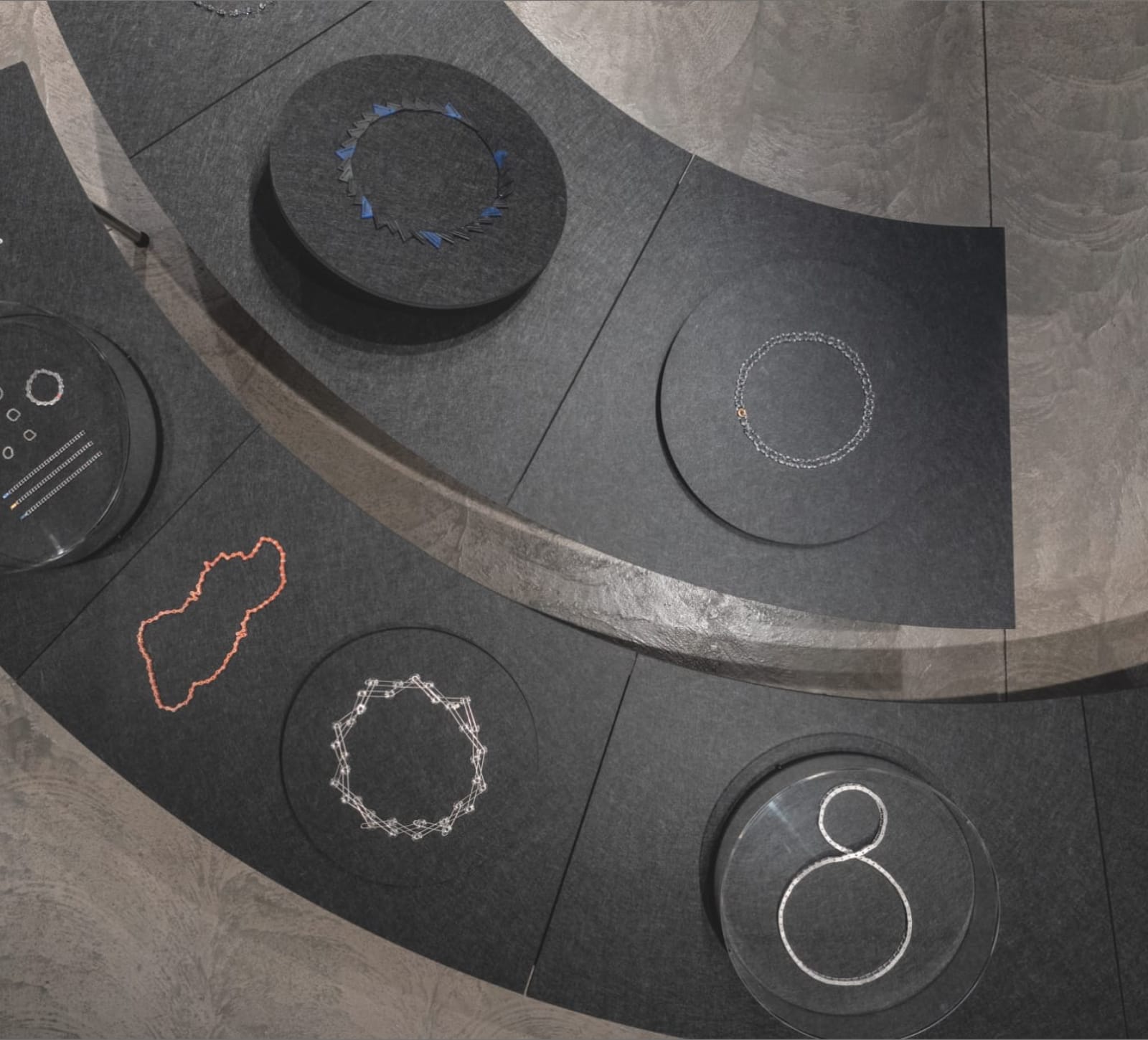
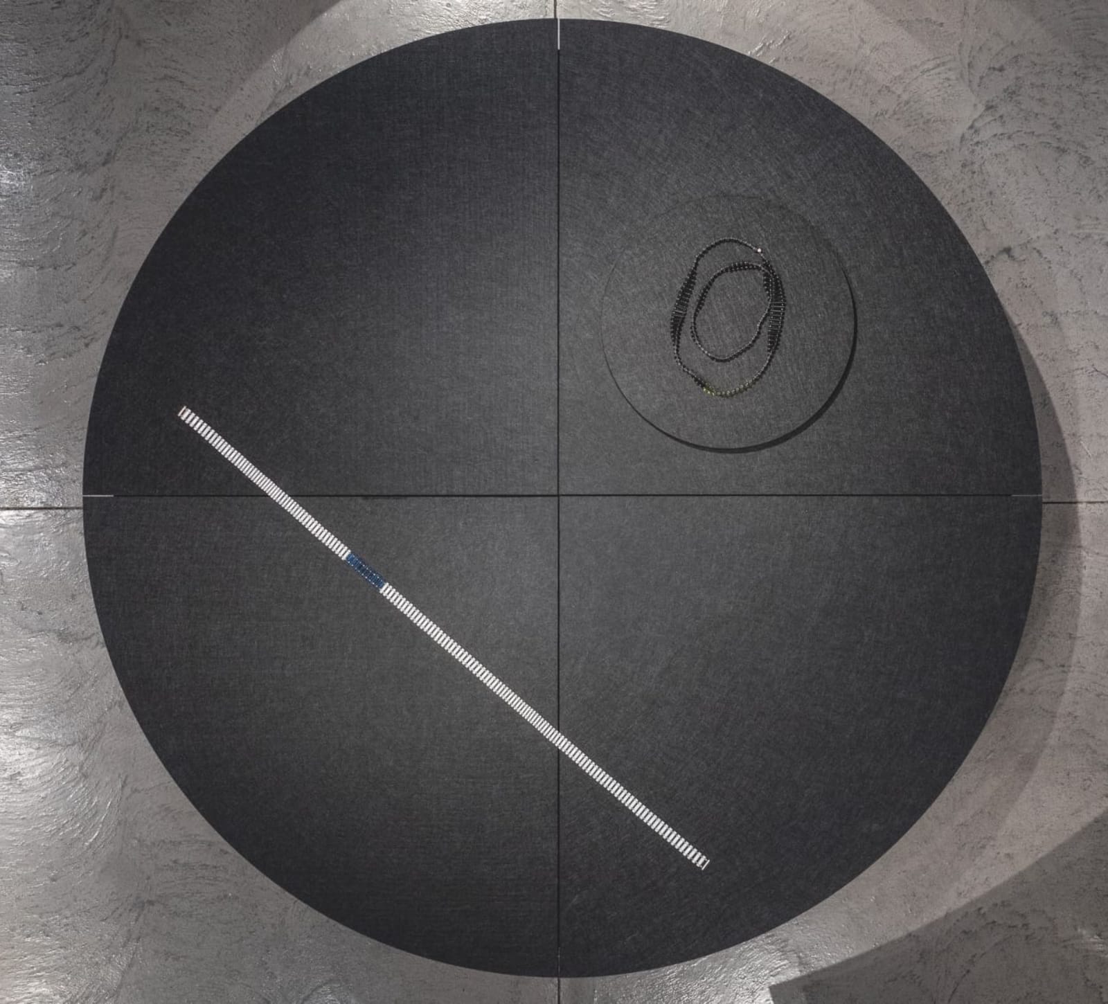
Martin Reid, another of Blanche’s long-time collaborators, designs the exhibition furniture and display systems complemented by selected historical graphics designed by Envelope.
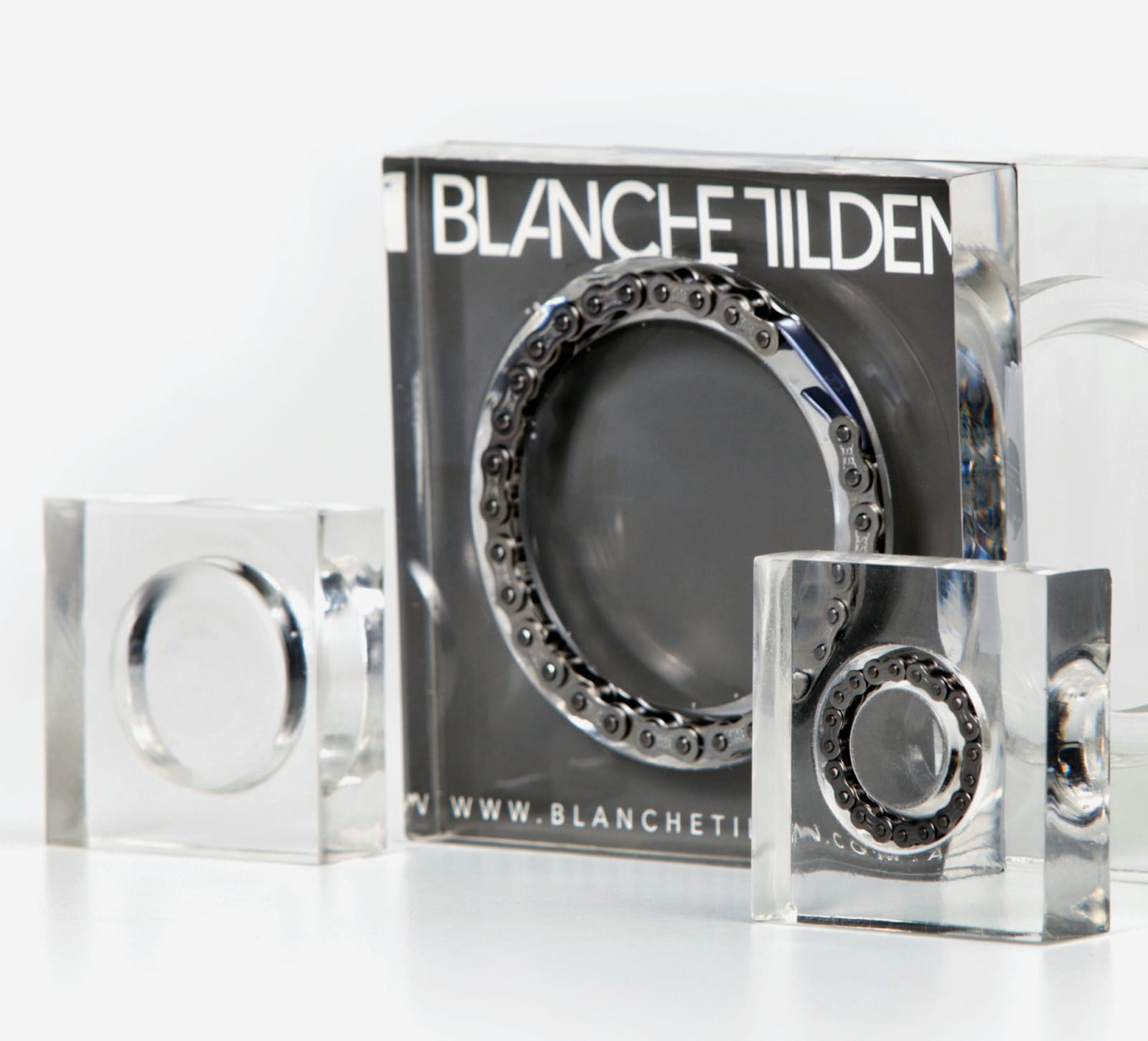
Packaging solutions allow Blanche to produce just enough to match her inventory. Humble petri dishes are elevated by elegant inserts providing support for Blanche’s jewellery in a unique brand statement.
I met Blanche in the late 90s when she was at Susan Cohn’s Workshop 3000 and I was a graphic designer at Emery Vincent Design, under the guidance of Garry Emery. Both are masters of their craft, generous, and forthcoming with their knowledge. Through their collaboration, we learned the importance of establishing and nurturing real trust between artist and designer. Since the early 2000s, our simpatico relationship and complementary working methods have formed into a creative design partnership, influenced by our shared love of the Bauhaus, modernism, architecture, typography and electronic music.”
Whether working with just one person or collaboratively with a range of contributors, Ty has the singular ability to distil the essence of a project in outstanding examples of graphic design. This distillation is achieved through careful listening and a desire to ‘get it right’ for the client. Information is presented with clarity and always realised via Ty’s unique approach. Working together now for 30 years, Ty and I have developed a brand language that is instantly recognisable with the flexibility to be adapted for use across the shifting landscape of visual communication, both printed and digital.”
hello@envelopegroup.com.au
T +61 (0)412 249 745
Instagram