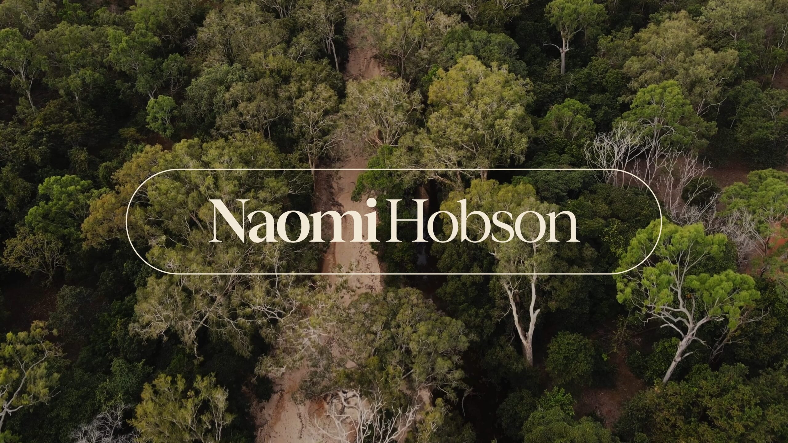
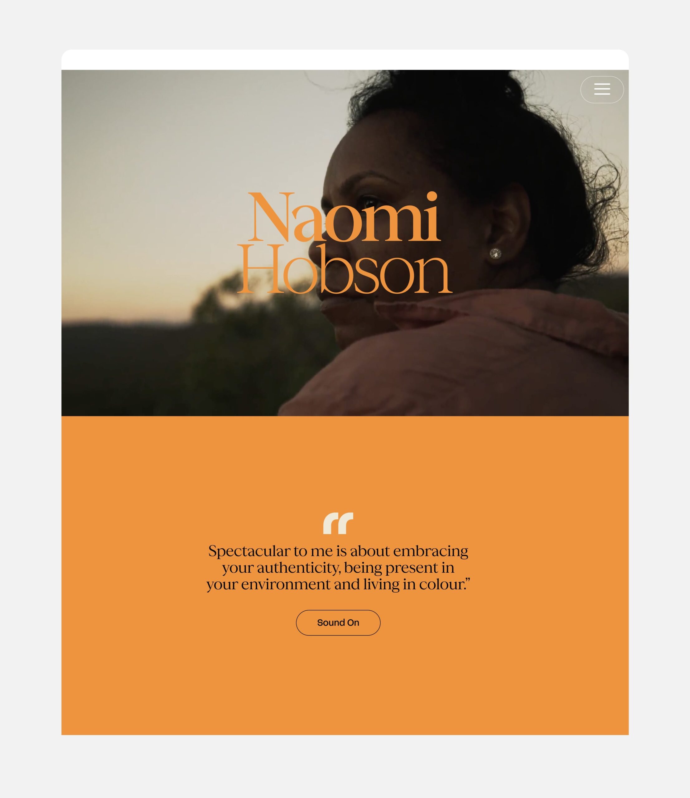
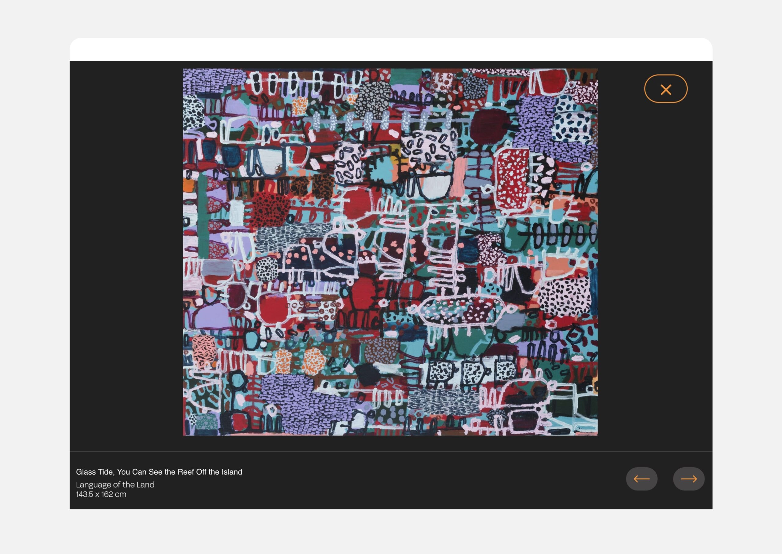
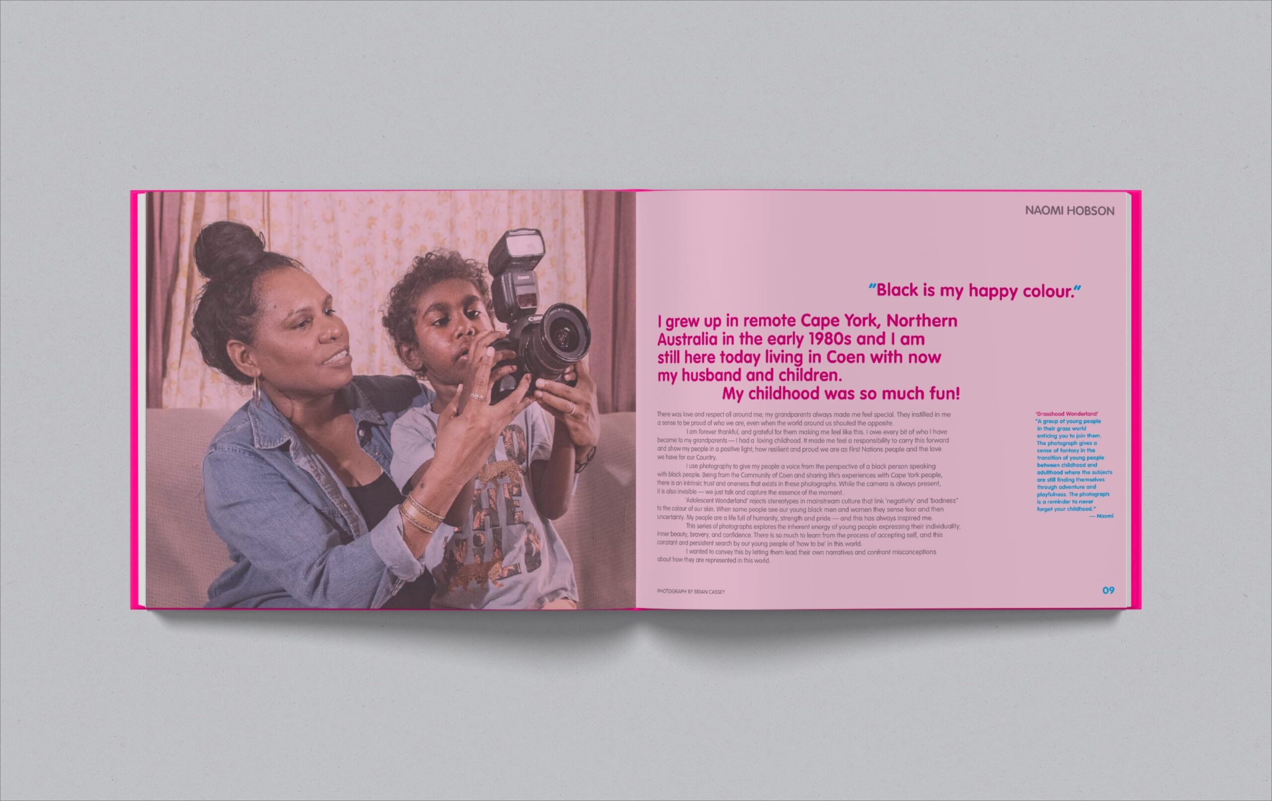
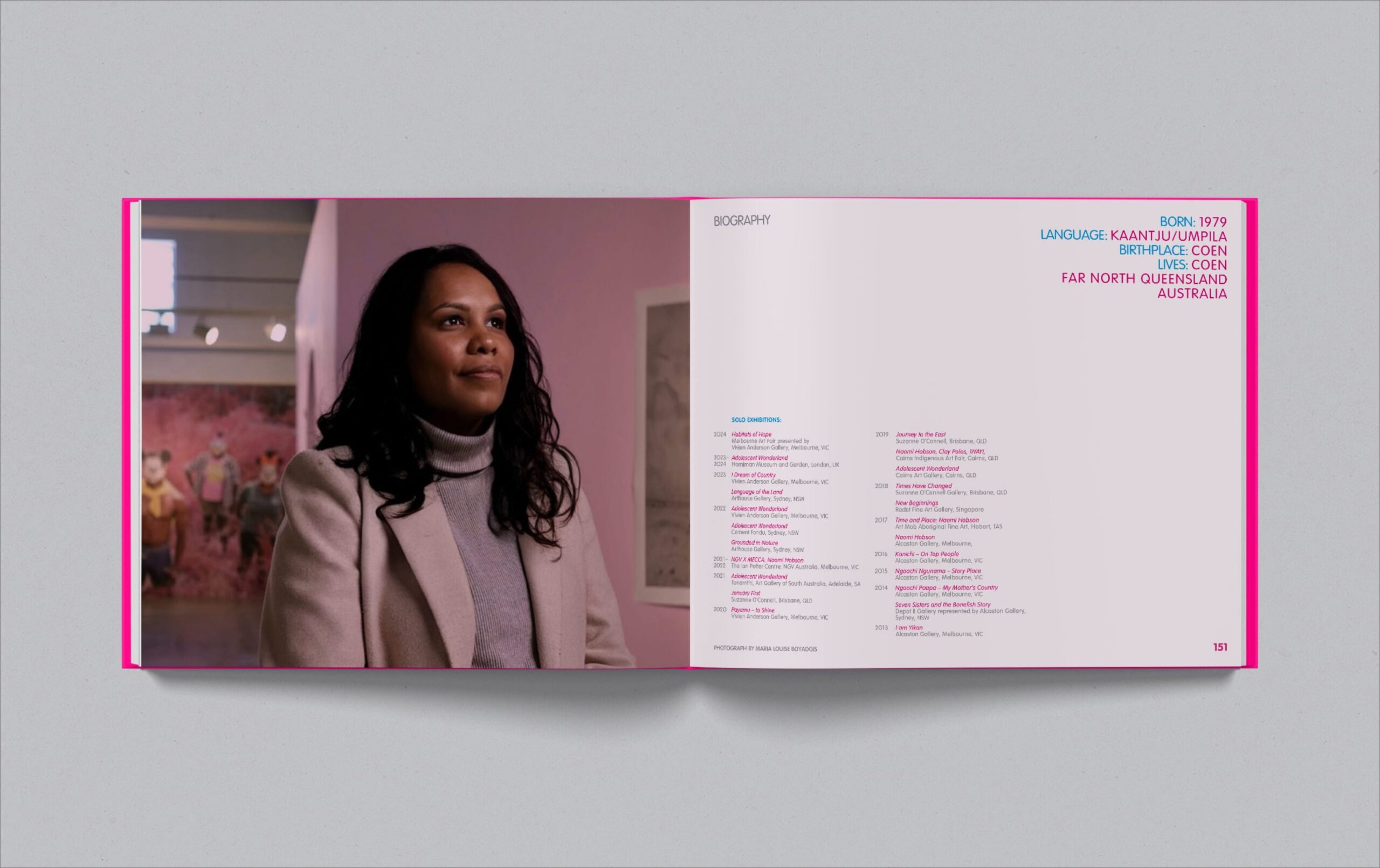
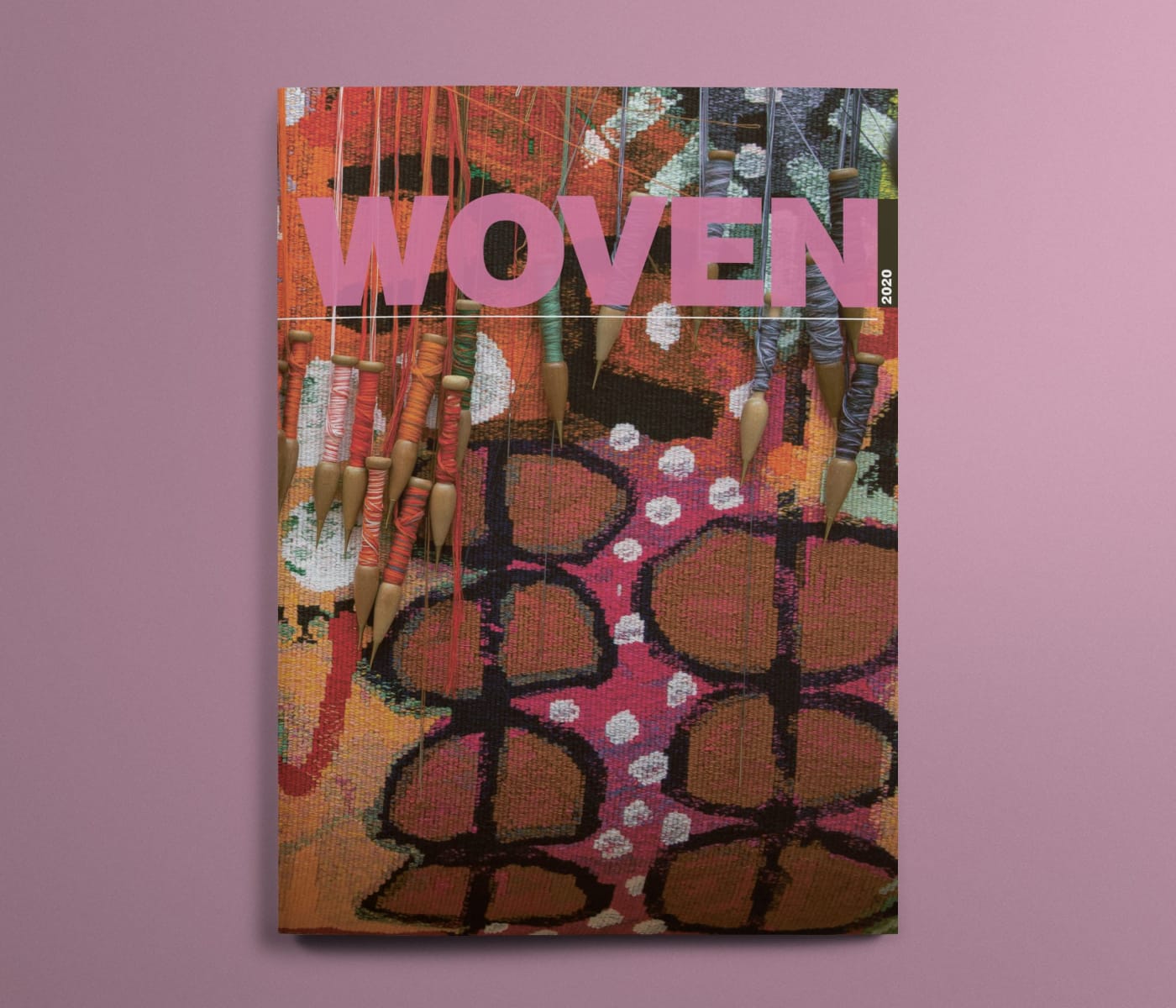
Naomi’s practice is rooted in the vast traditional lands of her ancestors, surrounding the town of Coen in Queensland. She explores her culture and community through different mediums — always underpinned by colourful compositions. A distillation of the tropical spectrum of her Country is the perfect foundation for a visual brand identity that needs to be highly adaptable. Naomi’s unique painting style is the inspiration for the selected typeface used in her elegant logotype.
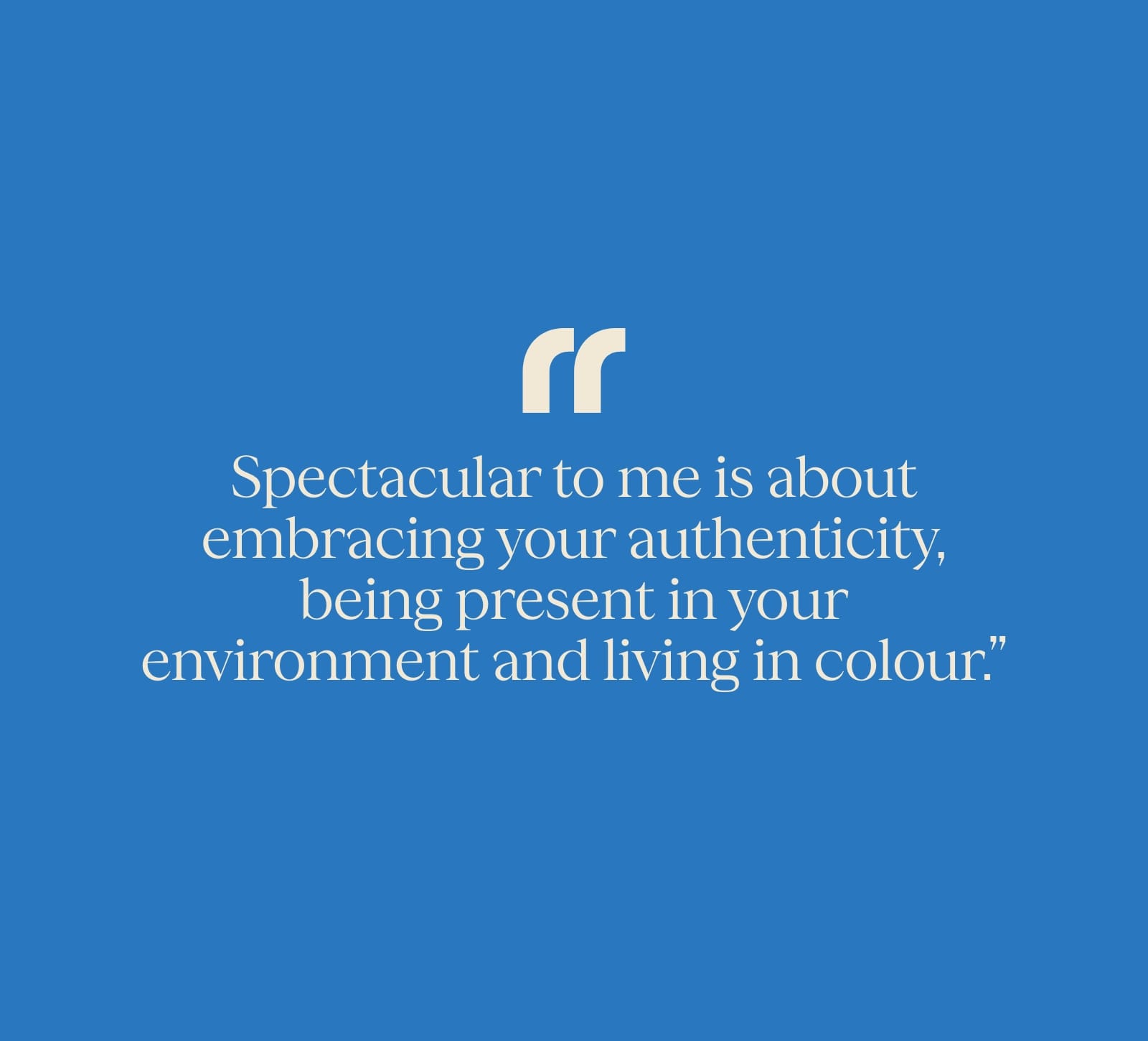
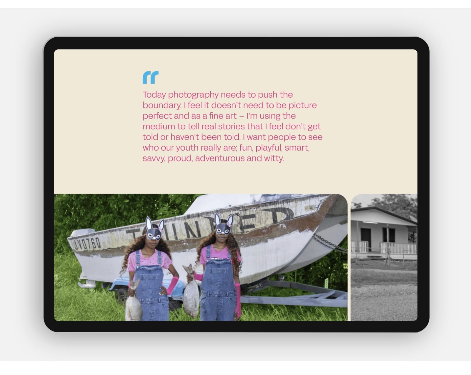
The art world is brimming with websites that effectively replicate the white box gallery aesthetic by displaying artworks on a white background. Rarely is the artist present to add their personality to the experience of their art. More than an archive of her practice, Naomi’s website is an opportunity to get to know her up close and personal. Visitors to the site immediately engage with a stunning insight into Naomi the artist. Where she lives and where she creates. Her Country and her culture. Naomi’s confident voice adds another level of interest for visitors with personal quotations referencing the artwork throughout the site.
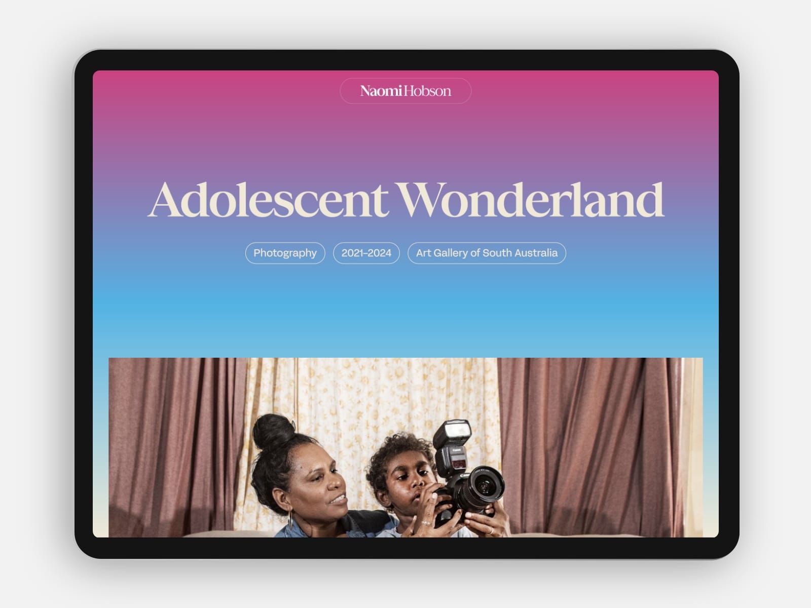
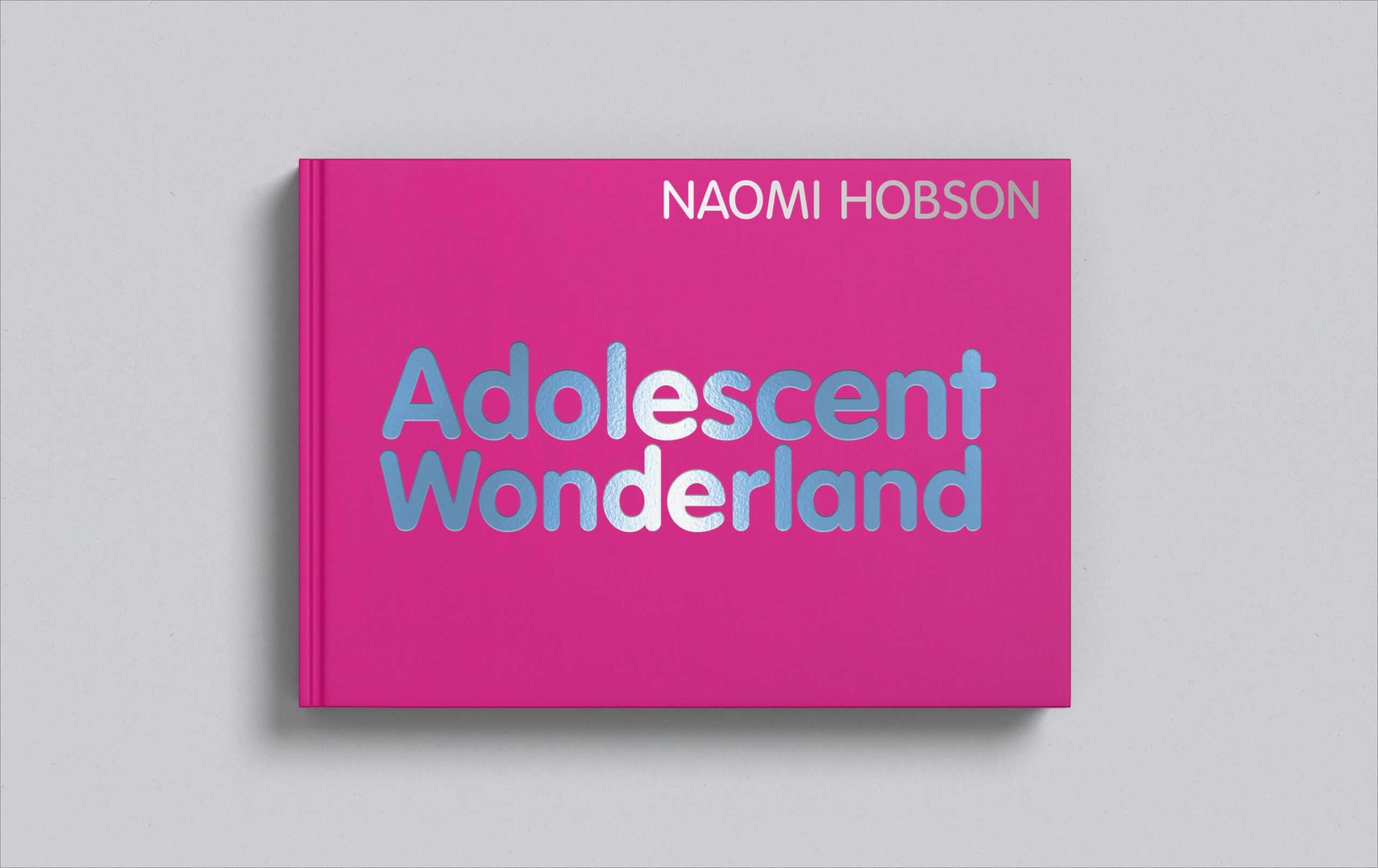
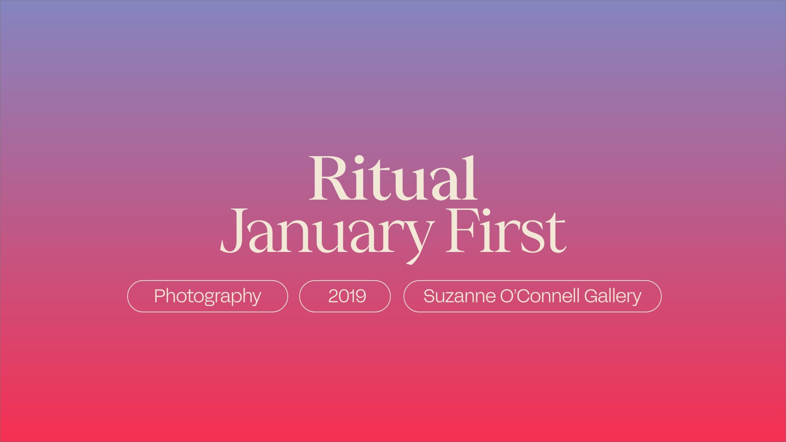
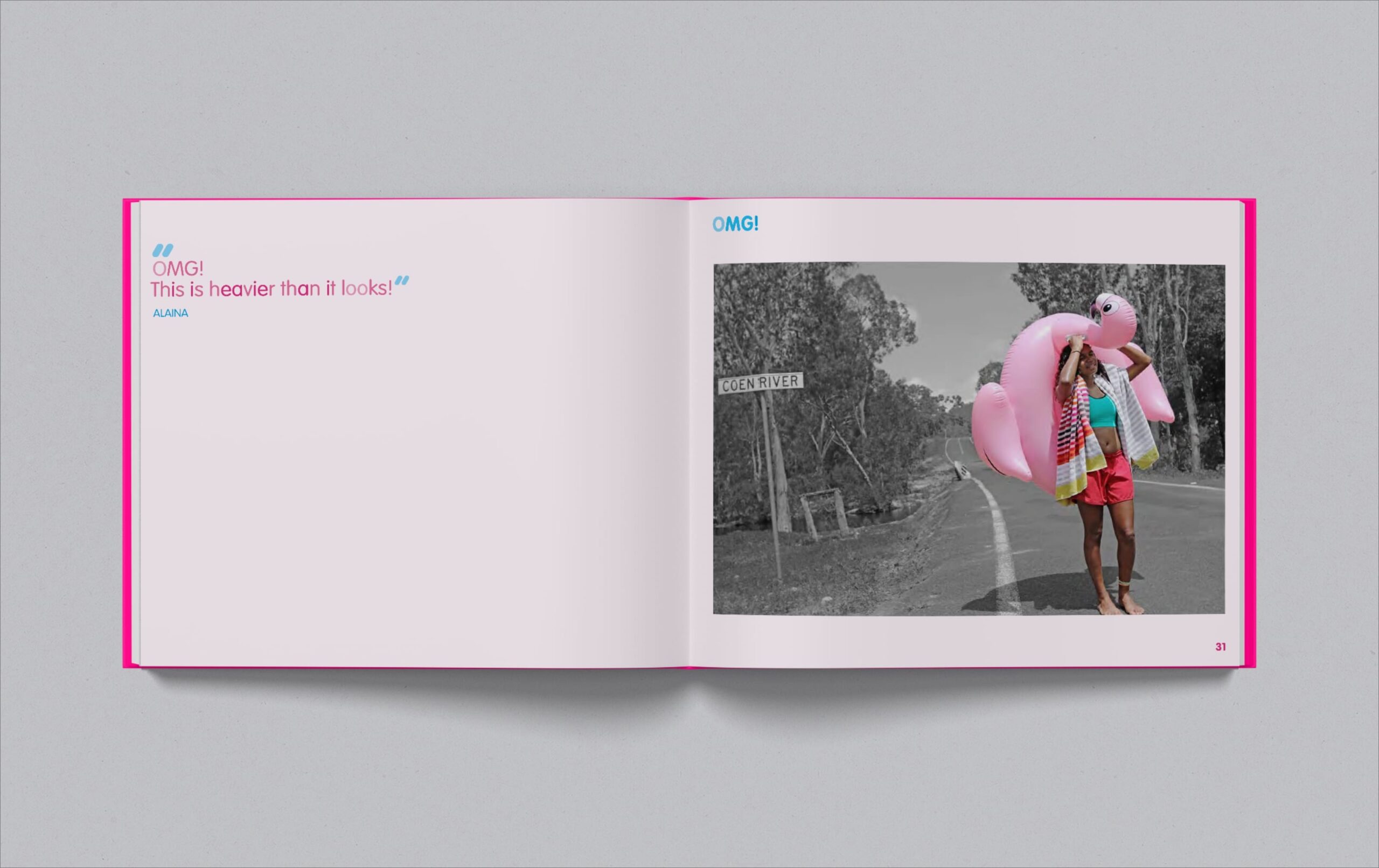
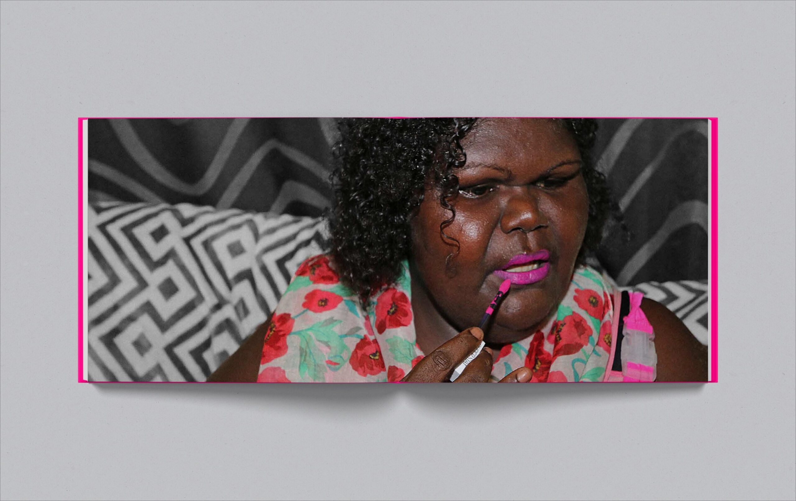
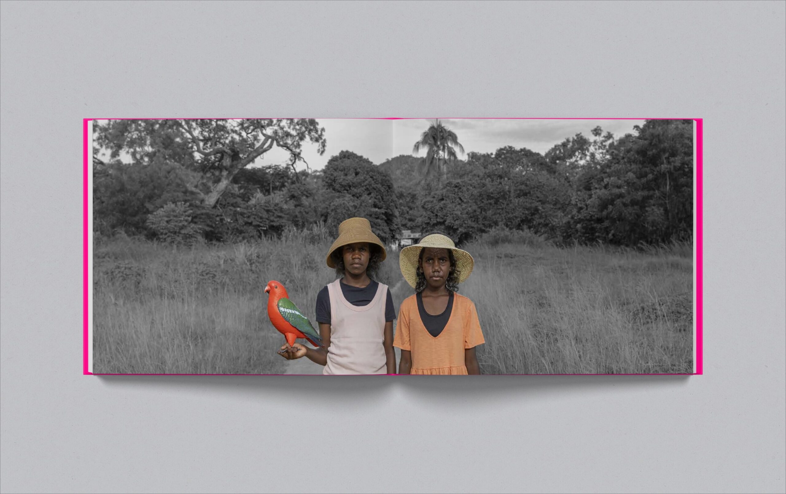
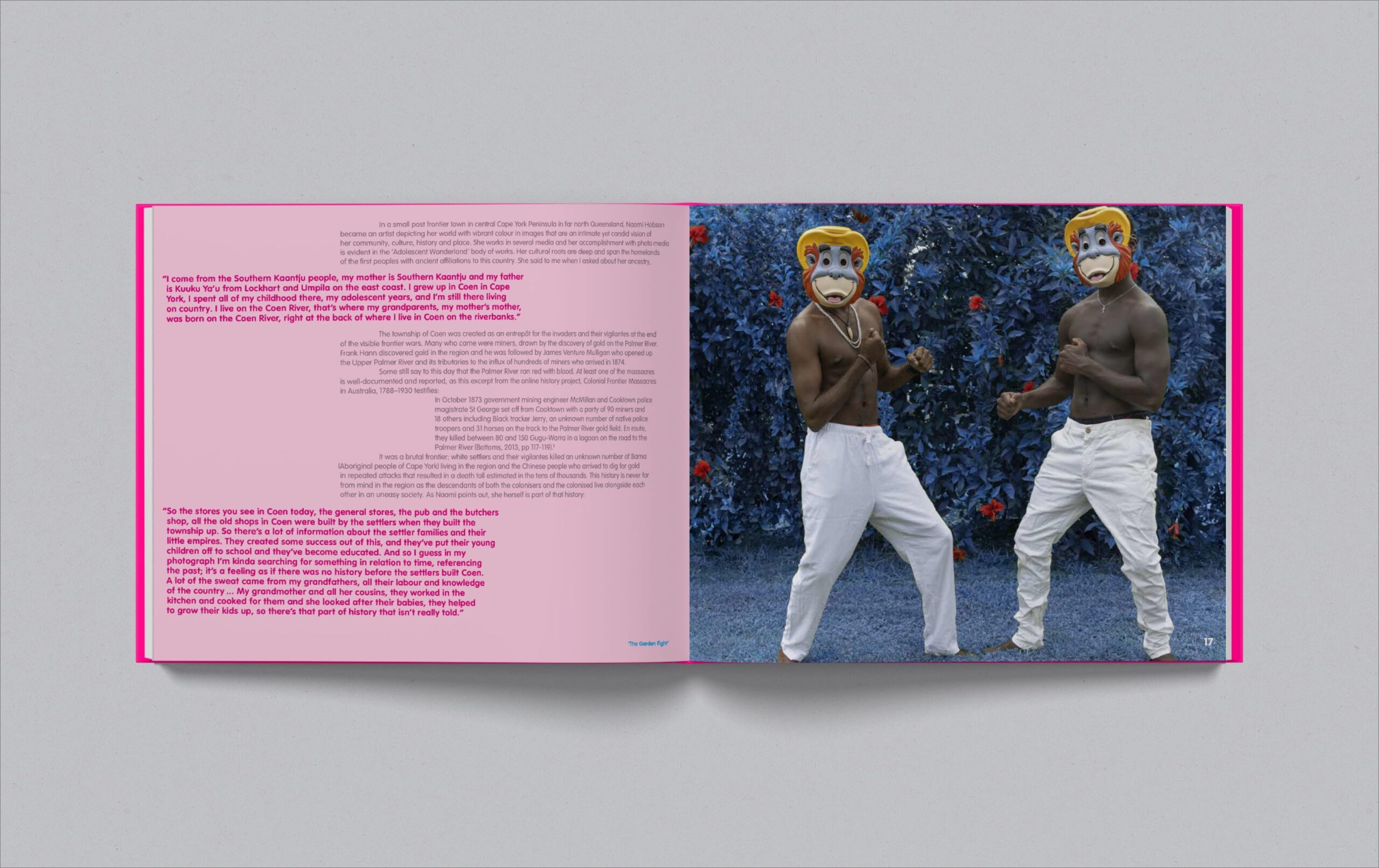
“Adolescent Wonderland” is a documentary photographic essay on the lives of Naomi’s extended family in Coen. Prior to the development of her website, Naomi provided an open brief to capture the essence of this joyous body of work in a physical catalogue. Envelope produced a 160 page, limited edition, hard-cover book bound in hot “poptastic pink” linen. Reflective metallic foils add extra sparkle to the front cover.
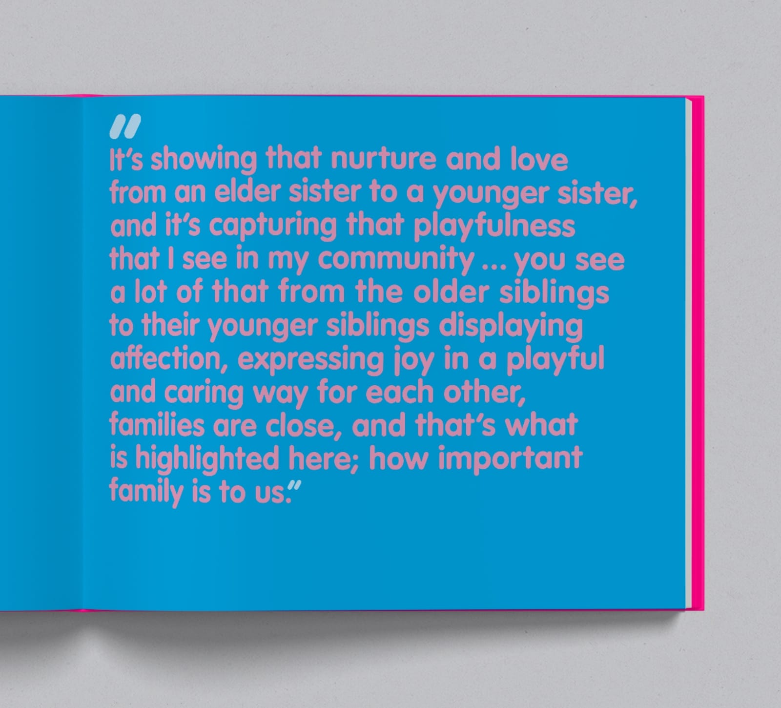
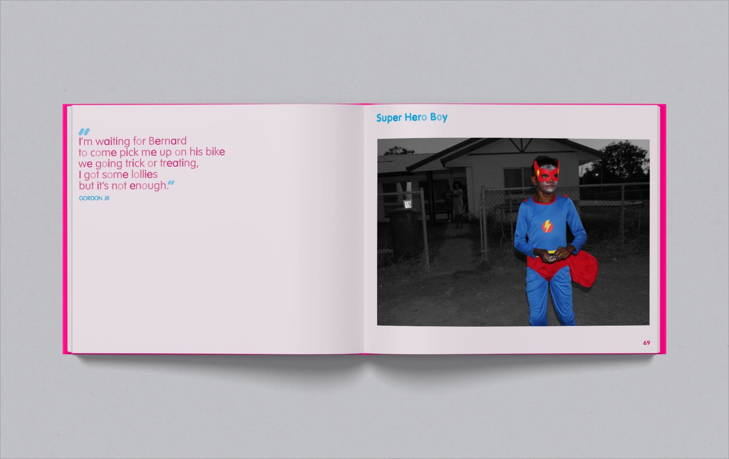
Naomi’s subjects are often dressed in vibrant colours with pink and blue seemingly a favourite combination. Isolating these, Envelope creates a dynamic backdrop that celebrates the theme of youth and freedom. Strong, confident people, representing as they want to be seen. A typeface with rounded edges is the perfect carrier for their individual voices with colours modulated across each quote to simulate the dappled light of the surrounding tropical rainforest.
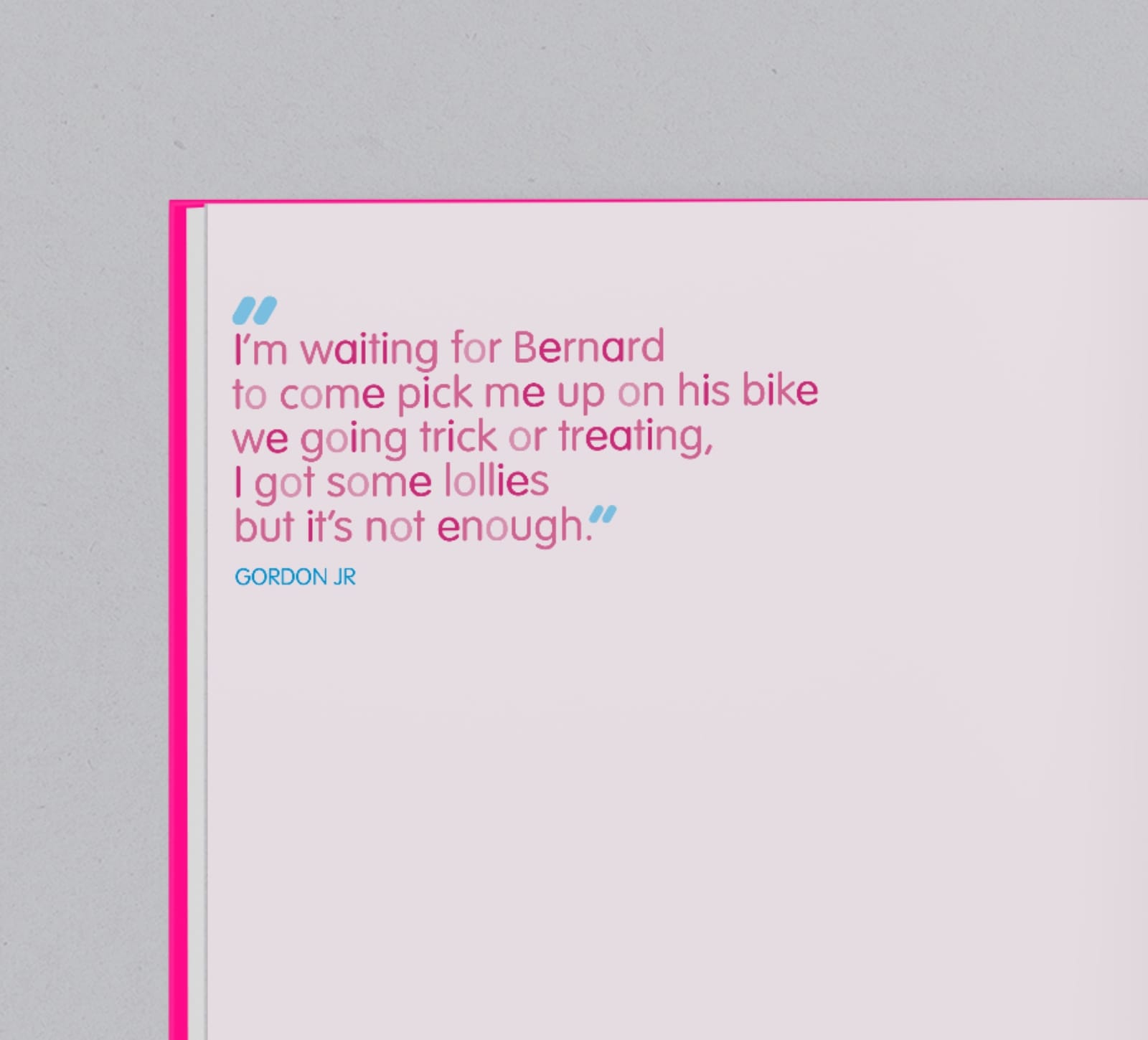
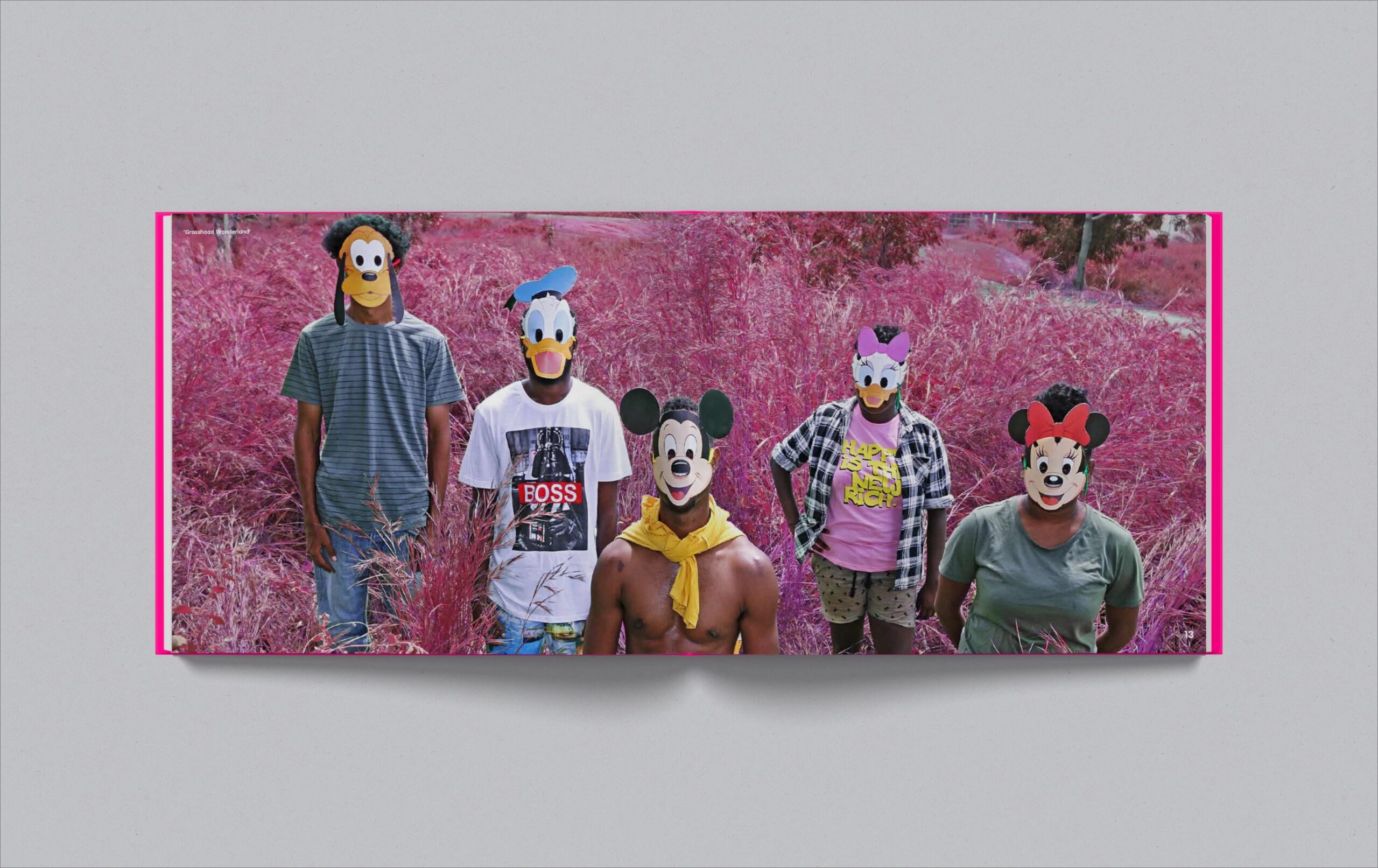

Naomi gave Envelope the freedom to sequence the images to create an engaging visual narrative. Punctuating the more than 50 individual photographs are enlargements also selected by Envelope. These are complemented with Naomi’s supersized quotations across double page spreads.

hello@envelopegroup.com.au
T +61 (0)412 249 745
Instagram