

Andrew Curtis

SNAP! CRACKLE! POP!

We've enjoyed working with Andrew for more than two decades. Whether it's documenting the train system in Singapore, waiting out storms at Bondi Beach to shoot an iconic building or capturing the innocence of a child for a “Candles by Candlelight” campaign, Andrew always delivers for us. After 20 years of collaboration, it was our turn to deliver for him.

Arts & culture
  • Brand identity
  • Website

Modern script, timeless shots.

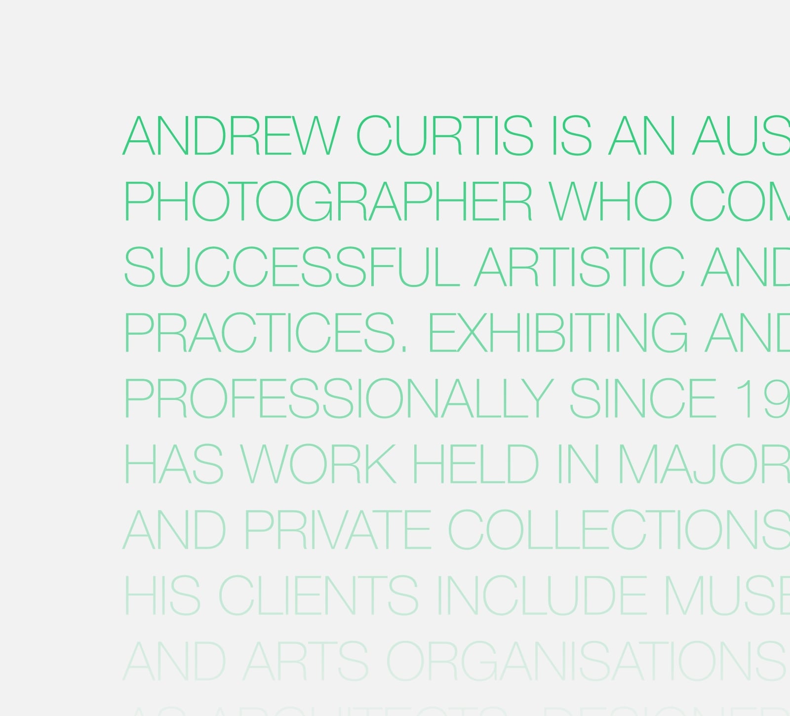
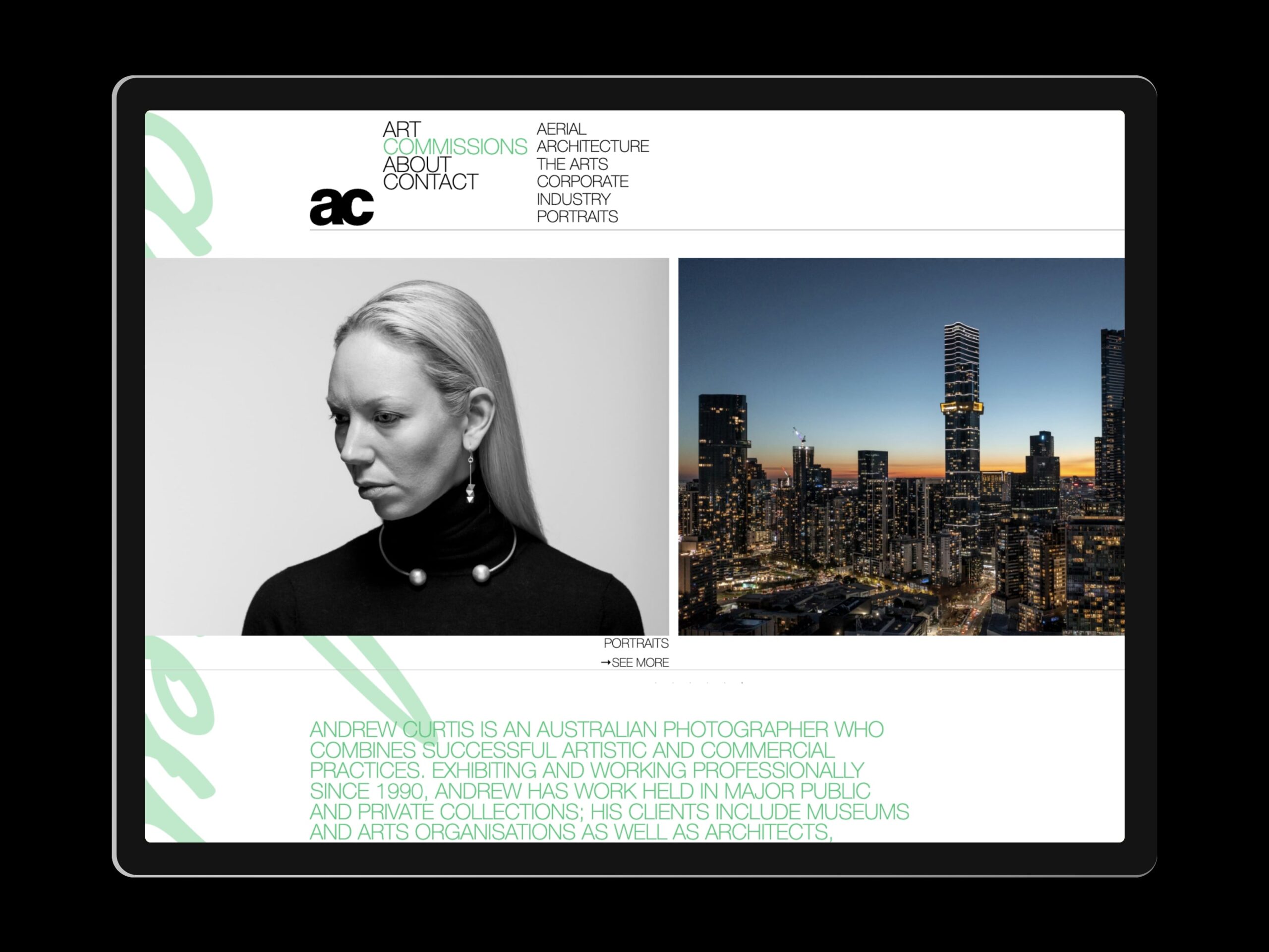
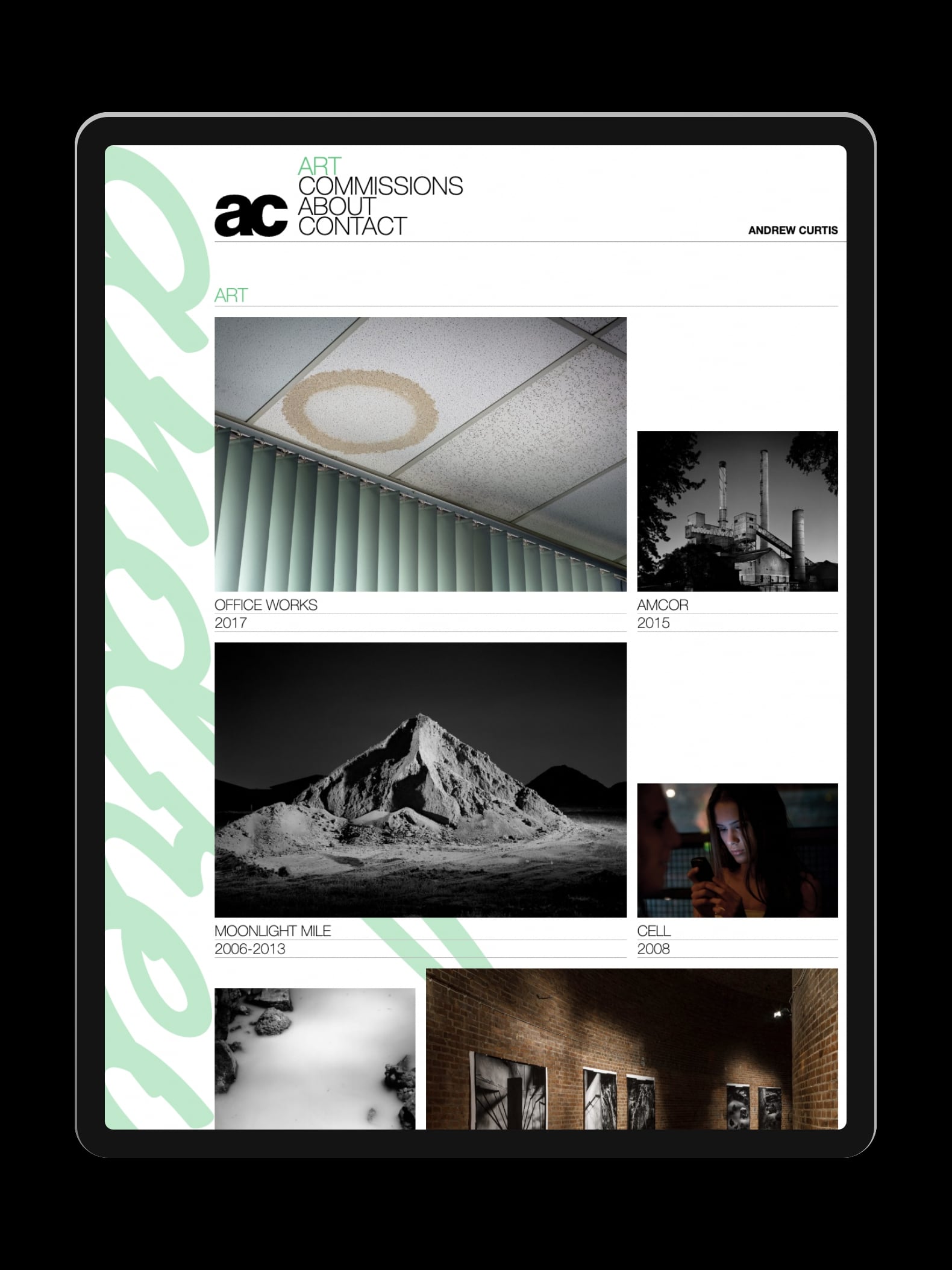
With a desire to bring a “pop art” sensibility to an existing brand identity, Envelope paired a fluid typographic script in Andrew’s favourite colour with the black, san serif monogram. This intentionally lurid aesthetic is in striking contrast to the cool, understated elegance of the typography designed by Emery Vincent Design almost 30 years ago. Together they help differentiate Andrew’s artworks from his commercial photography.

This clash of styles, perfectly encapsulates Andrew’s irreverence and his professionalism. Splashes of colour bucking the trend for austere photographic portfolios.

Andrew’s work often has more to say than meets the eye. An editorial approach to his portfolio allows space to explain, discuss and digress. Room to breathe.

Importantly, Andrew’s commissioned work is displayed in an accessible and widely understood format, categorised and carouselled for no-fuss browsing.

A unique landing-page, featuring Andrew’s own dramatic drone footage acts as a visual reset from the noise of the internet and presents visitors with two routes of entry.

Twin visions, one lens…

Envelope’s evolution of Andrew’s identity brings together two seemingly disparate audiences — art and commissions — under one cross-pollinating portfolio. How could our lens help you see your audience differently?


Contact us